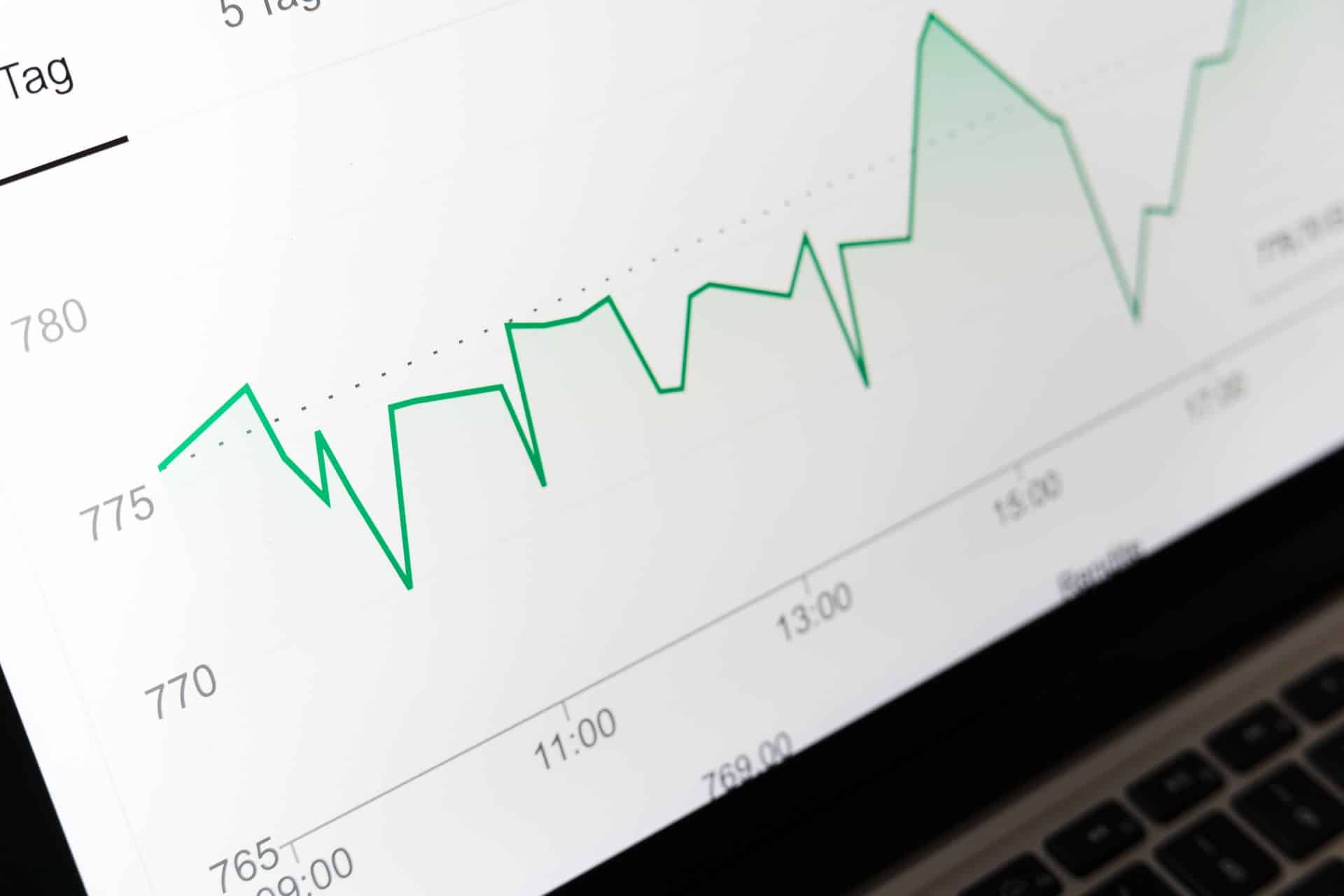
Increasingly, businesses are realizing the power of data analytics. By objectively measuring data related to your organization, you can make better decisions and increase your business’s chances of success. However, numbers aren’t intuitive to many individuals, and explaining complex relationships and trends to supervisors and clients can be downright daunting.
According to datapine, “one of the best ways to compensate for the difficulties of data analytics is to rely on data visuals.” Data visuals are things like charts and graphs, which allow you to review and present data in a more visual way.
But what, exactly, are the advantages of using more data visuals, and are there any weaknesses to keep in mind?


The Benefits Of Data Visuals
Let’s start by looking at some of the advantages of using visuals to explain data:
- Visual processing. Humans evolved for visual processing, and we process visual information far better than any other type of information. For example, the human brain can process imagery about 60,000 times faster than it processes text. When you translate data to a visual format, it instantly becomes easier to understand.
- Clear pattern recognition. Visualization also makes it much easier to spot a pattern, and determine the magnitude of that pattern. If you’re staring at a list of numbers, you might see a rising or falling trend, but you’ll have a much easier time estimating how sharp that rise or fall is if you see it in the form of a line graph or bar graph. Since much of data analytics depends on pattern recognition, this is an especially important advantage.
- Intuition and speed. Visualization is designed to make data analytics more intuitive; rather than going through the work of processing and scrutinizing numbers, you can glance at a visual and get the gist of the information presented. This has two important effects. First, people with limited experience in data science or data analytics can still access important information and view it with a discerning eye. Second, people are capable of processing data much faster, reducing the time you spend agonizing over dashboard reports.
- Variables and changes. With the help of the right data visualization tools, you can quickly adjust your data visuals on the fly. You can change the length of time you’re evaluating or study a different set of variables, then see how the graph or chart reacts in real-time. It’s an easy way to give more control to individual analysts and translate data to be more responsive.
- Communication and conveyance. You may be perfectly capable of analyzing numbers with ease, but that doesn’t mean your clients or coworkers are. Herein lies another advantage of data visualization; the power of communication. With a colorful, easy-to-understand graph, you can quickly and easily convey your complex data to a lay audience. You might still need to have a conversation to explain some finer points of your analysis, but the visuals will give you a good start.
Are There Any Weaknesses Of Data Visuals?
With so many benefits, are there any weaknesses to using data visuals worth keeping in mind?
- Outlier neglect. First, you’ll need to consider the importance of outliers. Many important questions can be answered by evaluating and studying general trends, but sometimes, the outliers of trends can help you draw equally important conclusions. If you’re too focused on a graph or a chart, you won’t see the individual data points that deviate from the norm—and you’ll miss out on some important conclusions.
- Lower accuracy. It shouldn’t surprise you to learn that data visuals are necessarily less accurate than the raw data you’d otherwise study. For some applications, this is perfectly acceptable, but if you’re looking for an “absolute” truth about the world, you’ll need to dig deeper into the numbers.
- Confirmation bias. Unfortunately, data visuals are more open to interpretation than raw data, so they’re also subject to more cognitive biases, including confirmation bias. With confirmation bias, people tend to overvalue data that agrees with their preexisting assumptions or conclusions. If you see a graph, you might interpret it in a way that caters to your existing conclusions, rather than picking up on aspects that contradict your conclusions or studying it in meticulous detail. This can be counteracted with sufficient diligence.
- Issues with design. Data visuals are typically generated by manmade tools, so we also must consider issues with the design. Data visualization tools may be inefficient or ineffective based on their design, or we may choose to generate and study the “wrong” types of visuals.
You can compensate for these weak points by choosing the right data dashboards to use when visualizing your data, and treating data visuals the right way. Use data visuals as a tool to improve your understanding of the data, and not an exclusive substitute for a fuller analysis.
If you are interested in even more business-related articles and information from us here at Bit Rebels, then we have a lot to choose from.


IMAGE: UNSPLASH
