Infographics have gotten so popular over the past few years that some people have dedicated entire websites to only infographics. It seems we can’t get enough of capturing data in ways that are visually stunning. Some creative designers have even branched out into creating video infographics and animated infographics. People are even transforming their resumes into infographics. The applications for how our lives can be illustrated in an infographic are endless.
Sometimes I wonder about the accuracy in the information presented in certain infographics since many times there are obvious errors. I’ve read that the majority of time goes into creating the infographic itself, and not into researching the actual information. However, it’s no doubt a very fast way to soak up statistics and facts in a way that is much more fun that reading text.
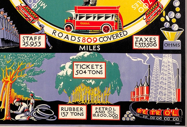
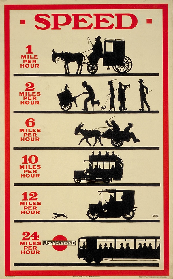
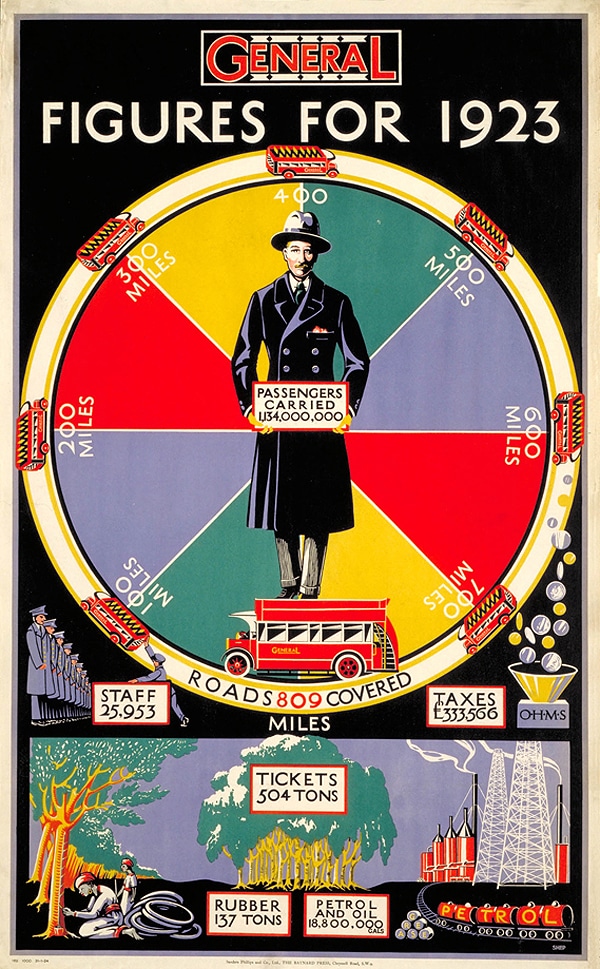
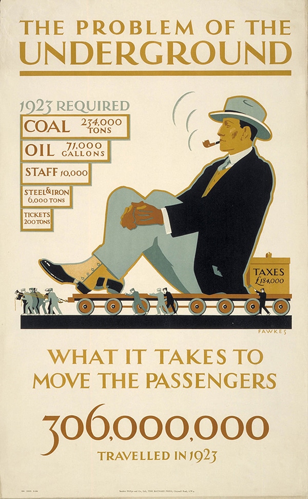
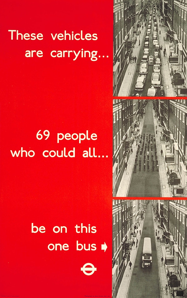
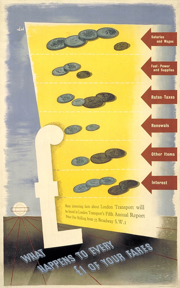
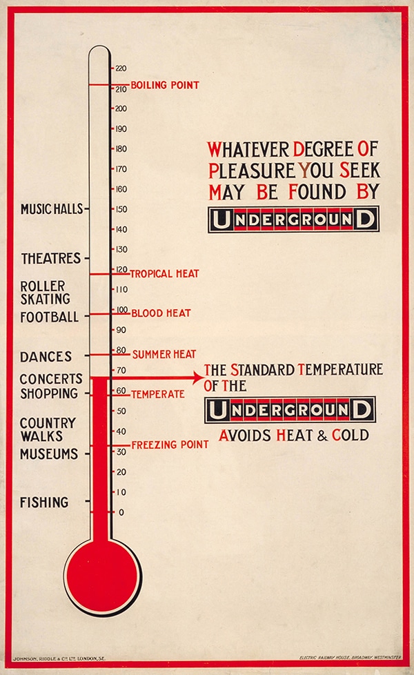
It may surprise you to know that even though we are undergoing an infographics craze at the moment, they are not necessarily new. Data visualization has been going on since the early 1900s. These posters below were all created between 1912 and 1938. What a brilliant glimpse back in time. These are on display right now at the London Transport Museum. You can click over to Creative Review to get the specifics on each illustration.
Via: [Nuclear Toast]
When it comes to safeguarding your home, windows are crucial for ensuring the safety of…
Transforming your outdoor space into a haven requires more than just a green thumb and…
Exploring the terrain of real estate investment yields numerous strategies to boost returns, among which…
There is no doubt that Netflix is one of the most popular video streaming services…
Educational trips are very valuable for learners at every age, giving chances to learn practically,…
Helen RY Sun, a versatile writer-producer from Los Angeles, whose journey intertwines music, marketing, and…