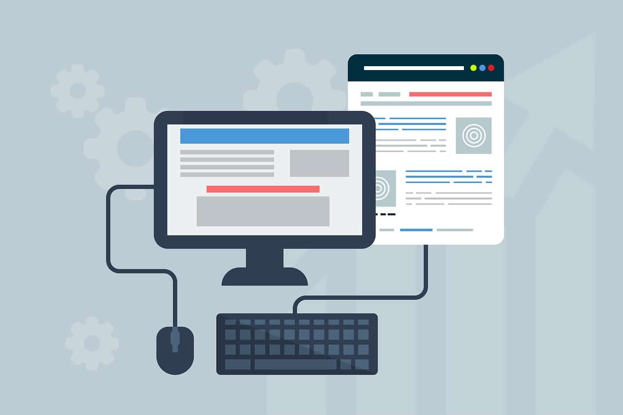
It goes without saying that a website is one of the strongest – if not the strongest of all – business strategies that modern businesses can make use of. And, at the core of any web sales funnel is the web design that makes attracts and converts new clients.
Modern businesses are now familiar with web design, and the best of them use it as a core business tactic because they understand that a website is more likely to gain consumer attention and loyalty over solely traditional storefront windows and the like. While traditional business strategies will always have their place, modern feats of digitalization like web design and the websites themselves are the new frontier in business strategizing and consumer outreach.
It does not matter which industry the business is even a part of the best business strategy is websites and web design for a reason: efficiency and global reach. But what are the three core components to successful web design in 2019 an into the future?
IMAGE: PEXELS
Clean Minimalism With Bursts Of Vibrancy
The perfect website is one that is not too busy but captures and holds the attention of viewers. Nobody likes to go on a website and stay on that site if it is chaotic to look at. It can be hard on the eyes, in general, to look at a screen, but couple this fact with a website that has too much going on, and it is easy to drive consumers away.
While it is important to get across all relevant information, of course, it is often easy and even imperative to be concise with what you are trying to get across. Additionally, having a clean web design layout, and adding in strategic bursts of graphic design, imagery, and even videography, gives consumers a fresh look to remember, but a strong, notable browsing experience that is not too over the top.
Clear Contact Information Is Key
It is inevitable that sometimes your consumers will have questions when browsing through your website. So, have clear contact information readily accessible for them to use when necessary. This is an incredibly simple web design initiative, but it can – and often does – make the world of difference when it comes to how consumers consider your company’s consumer focus to be. A contact information page with a link to email, phone, fax, or even (and now especially) live chat function will make consumers remember your website – and your business – for all the right reasons.
Mobile-Ready Design
Desktop-ready design is obviously important, too, but most consumers today are so busy that they do most – if not all – of their shopping and browsing online, on their mobile phones. As such, does it not make more sense to cater first to mobile-ready design when building a website?
There is nothing more irritating as a consumer than trying to access a website on your phone while you are on the move and realizing that it doesn’t format properly. This is how you lose potential customers. So, go mobile-ready first, but also make your website desktop-ready. Have both, but focus on mobile-ready design first and foremost.
If you are interested in even more design-related articles and information from us here at Bit Rebels, then we have a lot to choose from.


COMMENTS