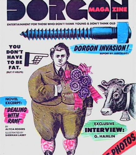
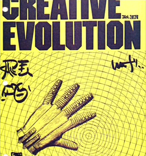
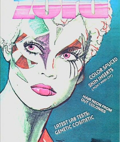
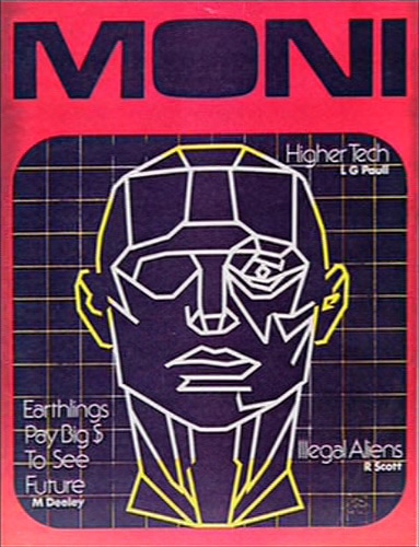
In 1982, Ridley Scott gave us Blade Runner. It hit cinemas in May to a lousy box office opening and was dwarfed by its rival at the time, Steven Spielberg’s E.T.. But as time passed, the movie gained a dedicated cult following that only continues to increase as the years go by. The special edition box sets and newly released Director’s Cut Editions also help.
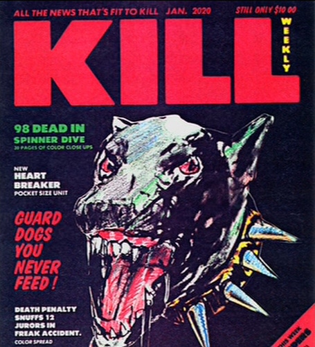
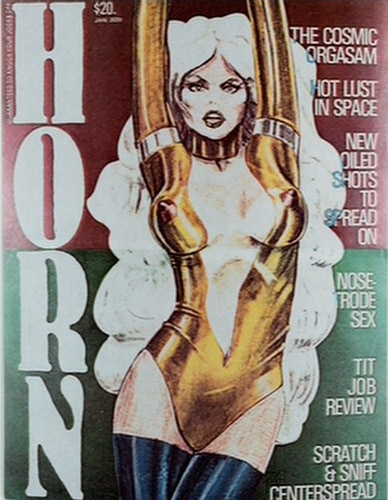
Recently on the Internet, some graphic design elements featured only briefly in the film cropped up. Six magazines in particular, designed by production and illustrator Tom Southwell in 1980-1981, appear in the city streets on magazine stands.
These were originally shown in the Blade Runner bonus feature “Signs of the Times: Graphic Design.” The magazines have a punk zine feel to their design. They use pubic domain clip art from the time, but strangely work to show us a window into the future. All of them give extra details about the dystopian future world of the Blade Runner movie, but are never shown clearly enough to be appreciated for their attention to detail, and most of all, their humor. Below are the designs for magazines that should exist, but don’t – Dorgon Magazine, Creative Evolution, Zord, Moni, Kill Weekly, and Horn.
Image Credit: [Flickr / sbwoodside photostream]
In the swiftly advancing domain of B2B digital marketing, the significance of B2B SEO as…
Conveyor rollers play a central role in the efficient operation of numerous types of material…
In today's technology-rich environment, having the most up-to-date smartphone is not just about staying in…
What is business agility? - No matter what industry a business is in, there is…
Roof damage is not merely an aesthetic concern for commercial property owners; it poses significant…
In the modern, digitally-driven world, managing data effectively stands as a key for organizational success.…