A logo is very important in branding. One must be careful in putting together elements to the design. It is after all its the first contact the consumer has on a product. Here are cool examples of logos that play with symbols as elements in the design.
“The Dressing Bar” – The main component of the logo consist of the bar element combined with that of a woman’s garment. The logo communicates the concept of a dressing bar. As per the designer the cocktail table is also a play on the jigger. Jigger is used by bartenders to measure and mix drinks at a bar. The only difference here is that the bottom is shaped into a hem of a dress. Green and Fushia was the color chosen to to signify freshness and vitality while simultaneously referring to invogorating cocktails and fashion trends. Very Clever.
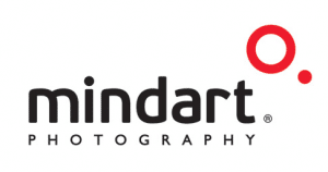
“Mind Art Photography” – Here the designer uses the 2 circles to connote thought process that goes through the mind while taking photos and the use of the symbol as the auto focus function of a camera.

COMMENTS