Most of the time, billboards are annoying as heck, aren’t they? Whenever we travel down the highway, there are signs everywhere telling us where to eat, where to buy gas, where to shop… it never ends. I suppose it could be worse, after all, some say that in the future we will be blasted with branding and commercialism everywhere through augmented reality.
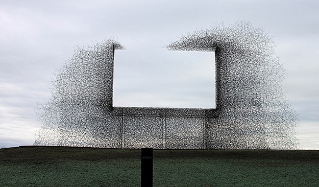
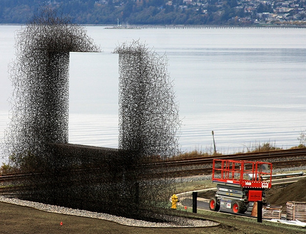
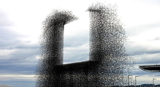
This new billboard; however, is literally a breath of fresh air. That’s right. It doesn’t advertise anything except a big open space of nothingness and air. Wanna know the craziest part? The U.S. government funded this beautiful piece of art.
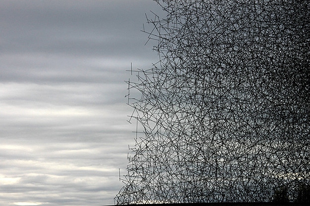
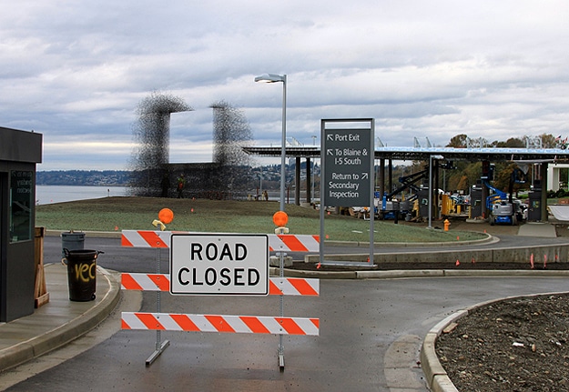
Located at the United States/Canadian border near Vancouver, there is a lot of symbolism in this rectangle of open space. This supposedly signifies the openness between both countries, and the cooperation of two nations. This whole concept is thanks to the brilliance over at Lead Pencil Studio. This lattice of stainless steel rods is called Non-Sign II. Regardless of whether you like or dislike America or Canada, from a design standpoint, I think this is the most beautiful billboard I’ve ever seen!
[via Fast Codesign]
COMMENTS