Email signature might look like a simple formality to many; however, it is definitely more than just that. It’s the end part of your email, and you’re final opportunity to reach out to your customers. Email signatures are used for different reasons: some encourage the users to take a specific action, some exist to offer contact data of a sender and to make emails more personalized, nothing more.
IMAGE: PIXABAY
In any case, such signatures have to look presentable and interesting at the same time. You wouldn’t want the recipients to confuse them with the signatures of other brands or persons, right? In this article, we won’t tell you about how to design an email signature.
You can do it by yourself or pick a professional signature creator like Newoldstamp — the choice is yours. We, however, will share some tips that could help you create stylish and effective email signatures that would benefit your business or personal brand. Here’s what you should pay attention to while designing an email signature.
1. Content
Email signatures can contain less information:
IMAGE: NEWOLDSTAMP
Or more information:
IMAGE: NEWOLDSTAMP
Which option should you pick? It largely depends on the circumstances. If you have to design a signature for an employee, it surely shouldn’t contain a lot of their personal data — an employee represents a company, after all. Listing only the necessary contact information will be enough.
If you create a signature for your personal brand, you might want to include more information about yourself. However, including too much data isn’t the best option for mobile-friendly signatures: in this case, less is definitely more.
2. Fonts And Colors
You can create a colorful email signature:
IMAGE: NEWOLDSTAMP
Or use only one color (besides black, of course):
IMAGE: NEWOLDSTAMP
Or even make it monochrome and leave all the colors for the photo:
IMAGE: NEWOLDSTAMP
In any case, make sure that the colors you utilize are the ones used in your logo or design. Stick to no more than three: you probably wouldn’t want your email signature to distract the subscribers from the content of your email.
As for fonts, it’s always better to use only one and to make sure that it is easy to read even on mobile devices. If you want to make certain parts of the text stand out, do it with the help of font size and color or make a text bold. Also,make sure the fonts you use are web-safe make.
3. Social Media Icons
If your goal is to drive the recipient’s attention to your social media, you can use relatively big icons that stand out:
IMAGE: NEWOLDSTAMP
Alternatively, you can make them small if making them look natural within the signature is your top priority:
IMAGE: NEWOLDSTAMP
In any case, we don’t recommend including as many social media icons as you can. Pick the ones that are the most important for your brand: for instance, LinkedIn if you are a businessperson, Behance, or Flickr if you are a designer or a photographer, and so on. In most cases, the recipients won’t have the patience to click on every social media icon, so be sure to include only the ones that really matter.
4. Hierarchy
When your subscribers see your email signature, could they instantly understand what information is the most significant? If not, you have to work on the hierarchy of an email signature.
This email signature is an excellent example of a proper hierarchy:
IMAGE: NEWOLDSTAMP
You can easily see the most critical part — the name of the sender — first, and their position next. Contact data could be useful; however, the call-to-action button matters more to the sender. Therefore, this button stands out. You can use the same hierarchy in your email signature or pick a different one. Either way, ensure that a signature is appropriately structured.
5. Photo Or Logo
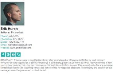
Photo or logo: what to pick? Well, that depends a lot on what impression you want to make. Once again, if you’re creating a signature for a personal brand, a photo is a must. The same goes for companies who intend to build a more personal communication with their customers. Adding a photo to an email signature helps the customers understand that there’s a person behind every email — and instantly feel more trust towards the company.
IMAGE: NEWOLDSTAMP
However, if you’re creating a signature for employees and your goal is to increase brand’s recognition, adding a logo instead of a photo might be a better option for you. The customers would see this logo more often and therefore will memorize it better.
IMAGE: NEWOLDSTAMP
You don’t need to follow a set of strict rules to create a great email signature. Just like every business is unique, an email signature is always unique too. However, these tips will hopefully help you understand the basics better and come up with the right signature with more ease.
If you are interested in even more design-related articles and information from us here at Bit Rebels, then we have a lot to choose from.










COMMENTS