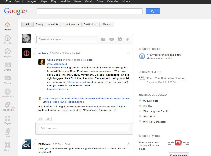
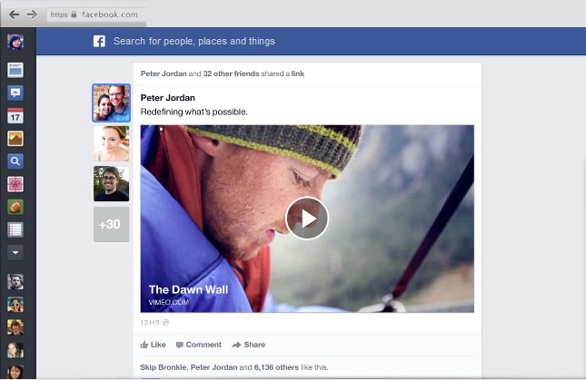
Facebook is rolling out a brand new redesign for your newsfeed beginning today. They have taken user feedback and gotten rid of the clutter to make way for a brighter, more beautiful and simplified new look. Is it just me, or at first glance does it look a lot like Google+? Facebook has realized how important visual communication has become to users, and they’ve reorganized the newsfeed to make more room for beautiful imagery and rich stories that are visually engaging to other users.
You will also be able to choose between different feeds about the topics you like most, and Facebook is FINALLY making its mobile match its web user interface. Now they are blowing up tiny thumbnails into bigger photo stories and rich previews of shared stories from your friends. These changes make any type of content more appealing to the eye, and make each story an experience.
Now you can go beyond the surface of your Facebook newsfeed. Facebook is adding a dropdown on the top right-hand corner of the newsfeed, which will display following, photos, all friends, music, groups and other interests that you might want to look at when you have more time to spend on Facebook. This narrows down certain topics or interests your friends have shared recently. For example, clicking on “photos” will allow you to see all the recent photos your friends have shared, which will give you more control over the stories you see.
Those will become known as your different feeds so you can gain more control over your Facebook newsfeed and see more specifically what you want to see, and what you care about most. Although it may look like Google+, these changes will make Facebook more advanced. As any FB user knows, the newsfeed is the hub, and making that more enjoyable will only make it more of a place where people will want to be. So Google+ may have rolled out a change to their platform a day earlier, but it looks like they may get owned by the new Facebook redesign.
Snapshots of Google+ vs. the new Facebook newsfeed redesign
Do you think they look similar?
(Click images to enlarge)
Changes coming to a Facebook newsfeed near you
Via: [Facebook Redesign]


COMMENTS