Regardless of the nature of your business, an engaging and easy to navigate website is crucial to your chances of success. With the development of smartphone technology and m-commerce encouraging a growing number of customers to reference and purchase products online, brands are competing for a dominant share of a keenly contested virtual realm.
Today it’s vital to have a home online as a business if you are looking for any kind of success, however, it is also vital that your website is as optimized as possible. Sometimes the mere loading time of a website can drive visitors away if it is taking too long. Such is the harsh competitive environment online and, therefore, it’s ever so important to implement creative tweaks to make sure visitors are kept on the site so that you can convert them into customers.
The ability to be proactive and think creatively is crucial to your chances of success online. We know this and that is the reason why we have put together this short list of highly effective and creative tweaks that will make your website even more competitive. So, consider the following ideas to achieve a better user experience.
1. Move Banners Above The Fold
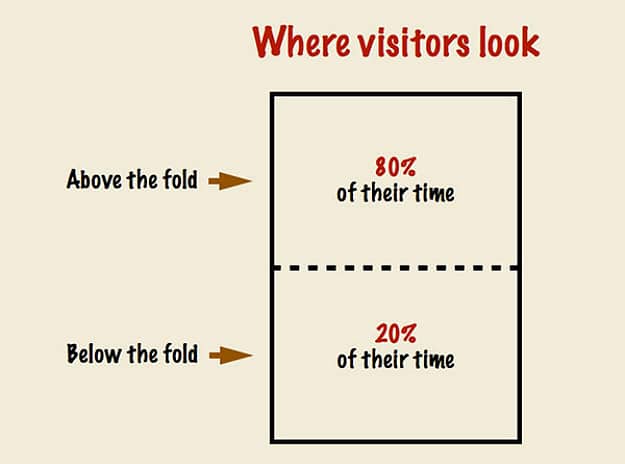
In the simple terms, ‘the fold’ refers to an imaginary line that separates the top from the bottom of your website. In the virtual world, the space at the top is crucial as this is what will draw the customers’ eye when they visit your site. With this in mind, there is a growing trend for revamping the traditional website with creative tweaks and move colourful banners above the fold, as this helps to distinguish individual sites and engages visitors on a deeper level.
2. Add Client Logos And Awards
Logos and award symbols are key components of your online brand, as they provide reassurance to customers and highlight any achievements that your business has earned. They also add much-needed color and graphical depth, enriching your landing pages and subtlety reinforcing the quality of your brand. I great creative tweak to add trust to your brand.
3. Include Creative Testimonials
Testimonials represent an excellent way of promoting your business, although many companies use plain text that does little to engage visitors. To make this messaging more potent, consider using interactive video testimonials where clients can share their passion and enthusiasm for your brand. Also, incorporate colourful brand logos to visually support the businesses you have partnered with.
4. Use The Psychology Of Color And Drive Conversions
The psychology of color is crucial for businesses, especially when applied to a website. By utilising color as a way of soliciting emotion, you can direct your customers and drive a higher rate of sales conversions over time. In addition to this, you should follow the example of the best dating sites by using bright colours to highlight actionable icons that draw the eye of the consumer and encourages them to register or subscribe.
5. Increase Page Loading Speeds
With a growing number of mobile customers, landing page loading speeds are more important than ever. Customers who are on the move have little time to wait for slow or cumbersome websites, so the failure to drive a fast and efficient performance could see your business lose out to more proactive rivals. Each page should take no longer than three seconds to load, so keep this in mind when you are designing your website using these creative tweaks.
Above The Fold Design Statistics – Creative Tweaks


COMMENTS