Imagine what it would be like if each website in the world were a place that could be pinpointed on a map. The map would have to be huge, and it might be called the Internet universe. As it turns out, the Internet is a massive place, just like outer space.
According to Popsci, if you spent 12 hours a day, 365 days a year for the next 50 years surfing the net at a pace of 5 websites per minute, you’d still only scratch the surface of 10% of the Internet, and that doesn’t account for the new sites being added each day. In other words, the Internet universe is huge beyond imagination, and it’s growing even bigger each day.
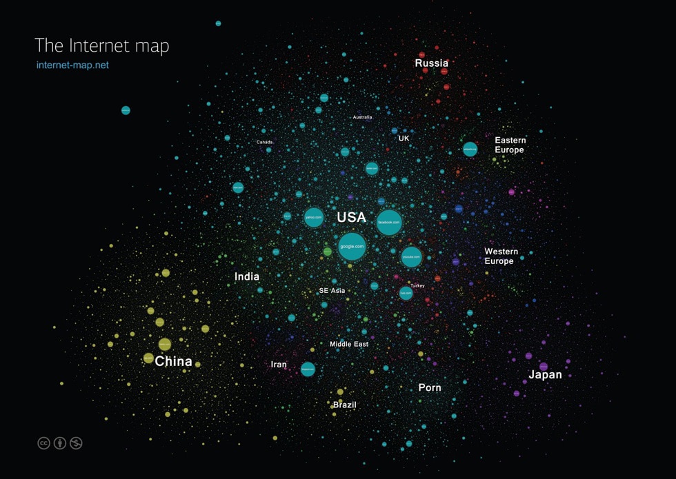
Daniel Galper, Vasiliy Pugovkin, Leonid Lilo and Vitaliy Zuzin decided to create an interactive map of the Internet universe so we could all get a feel for this. Not every website is listed on this map. Since there are over 650 million active websites in the world, they only made circles to represent the top 350,000 websites on the Internet, which represents 196 countries.
There are countries listed, and then you’ll see groups of websites that form around those countries since the people in each country tend to visit sites related to their country if that makes sense. The United States is blue, China related sites are yellow, Japan is in purple, Russia is in red, etc. Topics that are huge also have their own sections which are geographically placed where people surf those topics the most…like porn.
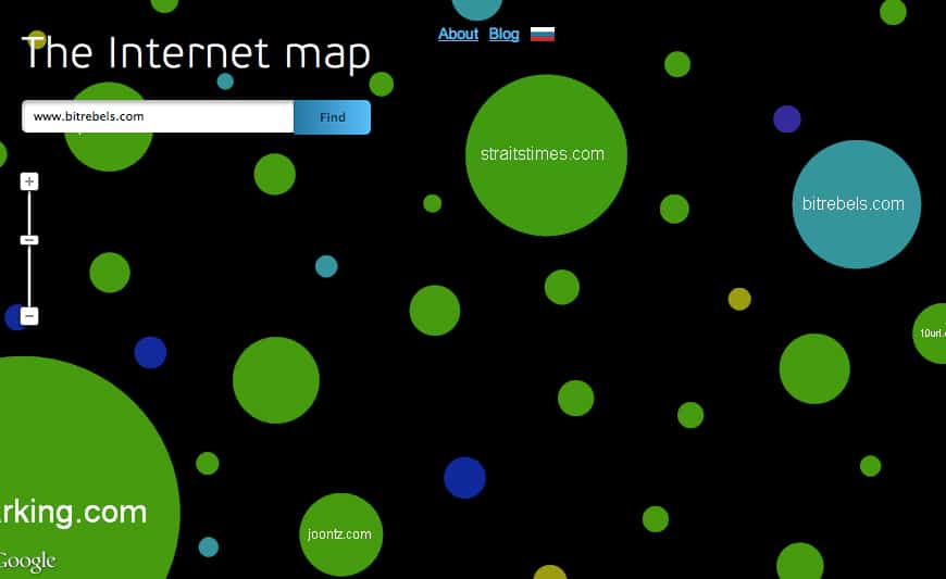
This Internet universe map is now also connected to Alexa. In other words, when you click on a website on the interactive map, you can see that site’s Alexa ranking right there within the map.
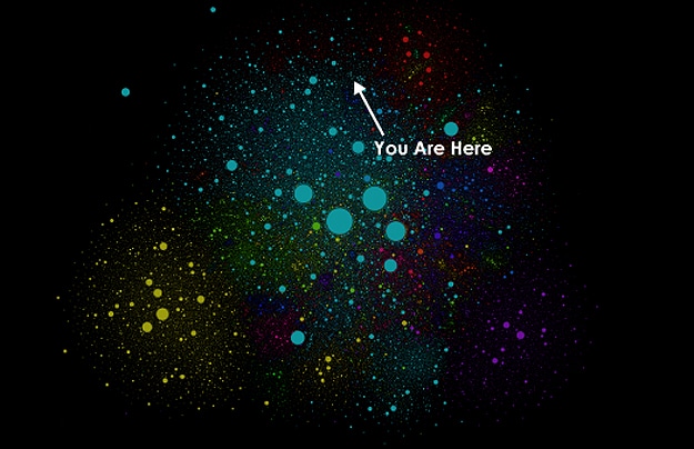
The complexities of this Internet universe go far beyond what I’m able to describe in this article since it would end up being way too long. If you would like to read all the details about what is where, how big, and why, you can click over to The Internet Map Blog and read the Popsci article which I’ve linked below as the source. Most importantly though, click over to the actual Internet Map so you can play around with it. I found Bit Rebels and put a snippet of that portion of the map in an image below. It’s fascinating!
Via: [Popsci]
Digital technologies are making significant inroads in the retail sector, particularly within boutique fashion shops,…
The global technology landscape is a dynamic ecosystem, constantly evolving and pushing the boundaries of…
Choosing a new water heater for your home boils down to two main factors. You…
In the heart of the Balkans lies a hidden gem for career opportunities – Serbia.…
Driving can be a convenient and efficient way to travel, but it also comes with…
Partitioning a hard drive on a Mac can be a useful endeavor for users seeking…