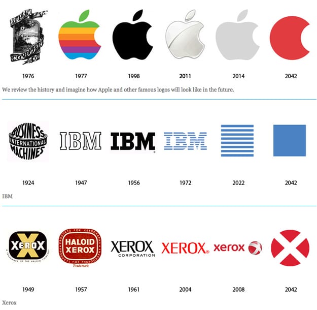
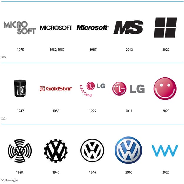
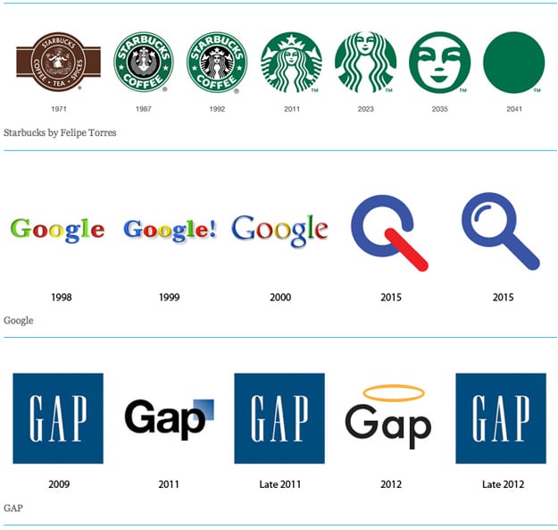
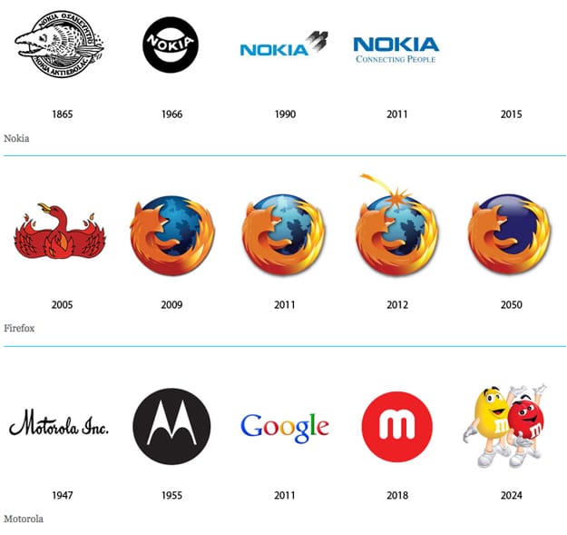
Following the evolution of logos is fascinating. I’m not a designer, but I think one of the keys to a successful logo change is keeping the essence of the original, but making it different, if that makes sense. It’s similar to watching someone with a lot of followers on Twitter change their avatar, which from a branding sense, is a personal logo. If they change it to something drastically different, their followers will many times lose them in the stream, and get a little wigged out. We’ve all seen some brands at the supermarket that changed their logo so drastically people are hesitant to continue buying the product.
I experienced this first hand when I went from a brunette to a blond Twitter avatar a few years ago. It wasn’t a good experience, and I quickly changed it back a few days later. However, if that same person changes their avatar to an image that represents the same essence, but just a little different, it is fine and even a welcomed, fresh change. A good example of this is the evolution of the Warners Bros. logo in Harry Potter. If you are interested in logos, and if you haven’t seen that, I highly recommend it. It’s so interesting to see the dramatic changes, that when done gradually, seem subtle.
Stock Logos recently picked up on the trend that we are seeing in corporate logos, which is the fact that they seem to be becoming simpler and cleaner over time. They took this trend one step further and projected what some of these logos might look like in the future. If you would like to read something serious about corporate logos, click over to Past Present and Future of Corporate Identity. If you would like to read something silly about corporate logos, click over to 13 Company Logos Redesigned As Condoms.
Via: [Neatorama] Header Image Credit: [ikram-zidane / Flickr]


COMMENTS