As 2011 comes to a close, I decided to examine what we have to look forward to in Web Design for 2012. But first, what makes me so sure that I have the ability to see into the future? Well, let’s have a look at my predictions for 2011.
I predicted that large headers would be the rage, minimalist designs would be popular, websites would be more social, Silverlight would die and Twitter would explode in popularity due to iOS5. Well, many of my predictions for 2011 were spot on.
So, I figured I would press my luck and try it again!
The following are the top 5 trends in web design for the coming new year:
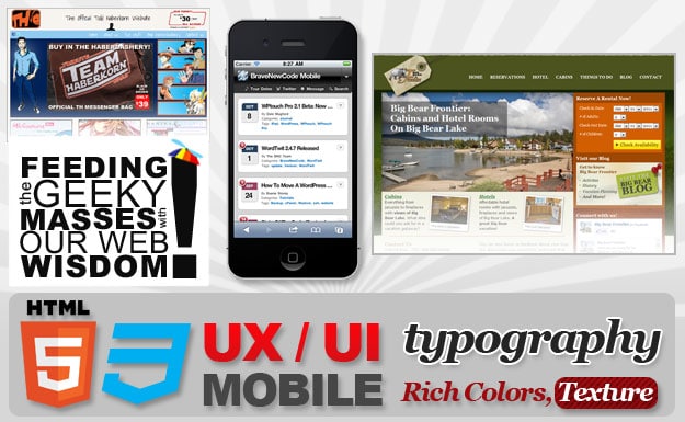
1. User Experience / User Interface
More attention will be paid to the user experience and interface in 2012. Visitors of sites are looking for ease of navigation and usability regardless of the device they use to surf with.
2. Mobile
Of course, no top 5 list for web design going into 2012 would be complete without mobile being included. Although I believe that there will be a continued emphasis on native apps, I think we will see the Responsive Design Pattern take off in 2012.
3. Typography
There is no replacement for a nicely developed header with the right font type, weight, shading, color and white space. Typography has become part of design, and this trend will continue into 2012. In fact, this is an art form and very difficult to master.
4. Rich Colors and Textures
Minimalist design has been very popular for the past couple of years. I can certainly appreciate a clean, crisp design with plenty of white space, but I think we will see the resurgence of color and texture in designs to come in 2012.
5. HTML 5 and CSS3
We have seen HTML5 and CSS3 hit the scene over the past year with a love / hate welcoming by designers and governing bodies of all things web. Whether or not you think they are ready for primetime, they are here to stay, and I think 2012 is going to be a banner year. In fact, I believe these fine technologies will prove they are more than just a Flash replacement.
While there are many other design trends that could be considered here, I think these are the pick of the litter. While concepts like Parallax Scrolling are cool, I don’t see them as compelling standards for use in everyday design.
Image Credits: [Stupid Cat]

COMMENTS