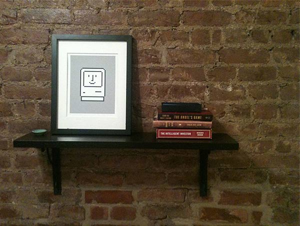
I have two words, iconic designer. Which one? Susan Kare is a profound contributor to the original Macintosh. I am fascinated by the female geeks of our world. The release of her coffee table book provides sentimental delight for any Apple user or design lover. While the world is fully aware of the impact Steve Jobs had on every industry with the creation of the Apple computer, his team merged all things both beautiful and functional into a friendly user experience.
Recently, I began a trip down memory lane (from 1998) thinking about my experience of pulling my very first brand new Macintosh out of the peanuts and packaging. I remember that feeling like it was yesterday. How exciting and heavy that machine was! I was amazed it rarely crashed (think Susan’s bomb icon), and I never had a virus on it. It took me a long time to permanently part with it.
Susan is often referred to as a “pioneer,” but that metaphor just doesn’t work for my visual brain. Let’s say, in my opinion, she is the Princess (as in Leia) of iconic user interface graphic design defending the battlefront for computer users and future design stars to fight the good fight. Susan says, “I believe that good icons are more akin to road signs rather than illustrations, and ideally should present an idea in a clear, concise, and memorable way.”
Susan also worked on development and designed some of the first computer fonts. She made them easier to read on a monitor. Do the font names Monaco, Geneva and New York sound familiar? Her design execution and style made our Macs ‘user friendly.’ Susan’s enhancements helped launch a piece of technology history. While those first user interface icons feel like the pioneer days, described in tech years, Susan is still producing strong work using her bit mapped block illustrative style that has become her stylistic trademark.
Image Credits: [Kare Prints] [Kare Prints Facebook] [AT Design and Illustration]

COMMENTS