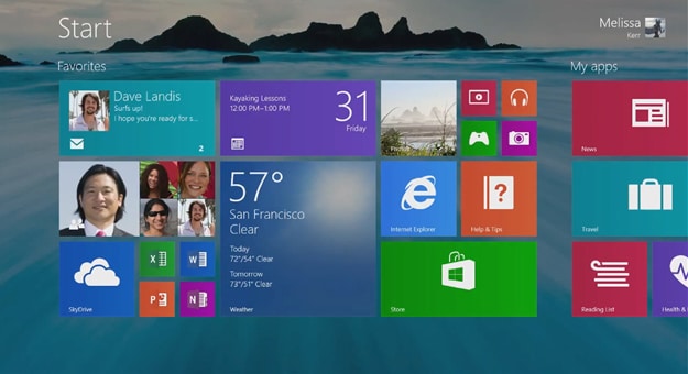
Microsoft has released Windows 8.1, the first major update to its current operating system, and they’ve addressed many of the issues users had with the original release. The Start Button is back, you can boot straight to the desktop, and even have the same wallpaper for the Start Screen as your desktop, thus providing a more cohesive experience when moving between each interface.
This is an update that Microsoft needed to do in order to counter the barrage of criticism Windows 8 has received, and it really is what the original version of Windows 8 should have been all along. One of the biggest misconceptions about Windows 8, at least from my perspective, is that it is not a continuation of the traditional Windows operating system that we all know so well. Yes, the desktop is still there, and you can still do just about everything you could on older versions of Windows.
However with Windows 8, the traditional desktop is a tile on the new modern user interface, which would infer it’s an app amongst others rather than the core system itself. The other inference is that when the time is right, the desktop could potentially be removed entirely once the new tiled, mobile environment is accepted by the public at large.
I don’t necessarily see any of this as a bad thing because the world is going mobile, but I do still love using the desktop for productivity. Despite the welcome improvements in Windows 8.1, I can categorically say that on my PCs, I will almost exclusively work within the desktop environment. However, I do recognize that this is fast becoming a legacy environment and Windows 8.1 still reinforces this idea. So for those of you hoping this update would represent a reversal on Microsoft’s part of their strategy, you will be disappointed with Windows 8.1.
Despite the concessions, Microsoft is still sticking to its strategy of combining traditional and mobile environments, with greater emphasis on the latter. And so they should if they want to remain relevant in computing. Microsoft needed to do Windows 8 to keep up with the rapidly developing mobile device world that Apple pioneered and others such as Google and Samsung are relentlessly pursuing.
Windows 8.1 smooths out the edges and provides a much more responsive and cohesive experience. Bringing back the Start Button and including boot to desktop functions were essential to appease the mainstream audience, but make no mistake: the modern, mobile user interface is here to stay.
Windows 8.1 Is What Windows 8 Should Have Been All Along
Image Credits: [Blog.gsmarena] [Beta News]

COMMENTS