I’m stepping over into Richard’s territory a little bit with this article. He is an extraordinary designer, and he writes about minimalist design a lot. According to him, it’s much more difficult and requires a lot more creativity to make an effective minimalist design when compared to a fancy busy design. If you are unfamiliar with the differences, you can see examples of both in Minimalistic vs. Over The Top Transfomers 3 Posters.
For me, since I’m not a designer, I didn’t really get it before. These minimalistic superhero posters are really neat, but overall, to me, it was nothing more than just a different style of design. It’s like the Cliffs Notes of Illustration. However, that all changed today. Now I get it.
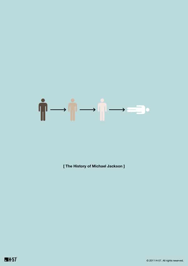
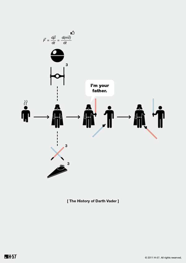
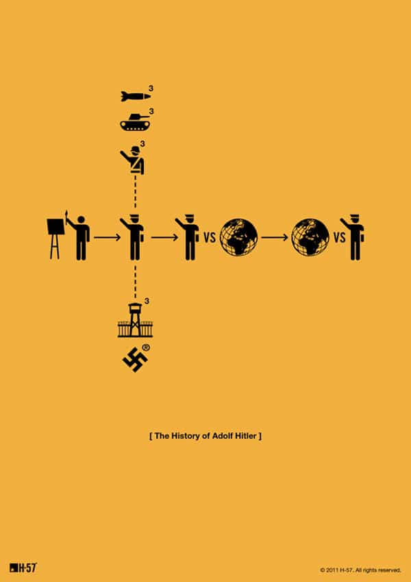
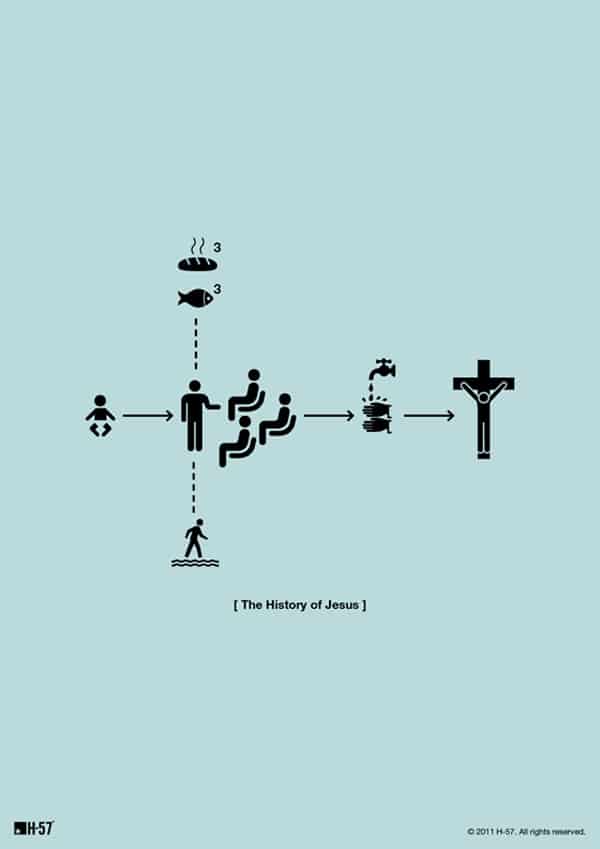
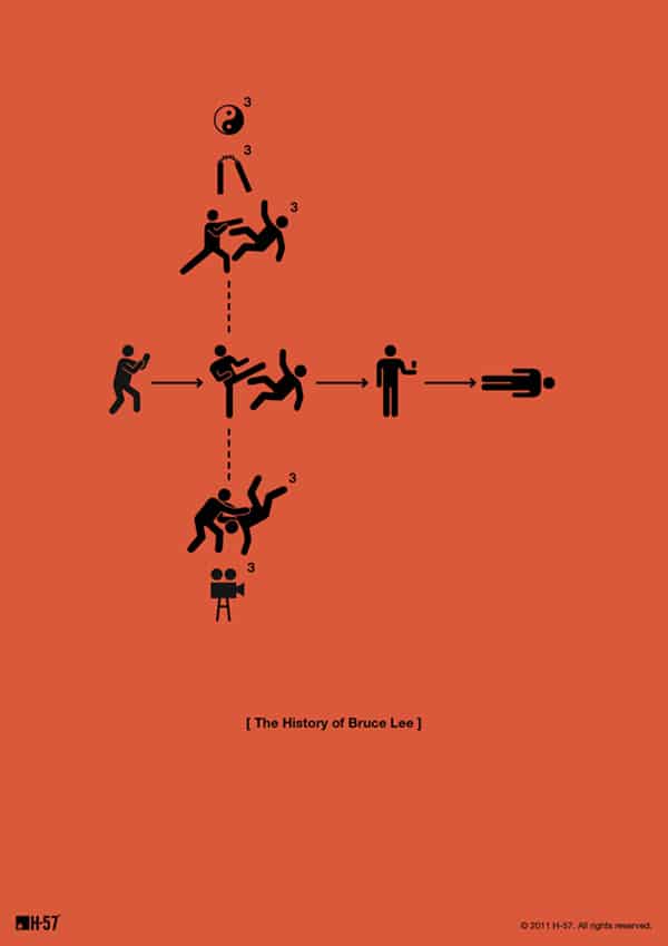
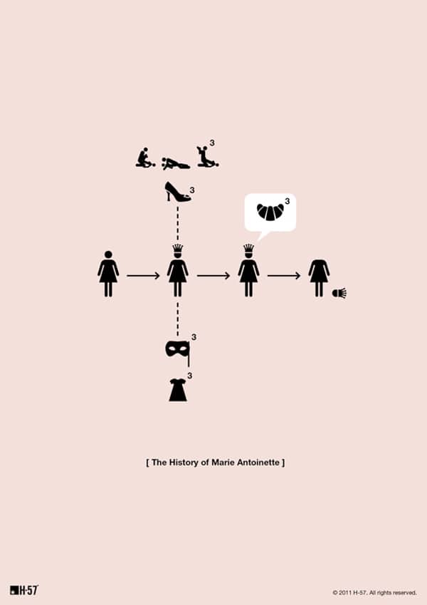
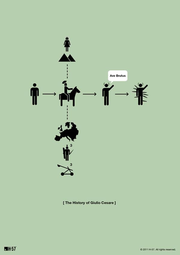
The Italian design studio H-57 created these minimalistic posters which creatively illustrate different people from history. They are somehow able to capture some of what we remember from their lives with just a few small pictures. I have no idea how or where a designer would get the kind of inspiration it would take to create something so simple, beautiful and effective. Yep, I’m officially in awe.
Via: [My Modern Met]
COMMENTS