I am, as most of you know, a designer with a passion. I never settle for a design it seems. I’m constantly trying to figure out something that will be more pleasing to the eye as well as functional for the user. The hardest thing in designing something is actually keeping it all simple and clean. Constantly adding things to your original design will only make it cluttered and hard to navigate, whether it is with your eyes or the mouse.
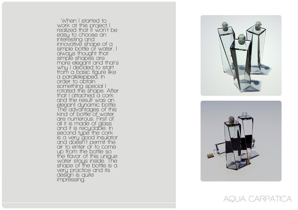
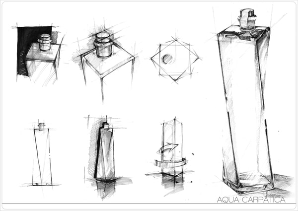
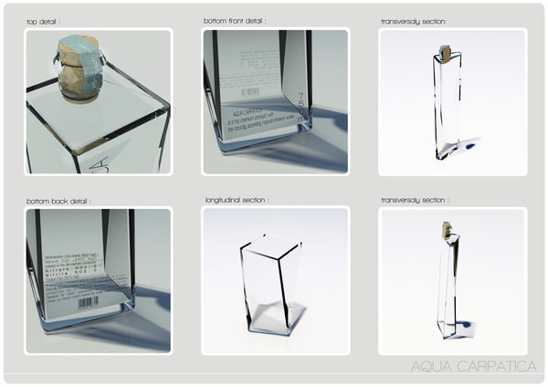
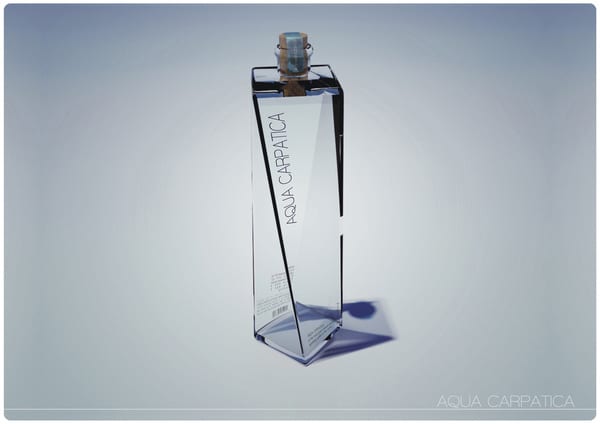
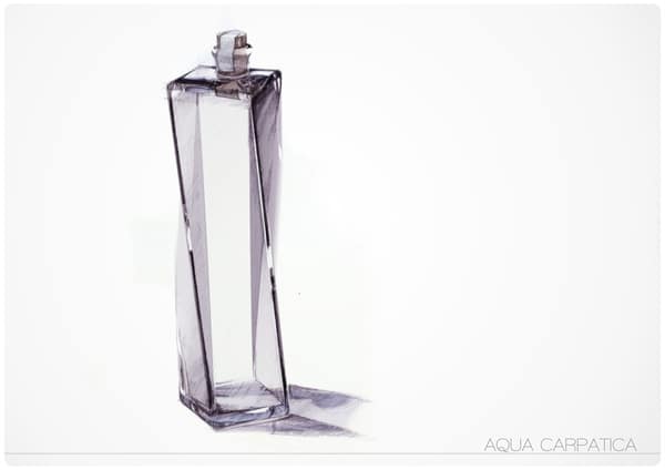
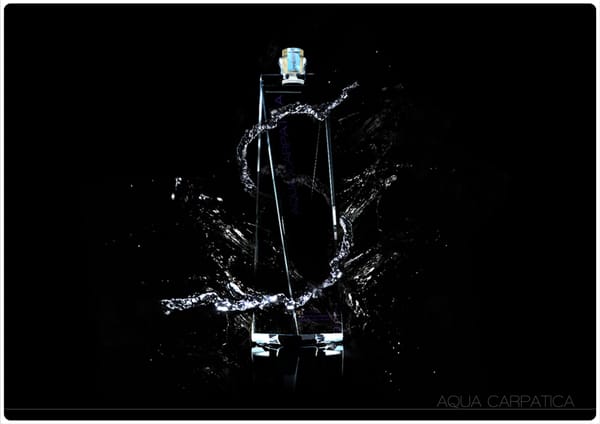
Designer Andrei Clompos is one of those people that really knows how to do this. The simplicity and the execution of something that is this simple, yet looks so pristine and luxurious, is definitely something to strive for. It’s pure beauty, at least if you ask me. A bottle, in our minds, has always been round or at max, square. This design; however, gives the bottle yet another dimension.
There is a lot that can be said about this design but that would make this post yet another all-out design oriented jabber, so I will just say that it’s the feeling of the bottle that I am wondering about. The shape of it is beautiful, no doubt, but doesn’t it look like it would fall out of your hands when holding it? I really hope we’ll see more of these designs in the future, not only on paper and in conceptualization, but also in the stores where we get to enjoy their full beauty.
Source: [Behence Network – Andrei Clompos]
COMMENTS