In At the Riverbank, Director of Photography Zohar Varadi crafts a visually compelling narrative, using the film’s desolate setting to underscore themes of isolation and survival. Through his collaboration with director Matt Wisdom and production designer Jacqueline Cheng, Zohar’s cinematography turns every frame into a reflection of the characters’ emotional journey.
In this interview, Zohar shares his approach to creating the film’s distinct visual language, from using anamorphic lenses to balancing light and texture.
Thank you, Zohar, for sharing your insights with our readers. Your work in At the Riverbank has provided a unique and powerful visual experience, and we appreciate your time in giving us a deeper look into your creative process.
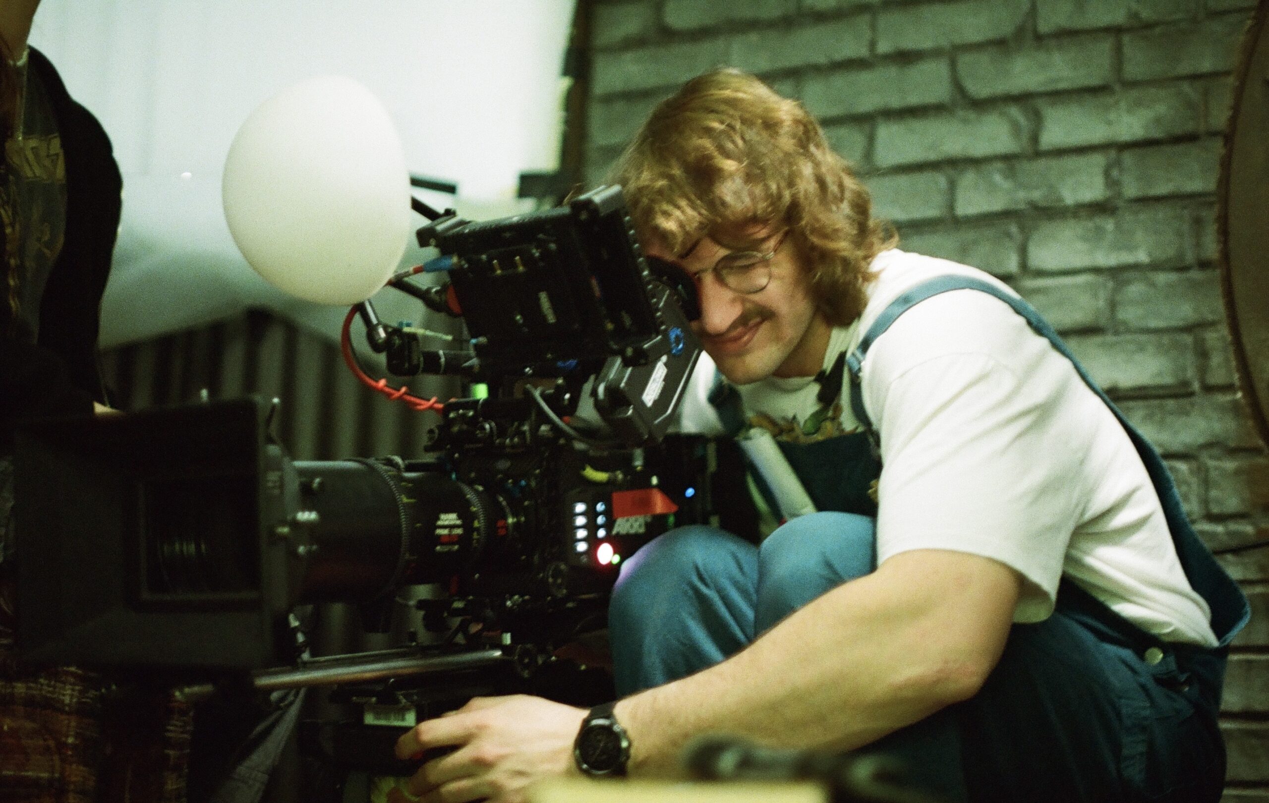
IMAGE: SEAN YANG
1. At the Riverbank tells its story almost entirely through visuals. What were some of the key conversations you had with director Matt Wisdom during pre-production to define the film’s visual language?
Matt and I knew we needed a clear visual language for the film’s core themes—climate change and drought—to come through. We began by selecting a tone, a color palette, and an emotional feel. That initial ambiance became the foundation for building a more layered visual language.
For us, these themes called for warm tones, which aligned well with our desert locations and primarily daytime scenes. However, we also wanted to contrast that warmth with a certain coolness—an almost grey undertone.
That led us to mix color temperatures inside the bunker, combining the warmth of the harsh sunlight with the green hues of fluorescent fixtures. We felt this blend would help create a space that felt like home, yet always carried a subtle sense of unease.
2. The film’s setting—a bunker in a desolate landscape—feels both expansive and claustrophobic. How did you approach capturing that duality with your lens and camera movement?
Capturing the duality of an expansive yet claustrophobic setting required nuanced use of the camera. I chose anamorphic lenses but stayed physically close to the characters. This approach made the characters feel small within a vast space. When shooting wides, the aspect ratio helped heighten the sense of claustrophobia—the environment seemed so overwhelming that the characters felt swallowed by it.
For movement, Matt and I agreed to let the camera follow the characters only when necessary. Otherwise, I preferred keeping it static. Restricting the camera’s movement mirrored the characters’ own confinement, allowing the viewer to experience the world as tightly constrained and emotionally tense.
3. You chose to shoot in widescreen and with anamorphic lenses. What inspired that decision, and how did it enhance the storytelling?
This was my first time using anamorphic lenses, and I tested many before settling on the Hawk C Series. They offered some anamorphic characteristics without extreme distortion or distracting flares. Matt and I chose the widescreen aspect ratio and anamorphic lenses to emphasize how small the characters felt in their environment.
Inside the bunker, the lenses allowed us to see so much of the space in one frame that even a close-up could make the surroundings feel overwhelming. Although close-ups with wide lenses can be risky, we embraced that challenge. Using a wide lens for close-ups helped us stay intimate with the characters while also conveying their isolation within a vast, harsh world.
4. Can you talk about your collaboration with Production Designer Jacqueline Cheng in developing the look and texture of the bunker? How did production design and cinematography influence each other?
Jacqueline was instrumental in shaping the film’s visual identity. We spent countless hours in pre-production testing paints, materials, and textures—especially for the bunker set. Having collaborated many times before, we share a strong creative trust. She understands my thought process, and I fully trust her to make choices that support the story.
Her treatment of concrete and rusted iron was so well-executed that every angle I filmed looked visually compelling. We tested how these textures responded to harsh lighting—a crucial element in the film—and she found ways to make them look believable under intense light. Her set design also accounted for lighting needs.
Since the bunker is underground but had to feel sunlit, we went with pools of light from above, which she seamlessly integrated into the build. The result was both functional and aesthetically powerful.
5. With minimal dialogue, did you feel more pressure or more freedom as a DP to “say more” with the camera?
As a cinematographer, my job is to honestly reflect what the actors are feeling. The lack of dialogue gave me more space to capture those emotions in their rawest form. I wouldn’t say I had to “say more” with the camera—but rather, I had to amplify what the actors were already expressing. I often favor long takes that let us sit with a character, absorbing their internal shifts.
In At the Riverbank, this was even more important. A fleeting facial expression or a slow emotional transformation demanded uninterrupted shots. Matt and I allowed the actors to guide the cinematography—I received what they gave through the lens and translated it for the audience.
6. Lighting plays a huge emotional role in the film—especially in scenes where warmth or coldness convey internal shifts in the characters. What was your lighting strategy, and how did it evolve on set?
I had a clear lighting concept during pre-production: a mix of hard and soft light. I especially love hard light when shooting on film—it conveys emotion beautifully, though this project wasn’t shot on film. The hard light pouring in from the ceiling symbolized the harsh, unforgiving world above the bunker.
We used CRLS reflectors to simulate sunlight, adjusting the softness depending on the moment. Inside the bunker, I layered fluorescents with raw incandescent bulbs. The incandescents added a surprising warmth—making the cold space feel faintly homey. The fluorescents, while colder in tone, acted as a neutral symbol of normalcy.
As long as they were on, the characters had some semblance of stability. Contrast ratios were also key. I aimed to vary them throughout the film to subtly guide the audience’s emotional response. Maintaining this vision during production was a challenge, but I’m proud of how the team brought the lighting design to life.
7. Climate change is a central theme in At the Riverbank. How did the film’s message influence your visual choices and your personal connection to the story?
Climate change is deeply important to me, both personally and professionally. Just before this film, I shot a documentary with the Blackfeet Nation in Montana about the reintroduction of free-roaming buffalo—so the topic was top of mind.
When Matt shared the script, I immediately felt it was a story I needed to tell. What I love about Matt’s approach is that it doesn’t overwhelm the viewer with climate crisis anxiety. Instead, it presents the issue through a deeply human lens.
Visually, we wanted the story to feel vast yet intimate. The world is dystopian and crumbling, but the narrative stays close to a father and daughter—keeping it relatable and emotionally impactful. That intimacy is crucial; if the story feels too distant, the audience might not internalize the threat. But when you see the climate crisis through the eyes of two characters searching for hope, it becomes impossible to ignore.
COMMENTS