Believe it or not, there are some people in the world who don’t understand how or why we love Star Wars so much. They are people who watch it once and say, “So what’s the big deal?” I can’t understand that at all, but I can respect that everyone is different. To me, not liking Star Wars is similar to not liking chocolate. I mean, really?
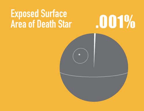
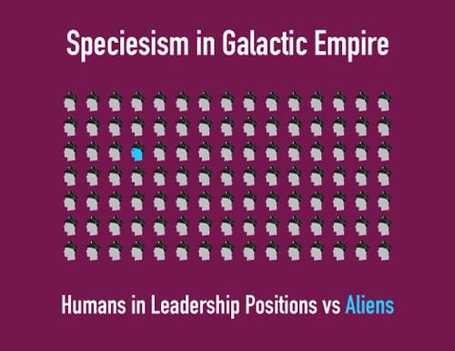
Sometimes when things are presented in a visual way, they make more sense. I know they do for me anyway. These interesting mini-infographics would be perfect to show someone who doesn’t really get Star Wars. They might also be helpful for you if you should ever find yourself flying through the galaxy in need of some quick information so you’ll fit in well.
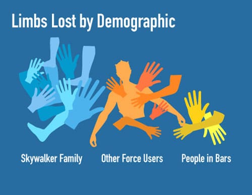
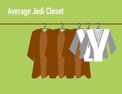
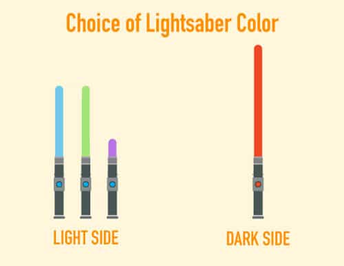
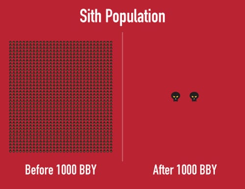
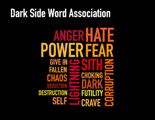
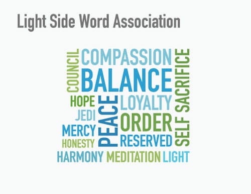
Are you wondering why the body parts in the “Limbs Lost by Demographic” image are all mixed up? It’s because Yoda made that graphic. All the rest of them were created by Oskoui+Oskoui, an advertising agency in Los Angeles. The Jedi could really use a little more color and diversity in their closets, don’t you think? And, if you’ve never read about those lighsaber colors before, may I suggest you check out Lightsaber Color Symbolism on the Star Wars blog? I love those little word clouds too. These cute graphics make me want to go watch Star Wars again, for the gazillionth time.
Via: [Walyou]


COMMENTS