Imagine opening a browser and seeing the entire planet, live and layered: satellites in orbit, commercial and military flights, street-level traffic, seismic blips and projected CCTV, all rendered in a cinematic 3D globe. That is the promise of the Geospatial Dashboard demonstrated in the original walkthrough. The real significance here is not the visual polish or the Palantir vibe; it is that a domain expert can now assemble a near-real-time operational Worldview from publicly available feeds and modern development practices, inside a standard browser.
What most people misunderstand is where the breakthrough actually sits. It is not only about prettier maps. The important change is that mapping, live telemetry, and cinematic rendering have converged into a single, composable experience.
That convergence lets someone who understands the domain stitch together open feeds, projection math, and shader effects to produce a usable, interactive picture in days rather than months.
This article reveals how those layers were combined, which data sources make the effect credible, and the practical tradeoffs that determine whether the approach is useful for research, content creation, or situational awareness. Early on, one constraint becomes unavoidable: public feeds provide remarkable reach, but they also impose limits on fidelity, latency and legal context that shape what this dashboard can do in the real world.
What becomes obvious when you look closer is the combination of three things that make the concept work: accurate 3D tiling, reliable telemetry feeds, and a rendering pipeline flexible enough to do post-processing inside the browser.
The remainder of this piece walks through each of those components, explains the performance and data limits, and teases where this trend is likely to go next.
What This Geospatial Dashboard Actually Is
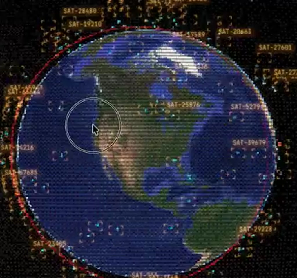
At its core the dashboard is a browser application that uses a tiled 3D globe as its canvas and overlays a set of live data layers. It presents the world like a classified intelligence product, with stylistic filters such as CRT, night vision, and thermal imaging available on demand, plus LUT-style post-processing for cinematic output. More than just eye candy, these effects are tools for legibility when you are scanning dense telemetry or planning a visualization.
The project shows how a full globe rendered from 3D tiles can be combined with point and vector layers that track moving objects and events. Points of interest are camera-centered using volumetric data from OpenStreetMap so camera framing is correct and stable. That framing matters for both situational monitoring and for content production when the goal is a repeatable shot rather than an approximate lat lon view.
How The Dashboard Is Built
The dashboard is assembled by composing three technical families: tiled 3D geometry for the globe, telemetry streams for moving assets, and a browser-side rendering pipeline that supports custom shaders and post-processing. Those elements are wired together with coordinate transforms and projection math so disparate sources align visually and temporally.
Practically, the build workflow favored rapid composition. Existing data feeds and rendering libraries were wired into a 3D tile globe, with command-line orchestration and parallel development threads used to iterate quickly. The result is not a single product but a reusable pattern for fast prototyping of operational Worldviews.
Live Data Layers That Make The Worldview
Satellites And Orbits
One layer is an entire live satellite inventory. The display lists NORAD IDs, shows orbital paths around the globe, and indicates orbit classes such as low Earth or geostationary. The effect is not a static catalog. Clicking a satellite locks the camera to its orbit, letting the user trace a specific asset in motion. That gives the dashboard an immediate operational feel because space assets are shown in context with everything else on the globe.
Flights And Military Tracking
Another critical layer comes from flight telemetry. The dashboard shows thousands of flights simultaneously. In the demo 6.7k flights appeared when the feed loaded, which offers a sense of scale.
Commercial traffic is visible via established public feeds, while military flights are surfaced using crowdsourced ADSB-style inputs. Those orange-labeled aircraft represent aircraft that do not always show on conventional trackers, demonstrating how open source intelligence practices can broaden visibility.
Being able to isolate military flights, or to filter by aircraft type, altitude or region, converts the map from a visual toy into an analytic workspace. You can, for example, focus on the airspace around a specific facility and then superimpose satellite coverage to determine which orbital passes intersect the area at a given time.
Street Level Feeds And Traffic Emulation
Zooming down to surface level, the dashboard uses OpenStreetMap road network data to spawn particle systems that emulate city traffic. Those particles are not precise vehicle tracks but they provide a believable density model for planning and visualization. For some cities, the system projects live CCTV into the 3D scene. In the demo, feeds from a specific city update at roughly one frame per minute, which is a crucial detail about freshness and usability.
Projecting a camera feed onto the local geometry requires calibration. The demo speaker discussed a calibration workflow where a handful of control points improve projection accuracy and shader realism.
When the calibration is good, a single street-level camera can be rendered onto building facades and crosswalks in a way that reads as integrated, not pasted. That makes the view useful both for creative shot planning and for situational understanding.
Why This Matters
This pattern lowers the barrier between insight and presentation. By combining mapping, telemetry, and cinematic rendering inside a browser, domain experts can create bespoke operational views quickly. The practical benefit is speed of iteration, which matters for research, rapid storytelling, sensor planning, and operational monitoring.
How Rapid Assembly Changes The Equation
What is notable about the project is the speed of assembly. The demo author built a functioning Worldview in a matter of days by composing existing data feeds and rendering libraries, wiring them to a 3D tile globe, and layering custom shaders and UI controls. The workflow favored command-line orchestration, multiple parallel development threads, and iterative problem solving rather than building everything from scratch.
From an editorial standpoint, the takeaway is that domain expertise now buys much more leverage. A security analyst, a cinematic director, or a public safety planner who understands projection math, coordinate transforms and telemetry semantics can create specialized interfaces quickly.
They can also tailor post-processing to highlight what matters to their audience, whether that is a thermal-like filter for sensor simulation or bloom and sharpening for cinematic output.
Constraints And Tradeoffs That Define Usefulness
The dashboard is compelling, but what determines whether it matters in practice are the tradeoffs. Here are the primary constraints to keep in mind.
Data Freshness And Latency
Not all feeds are born equal. The demo contains a mix of truly near-real-time streams, such as many satellite and flight telemetry feeds, alongside slower or bursty sources, such as CCTV cameras that update around one frame per minute. That difference matters depending on use case. For live incident response, sub-second or second-level refresh is required. For situational awareness or content production, minute-level or multi-second updates may be acceptable.
When specifying requirements, a useful rule of thumb is to categorize streams into three buckets: near real-time, operational latency, and archival.
Near real-time is measured in seconds to low tens of seconds, operational latency is often tens of seconds to minutes, and archival data is useful for historical playback or modeling. The dashboard mixes those buckets, which increases capability but also increases complexity in reasoning about timeliness.
Scale And Performance
Rendering dozens of thousands of moving points and heavy shader passes in a browser is practical but bounded. The demo encountered immediate browser instability when particle counts were left unconstrained.
The pragmatic solution was to adopt sequential loading and progressive refinement, for example loading primary roads first then arterial networks, and applying density culling for point layers.
Quantified context helps: interactive sessions that attempt to render tens of thousands of particles and full-screen post-processing reliably push modern browsers into memory pressure on typical laptops.
In practice, keeping active particle layers to a few thousand on-screen elements and staging the rest into progressive loads preserves interactivity. The tradeoff here is between completeness of visualization and the need to keep the UI responsive.
Data Completeness And Legal Context
Open feeds unlock visibility, but they are not comprehensive. Military telemetry surfaced from crowdsourced networks can be patchy, and commercial flight feeds vary in coverage and update cadence. There are also legal and privacy boundaries to consider when projecting live CCTV or other imagery. The dashboard demonstrates capability, not carte blanche. Anyone deploying a similar system needs to factor in terms of service, local laws, and intended use.
On the cost side, many telemetry sources are free at low volume, but commercial APIs that provide higher fidelity, lower latency, or enterprise bulk access move into a paid tier. Expect development-level experimentation to be feasible on modest budgets, while production-scale feeds and redundancy can push costs into the hundreds to thousands of dollars per month depending on throughput and contractual terms.
Geospatial Dashboard Vs Alternatives
When deciding between a browser-native dashboard and larger platform solutions, the tradeoffs are clear: speed and composability versus integrated enterprise features and support. Browser projects allow domain experts to prototype and iterate fast. Larger vendors may offer reliability, SLAs, and higher fidelity feeds out of the box, but they also slow the feedback loop for bespoke views.
Browser-Native Projects Versus Enterprise Platforms
- Browser-Native: Fast to prototype, highly customizable, dependent on public and paid feeds for coverage.
- Enterprise Platforms: Offer integrated data contracts, support, and scaling, but require longer procurement and customization cycles.
Practical Patterns For Building Your Own
If the idea is to replicate or extend this approach, a few practical patterns emerge from the demo that shorten the learning curve. Center cameras on volumetric POI data, categorize streams by freshness, and make heavy layers progressively loadable so interactivity remains smooth.
- Center cameras using volumetric POI data so framing is stable across cities and zoom levels.
- Design the data pipeline to categorize streams by freshness and reliability, and surface that metadata to users.
- Adopt progressive loading for heavy layers and provide density culling controls so users can decide how much detail they want live.
- Keep post-processing configurable so the same scene can be used for creative renders or analytical views by toggling LUTs and sensitivity.
These are design constraints rather than technical silver bullets; applied judiciously they let an interface scale from a demo to a practical workspace while keeping the UI responsive.
Where This Fits In The Bigger Picture
The Geospatial Dashboard demo is part of a broader shift where mapping, telemetry, and cinematic rendering converge into interactive, browser-native products.
That convergence lowers the barrier between insight and presentation. It means domain experts can build bespoke operational views without waiting for large platform vendors to ship custom features.
At the same time, the approach highlights a cultural tension around openness and control. Public feeds democratize visibility, but they also make it easier to assemble revealing cross-sections of the world. Those questions about governance and safety remain open and will shape technical and policy decisions as the pattern matures.
Who This Is For And Who This Is Not For
Who This Is For: Security analysts, cinematic directors, public safety planners, and researchers who need rapid, bespoke spatial visualizations and who can accept some tradeoffs in fidelity and latency for speed of iteration.
Who This Is Not For: Organizations that require guaranteed, low-latency feeds with contractual SLAs, strict data sovereignty, or comprehensive sensor coverage out of the box. For those needs, enterprise platforms or commercial telemetry contracts are a better fit.
Final Thought
What matters next is not whether someone can make a slick dashboard in a weekend. The real test will be the applications that emerge when domain experts use these canvases for rigorous problems: planning sensor coverage, visualizing infrastructure fragility, or telling better spatial stories.
The Geospatial Dashboard shows what is possible. The remaining work is about defining the boundaries of usefulness, the governance around shared feeds, and the operational patterns that make such views reliable day to day.
For further reading on concepts touched on in the demo, exploring 3D tile rendering, telemetry fusion patterns and projection calibration will give a practitioner the fastest route from curiosity to capability.
FAQ
What Is A Geospatial Dashboard?
A geospatial dashboard is a browser or application interface that overlays live and historical spatial data on a map or 3D globe, combining telemetry, imagery, and vector layers to present an operational Worldview.
How Does The Dashboard Use Public Feeds?
The demo composes public satellite catalogs, flight telemetry feeds, crowdsourced ADSB inputs, OpenStreetMap geometry, and some CCTV streams to create layered views. Coverage and freshness vary by source and location.
Is The Data Shown Truly Real Time?
Some feeds are near real-time, measured in seconds to low tens of seconds; others are operational latency or archival. For example, demo CCTV updated at roughly one frame per minute, which is not sub-second freshness.
Can This Approach Replace Enterprise Platforms?
Not entirely. Browser-native dashboards excel at rapid prototyping and customization. Enterprise platforms remain preferable where contractual SLAs, redundancy, and guaranteed coverage are required.
What Are The Main Technical Limits To Expect?
Expect browser memory pressure and performance limits when rendering tens of thousands of moving objects with full-screen post-processing. Progressive loading and density culling are common mitigations.
Are There Legal Or Privacy Concerns?
Yes. Projecting live CCTV and combining public feeds raises legal and privacy questions. Anyone deploying a similar system must consider terms of service, local laws, and responsible use policies.
How Much Does It Cost To Run At Scale?
Development-level experimentation can be inexpensive using free feeds, but production-scale feeds, higher fidelity telemetry, and redundancy typically move to paid tiers and can cost hundreds to thousands of dollars per month depending on usage.
How Do I Start Learning The Technical Foundations?
Begin with 3D tile rendering, projection calibration, and telemetry fusion patterns. These topics offer the fastest route from curiosity to capability along the lines demonstrated in the demo.
COMMENTS