If your logo or messaging isn’t appealing to your audience like it once did, you may wonder if rebranding is necessary. However, the thought of a rebrand often sparks worry among marketers, who realize that it can take significant time and investment.
Delaying a rebranding can hinder a brand, so it’s essential to know when it’s the right time for a new direction. So, is now the time to change things up? The branding team at MDG Advertising has pinpointed nine things that every marketer should be aware of.
IMAGE: PIXABAY
1. Your Brand Objectives Have Changed
Through the years, you may find that market conditions have changed, making it necessary to adjust your brand’s goals. Many brands find themselves in situations that are very different from when the business started, whether it’s due to a changing target market or even its products or services.
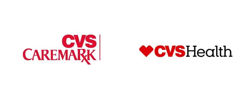
Take CVS Caremark, for example: it was initially formed as an alliance of general store CVS and pharmacy management firm Caremark. It eventually turned into a multiservice healthcare company with multiple products and services, so it needed a branding that reflected those changes.
With its new name—CVS Health—the business was able to focus on an updated goal: helping people achieve good health. The new name also aligned with the company’s decision to stop selling cigarettes.
2. Your Brand Is Constrained
Often when brands begin, they choose detailed branding that clearly illustrates their products and services. Unfortunately, highly specific branding can be limiting as a firm branch out into other areas.
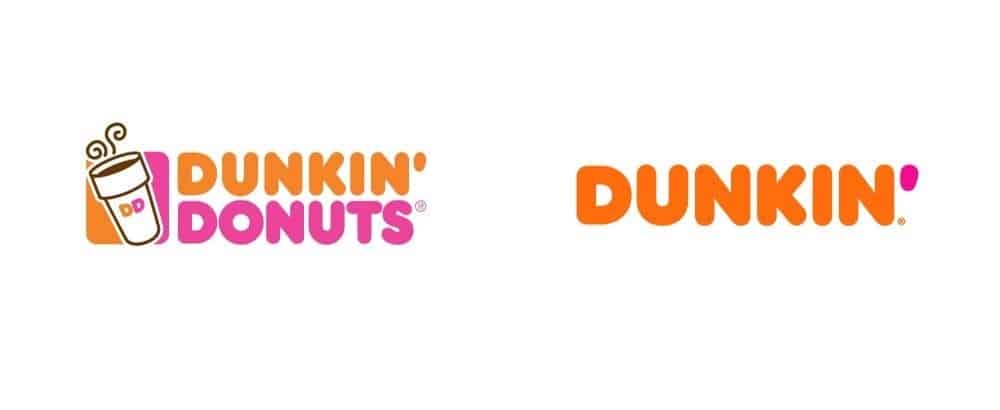
Dunkin’ Donuts experienced this problem recently as it expanded its menu beyond doughnuts and coffee. As the company was now offering a full array of breakfast foods, it decided to remove “Donuts” from its name and rebrand to the simpler Dunkin’. While still recognizable, the new name was unique and ownable.
3. Your Brand Causes Confusion
Is your brand’s name or message straightforward and clear to your target audience? Sometimes, brands choose a name or logo that creates confusion instead of clarity. When this happens, it’s time to rebrand.
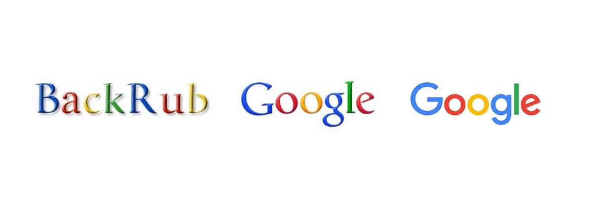
You might be surprised that Google got its start with the name BackRub, since its focus was analyzing backlinks. The name didn’t hit the mark with consumers, so the firm switched to Google in under a year. Google also rebranded again in 2015, changing its serif typeface to a fresh-looking sans serif font. The firm felt that the new logo style better reflected its goals.
4. Your Brand’s Business Structure Has Changed
If your brand has undergone significant changes—an acquisition, merger, legal issues, etc.—rebranding may be necessary. Andersen Consulting, which was a spin-off of Arthur Andersen, faced these struggles in 2000 and required a different name. Then in 2001, Andersen developed a negative reputation due to the Enron debacle, which was yet another good reason to rebrand.
The firm changed its name to Accenture, which is now associated with industry leadership and top-notch performance. Accenture is a combination of “accent” plus “future,” indicating that the consulting firm is committed to investing in the future of their clients.

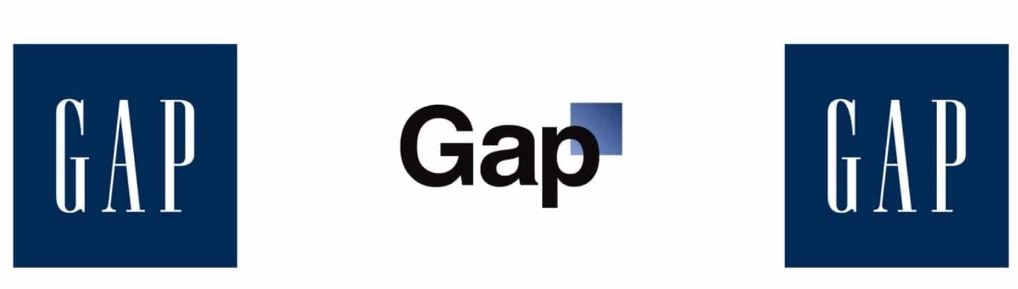
5. Your Brand Isn’t Distinctive
Does your branding distinguish your business from others in the same market? Successful branding isn’t only about aesthetics—it’s also about differentiating yourself from the competition. Gap decided to make a change in 2010, but it didn’t quite go as planned.
The brand replaced it’s a signature blue box with white lettering and a different logo featuring a more modern font and smaller box. The logo didn’t resonate with consumers—in fact; it was viewed as being dull and uninspired. Gap switched back to its old logo shortly afterward.
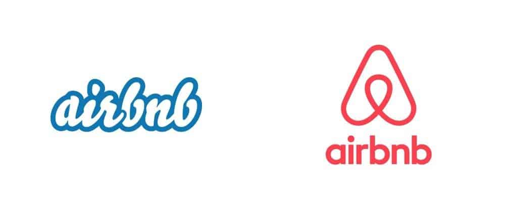
6. Your Brand Isn’t Effective In Multiple Contexts
If your brand isn’t working in different contexts, it may need to be revamped. This is particularly true for businesses that have customers abroad or have multiple locations. Sometimes, a logo or name isn’t well suited across multiple languages or formats.
One example is Airbnb, which was going strong abroad and on mobile devices. However, its logo didn’t reflect that until 2014, when it switched its original text-based logo to an icon. The new design had broader applications, and the “Bélo” icon has become a symbol of belonging that’s recognized worldwide.
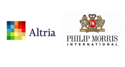
7. Your Brand’s Reputation Is Poor
Unfortunately, brands can sometimes become liabilities instead of assets. When consumers associate your brand with a negative experience, it may be time to make adjustments. For years, Philip Morris gained negative attention among consumers due to its ties to cigarette manufacturing.
The company decided to rebrand as the more-neutral Altria, which isn’t particularly memorable among consumers. However, the firm determined that shedding its negative image was more important than having a flashier brand name.
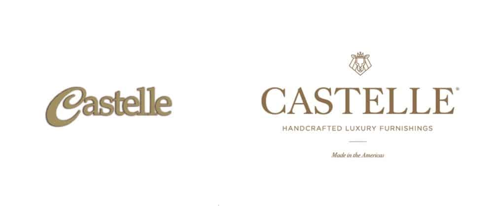
8. Your Brand Decides To Target Upscale Consumers
Is your brand hoping to break into the upscale market? Sometimes, rebranding is necessary to evoke the feeling of luxury that upscale consumers expect. But, what’s relevant for some market segments may not resonate with others.
Castelle wanted to market its outdoor furnishings to an affluent consumer base, so it did a total rebranding that included the tagline, “Handcrafted luxury furnishings.” It also overhauled its font and added a new logo to its branding materials.
9. Your Brand Looks Old-Fashioned
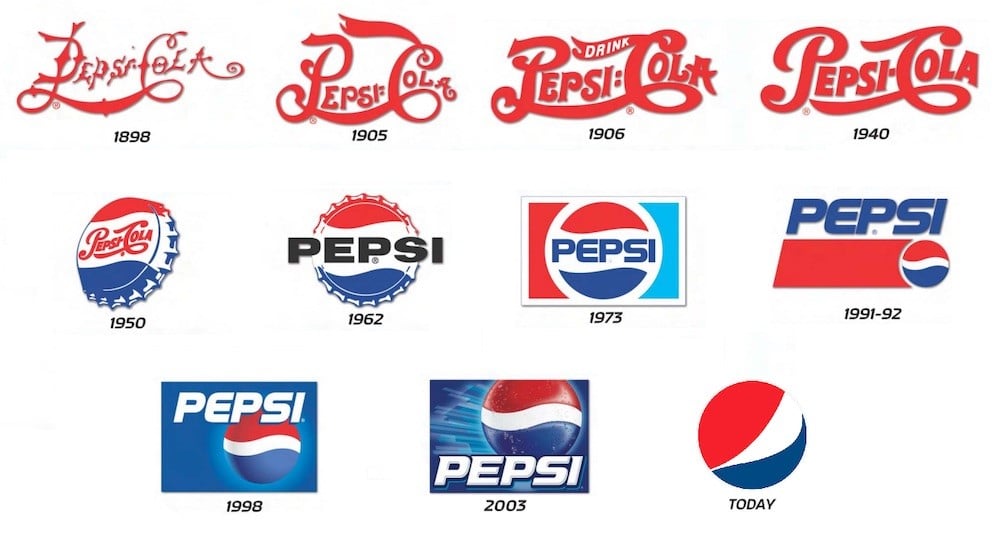
Consumer attitudes and tastes change through the years, often for no reason at all. Because of this, specific colors and trends become outdated, making it necessary to refresh your brand. Pepsi’s evolution is an excellent example of a brand adapting to reflect changes in trends. Initially, the brand was called Pepsi-Cola and featured just one color in its logo. Today, Pepsi utilizes only one name and two colors – blue and red.
The brand also opted for a more modern sans serif font instead of its original dated-looking serif font. Ultimately, brands must evolve to avoid becoming irrelevant in today’s ever-changing landscape. Remaining in fashion may take investment, but the rewards can be significant.
Author Bio: Anthony Del Gigante is a chief creative officer at MDG Advertising, a branding/traditional ad agency made digital, with offices in Boca Raton, Florida, and Brooklyn, New York. Over the years, his unique talents in brand strategy, visual identity development, and brand activation have consistently delivered measurable results for a wide range of world-renowned clients, including American Express, Verizon, AbbVie, and Cushman Wakefield. A brand specialist, Anthony leads MDG’s creative development, working with clients to develop creative, strategic, and functional solutions for their brands.
If you are interested in even more design-related articles and information from us here at Bit Rebels, then we have a lot to choose from.
COMMENTS