There are two reasons why I’m writing about this topic today. The first is because I’m craving a cupcake, and since there are none within a ten-mile radius of where I am right now, I thought writing about them might make me feel better. The second reason is to highlight a data visualization trend we are seeing more and more when it comes to simple tutorials, like recipes.
I’ve written about this once before in an article called Charming Illustrated Recipes – The New Cooking Trend. I’m really enjoying this way to present information, and I hope it sticks around longer than a fad. It’s much trickier than it looks to pull off. The artist actually attempts to capture the essence of the recipe itself. It’s important to keep it simple, but not to over simplify it so that the spirit of the recipe and flavor is lost. It’s a balancing act for sure, and it reminds me of what a designer goes through to create an infographic. It’s the same concept really.
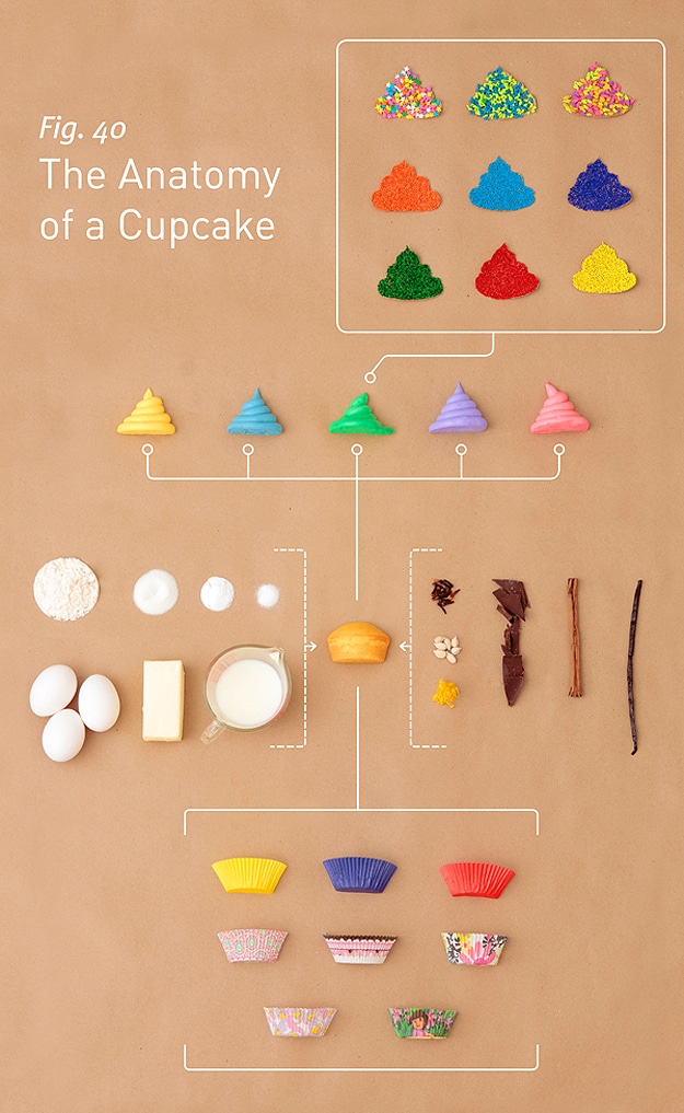
A well-done data visualization chart when it comes to a simple recipe will allow us to feel the food so to speak. We should be able to see the flavor and taste. I think this one below called The Anatomy of a Cupcake is a superbly illustrated example of this. This particular chart was created by Allen Hemberger and Sarah Wilson as a birthday present for a girl named Lesleigh. If you would like to purchase a print of this chart, you can visit Allen Hemberger’s site.
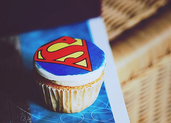
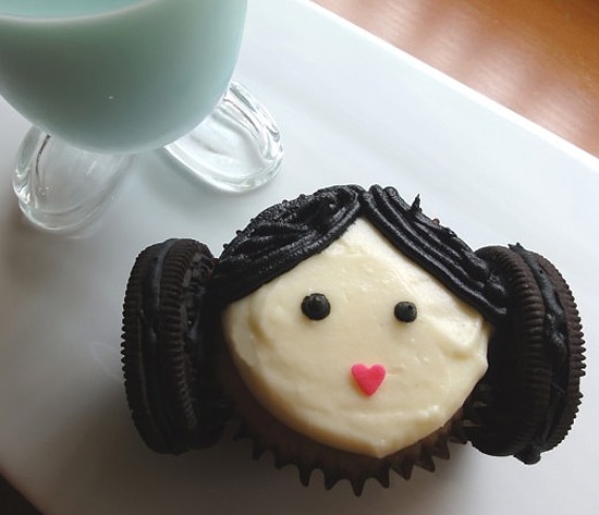
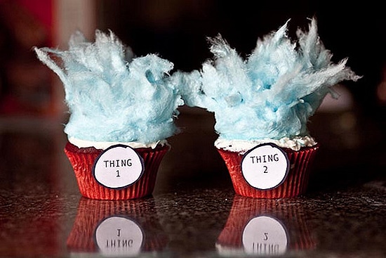
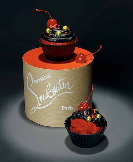
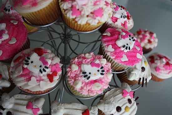
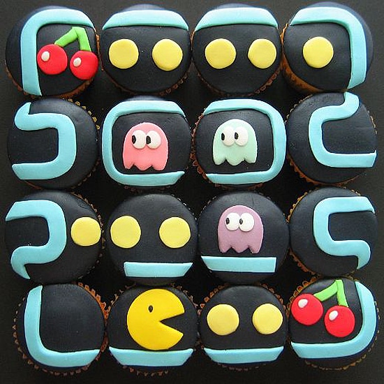
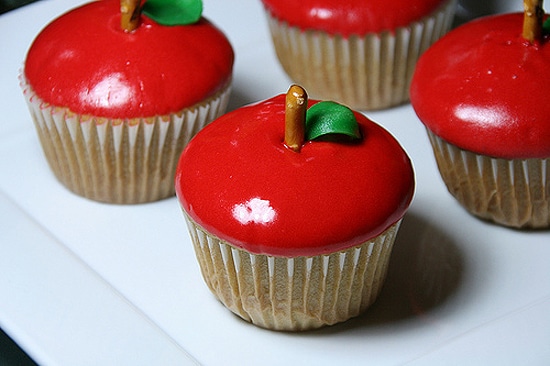
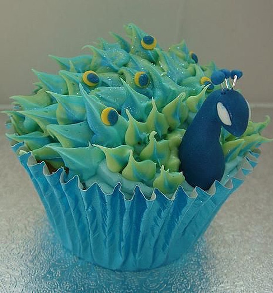
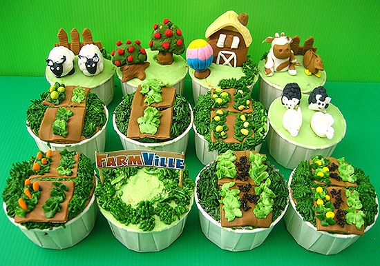
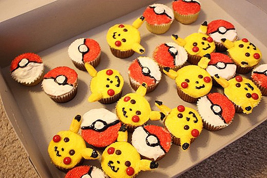
Of course, it would be a sin to write a post about cupcakes without including some pretty cupcake pictures, right? Here are a few of my favorites which I pulled off Cutest Food. Hmm… #sugarcraving
Via: [Forbes]

COMMENTS