Let’s think about all the movie posters we have seen throughout the years. There are quite a few, aren’t there? One thing in particular that superhero movies have in common is of course the fact that they all sport the “epic” theme. The more epic the poster is, the more we seemingly want to watch the movie. But are they getting a little bit too busy? That’s the question I want to ask today. I mean, just have a look at the latest Transformers – Dark of The Moon movie poster. The main characters are almost entirely lost in the debris and chaos that is scattered over the whole thing. What ever happened to the minimalistic posters that still kept the tension between awesomeness and epic?
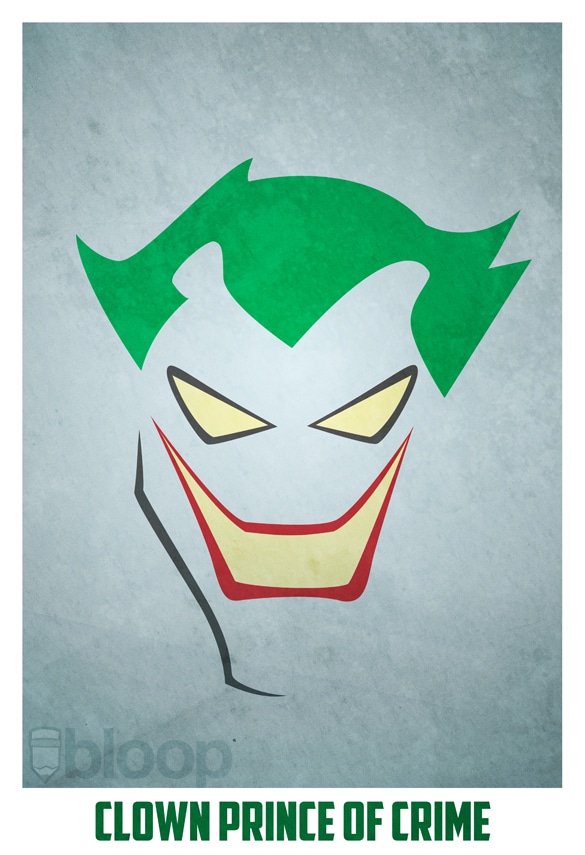
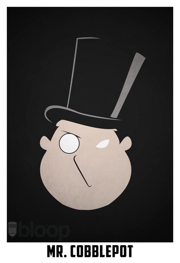
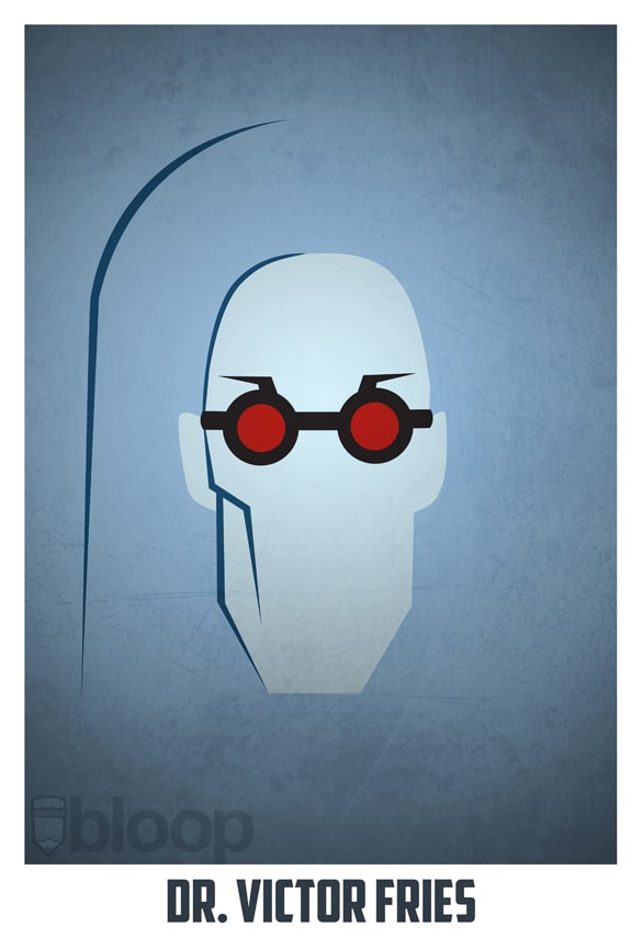
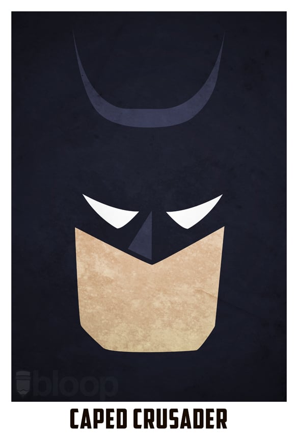
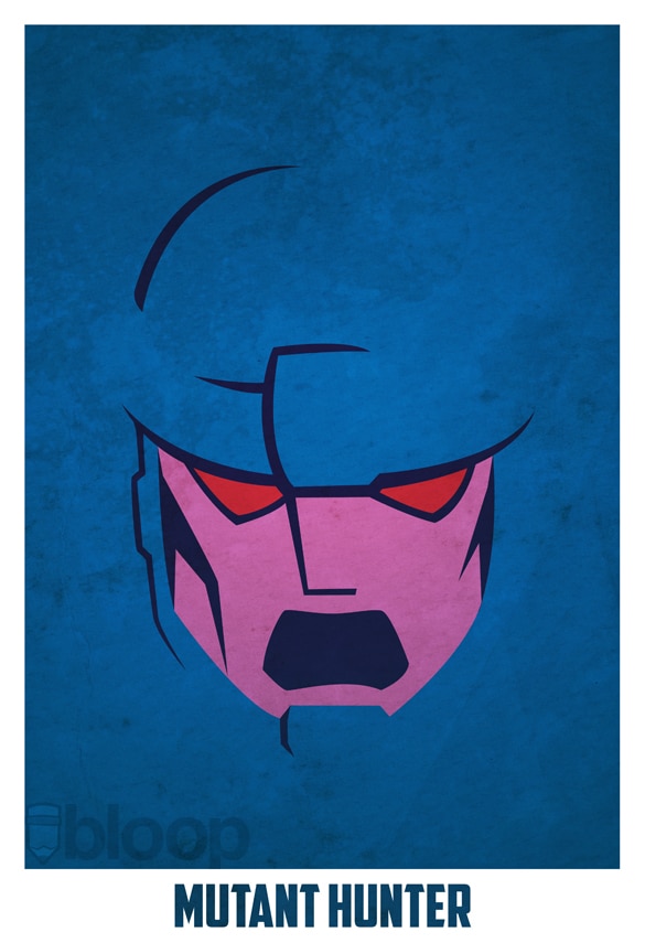
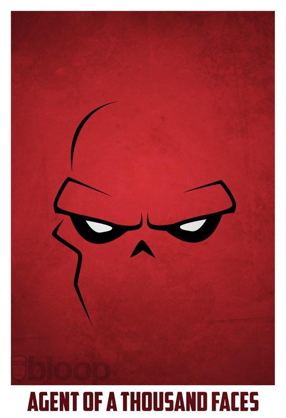
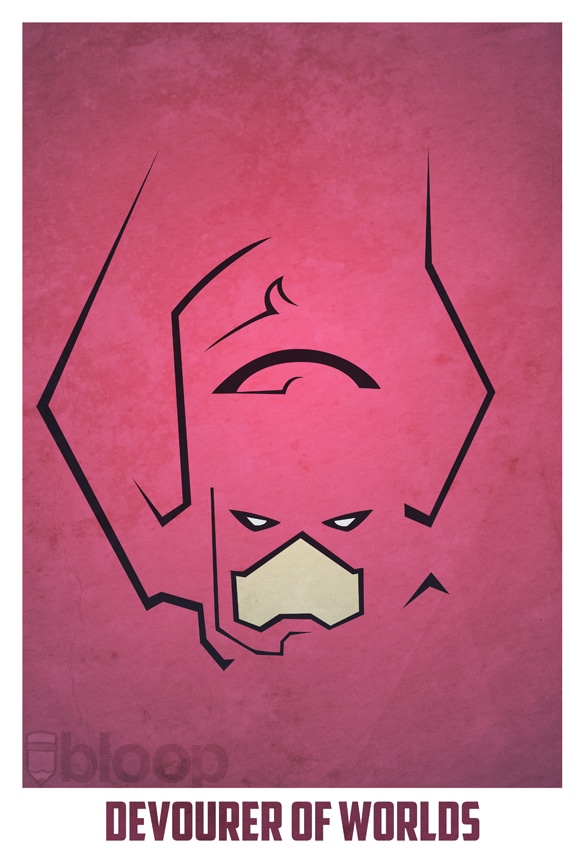
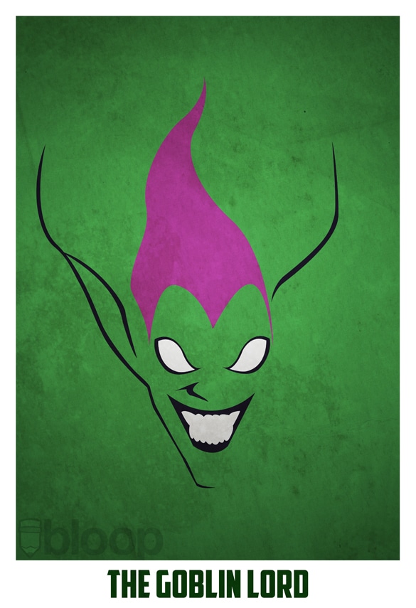
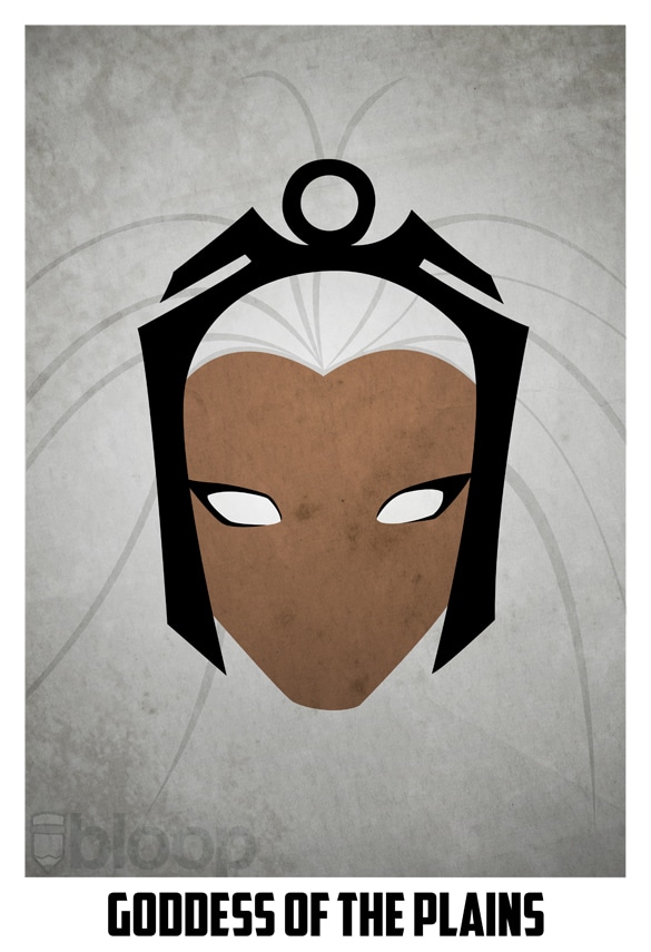
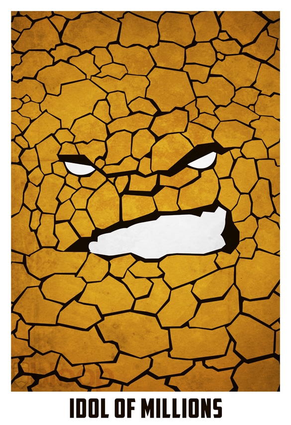
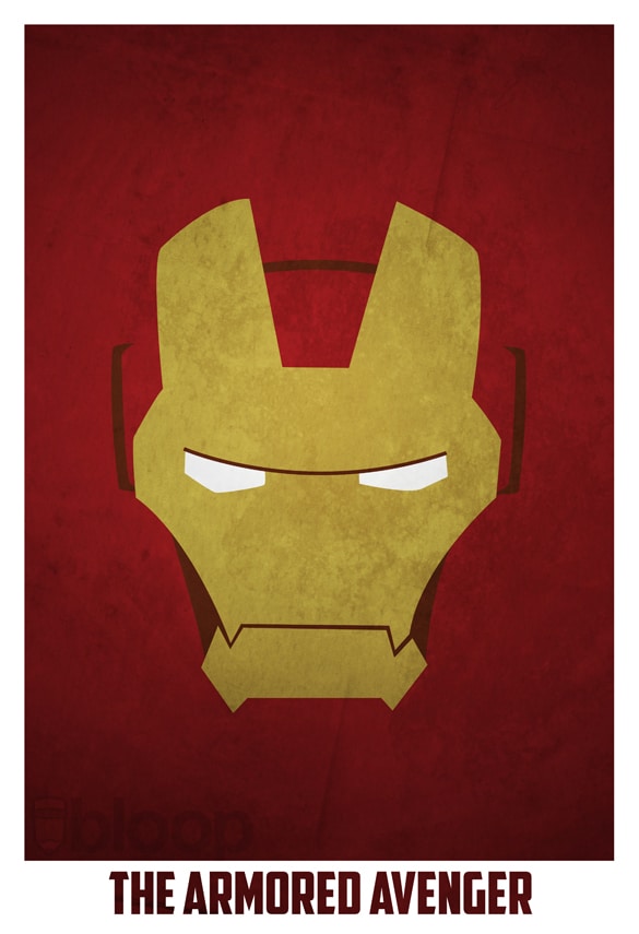
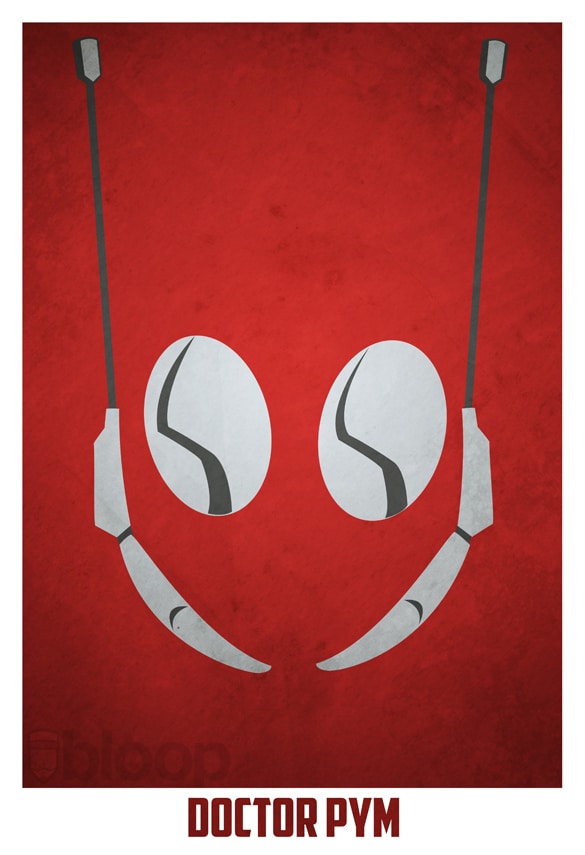
Nah, I am more for the more stylistic posters. Even though I thought the latest installment of the Transformers franchise was badass, I still think they could have spent a little less effort on the movie poster. Maybe that is the designer in me speaking since any designer knows that less is more, especially when it comes to print. Take these really impressive minimalistic superhero posters from Andres Romero, for example. They communicate the epicness of the characters themselves, and that is many times what is necessary in order to paint a lasting impression and message.
It certainly gives the posters a more eye-catching feature in a world where everything is so crowded and over edited. I am still waiting for that movie poster that is just a screen capture from the actual movie. It has to be epic, don’t get me wrong, but like any game trailer that you have seen lately, they make things up for the poster to sell the movie or the game. When you eventually play the game or watch the movie you are most likely going to feel cheated out of all the epicness they added in. If we’re talking about the latest transformers movie though, that isn’t the case, but there are countless of examples out where the movie literally sucked compared to the trailer and movie poster.
Via: [Geek-Art]
COMMENTS