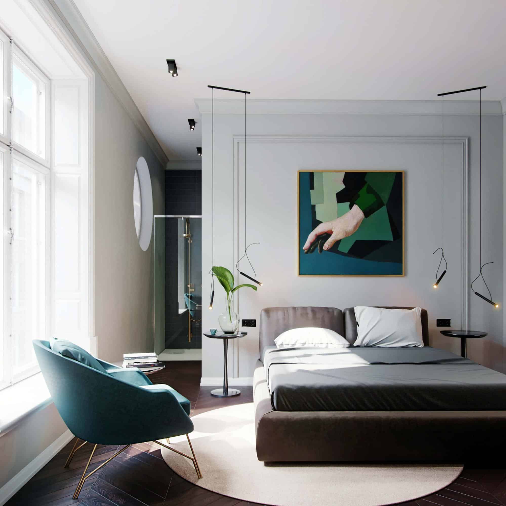
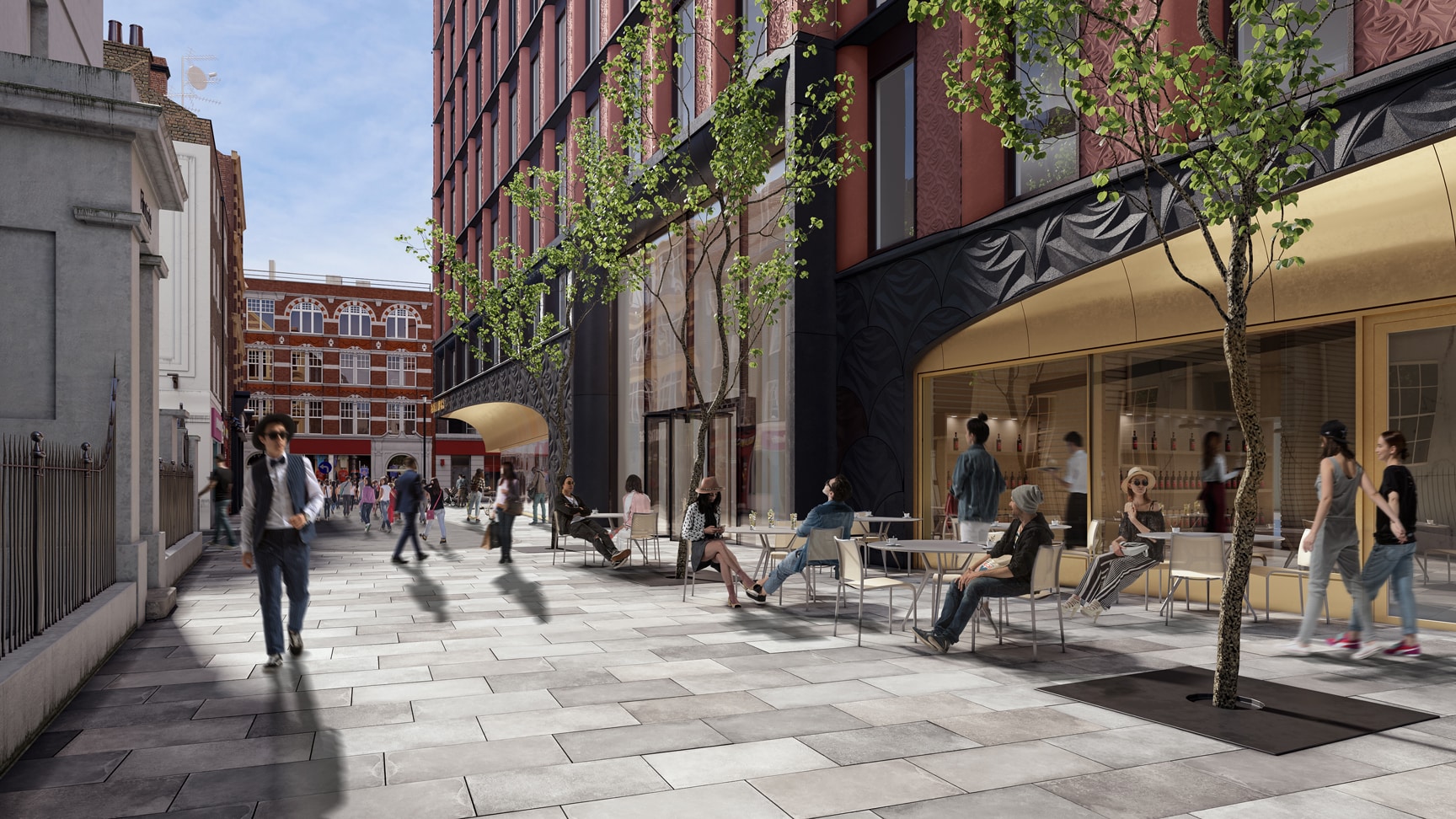
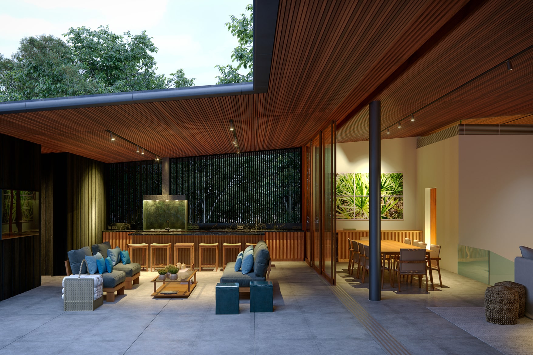
A simple test will help you distinguish a mediocre 3D visualization from a high-quality one – if from the first glance you cannot tell whether it is a real photo or a 3D, you are on the right track, especially with 3d visualization studio VisEngine. Of course, it takes time and effort to become a magician in this sphere, but there are also some hacks you can learn to exceed faster.
IMAGE: VISENGINE
Never Underestimate Details
In 3D rendering, as in most other spheres of life, details are precisely what can give away poor performance. There are some common mistakes that people make when neglecting significant details:
1. Unnecessary Perfection
You should not always opt for perfect weather when creating your visualization. Furthermore, it can look unrealistic, like a poorly directed TV commercial. It may be much more efficient to actually make the setting imperfect. Consider using rainy weather, but remember that it must also transform the building and give it alternative shades, water traces, etc.
2. Unnatural Colors
People who do not have enough experience usually choose acidy green for trees and grass and unrealistic blue for the sky. If you are wondering what those really look like, look out of your window or take a walk – the reality is far less cartoonish than most poorly conducted animations.
IMAGE: VISENGINE
3. Leaving The Windows Empty
Very rarely can you find a building with perfectly transparent empty windows in real life? One usually can see curtains, blinds or flower pots, a random cat or even a person looking outside. If your image shows a sunny summer afternoon, some windows should also be open. This way, you can create a realistic and compelling image, not a dead architectural model.
4. All People Are The Same, Or There Are None At All
Of course, architectural visualization is not about people. Still, our eyes are trained to pay attention to people above all other things, so if you make all ten humans in the image look exactly the same or wear the same clothes, it is very unlikely to go unattended. Your 3D will also miss a lot if you do not include people because they let the viewers estimate perspective and sizes and, generally speaking, make your visualization more believable.
5. Bad Work With Proportions
The root of any architectural task is knowing how to work with proportions, including 3D visualization.
6. The Materials All Look The Same Or Are Hard To Recognize
This will not only distort the perception of the building, and it can actually make your image look like a poorly painted holiday card.
Let us take a look at some details that can do the contrary and actually make your 3D visualization hard to distinguish from a real photo:
1. Atmosphere
This may sound too poetic to make a difference; however, the general atmosphere is the first thing viewers pay attention to and the one that influences them the most. You can achieve this by adding details such as clouds, sunlight, or rain. Consider adding fallen leaves if it is autumn or puddles if it is raining.
IMAGE: VISENGINE
2. Windows
Windows with curtains, reflections, people, interiors, flower pots, or cats can change the picture significantly. Of course, not all of them should be staffed, leaving some empty will only make the image more realistic but do not make it look like a ghost building. It depends on the size of the windows as well – big ones may show you the inside live-in details.
3. Cars
Be careful with those. Most areas will look unrealistic without cars, but adding ones that have not been completed will easily give away a poorly conducted visualization. You need to make sure that at least some of the cars have a driver, all of them differ in shape and color, and all details such as highlights, numbers, and mirrors are carefully worked through.
4. Texture
Make sure that all the surfaces give different textures regardless of whether it is a part of the building, grass, or someone’s clothes. The texture is what distinguishes 3D from 2D, so it is imperative in architectural visualization.
Winter Visualization
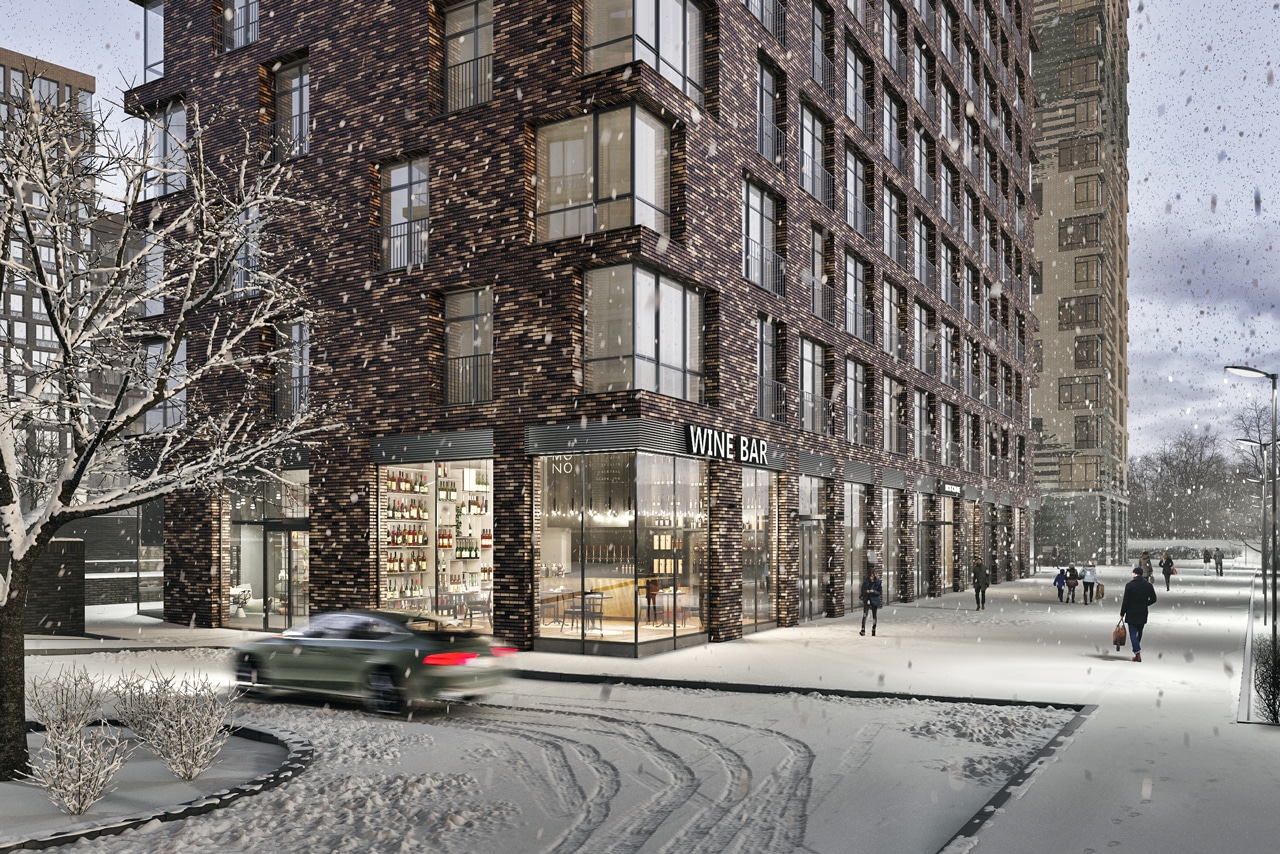
When working with images that must resemble real winter photographs, there are a lot of things that could go wrong. Firstly, you need to be careful not to make it look like an unrealistic Christmas card, so always remember to avoid excessive perfection.
IMAGE: VISENGINE
1. Snow
If you have decided to work with snow, make sure to make it uneven and show that it has small particles rather than looking like a blanket. Avoid any patterns that could be obvious to viewers. Also, remember that there should be some on the cars, trees, and windows if there is snow on the ground.
2. Haze
We all know that the air looks different in winter for some reason. If it is frosty outside, you can usually see the haze in the air that influences the lighting and transforms it – try to achieve this effect in your 3D visualization if you want it to look exceptionally realistic.
3. Imperfections
Even the building you visualize should have imperfections such as spots or scratches if you want it to look the way it would in reality. So should the cars and even the pavement. The real world rarely looks perfect, and neither do real-life cities – they should have traces of people, life, and time if you want them to resemble reality.
In conclusion, your aim as a 3D artist should always be to create a visualization that can easily be mistaken for a photograph. If you are a great artist, your 3D visualization can be even better than a photograph. There are many details that can give away an amateur, such as empty windows, people that look like identical tweens, acidy-green grass, and, above all, excessive texture perfection. Still, the essential thing when rendering is to create an atmosphere because, after all, that is what viewers usually either fall for or not.


COMMENTS