Categories: Design

The Ultimate Visual Color Theory Guide Behind Brand Design

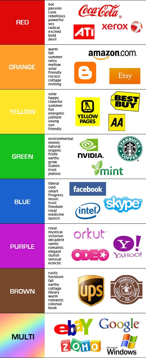
When starting a business, there are plenty of aspects to take into consideration.  First you should of course have a great idea that you are ready to work with until it becomes a success.  You also have to make sure your brand is as visually appealing as you see it yourself.  There are a lot of factors that determine how a customer will react to your brand, and it has a lot to do with what colors you choose for your logo, website and other colorful creations.  You have to know what you want your brand to stand for, and how you want to present yourself.  For example, the red color that Coca Cola uses for their cans has been carefully researched and patented.

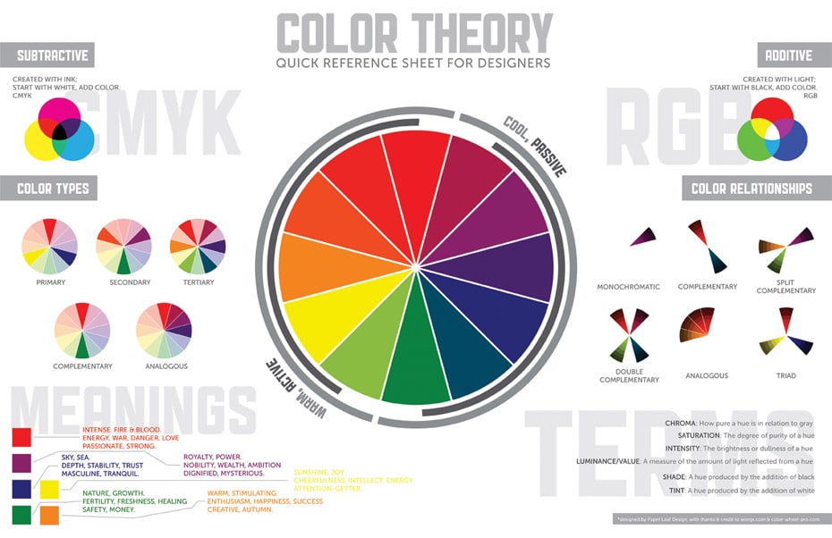
What colors should you use, and what do they all stand for?  Well, there was some extensive research completed to find out what each does to the emotions of us humans.  A carefully detailed color map was then created to present what they found.  It’s an invaluable tool for anyone who wants to make sure that the color they use presents them in just the right way.
These two guides were created by Paper Leaf Design, and should work as a guide when you start designing your own or someone else’s logo, website, printed boxes, packaging, or marketing materials.  There is more to colors than some people might think.  Choosing the wrong color for your brand could potentially mean less visibility, and in the long run, loss of revenue. The eye is the very first filter that we humans use to determine what we like.  It shouldn’t be overlooked.

Click Image To Enlarge
Richard Darell

Richard Darell is the founder and CEO of Bit Rebels, a multifaceted online news outlet that reports daily on the latest developments in technology, social media, design and everything geek. Today this media entity welcomes more than 3.5 million unique visitors per month and is considered the go-to place for people in constant motion. As an Internet entrepreneur, he is dedicated to constantly trying to develop new ways to bring content faster and closer to the end user in a more streamlined way. His excitement for statistics has allowed him to further develop systems that continuously produce accurate and fast-paced analytics to better optimize the approach by which Bit Rebels presents news and content. His graphic design background has proven to be an important tool when designing new systems and features for Bit Rebels since the development of solid and stable code depends entirely on their structure and implemented procedures. Richard currently resides in Stockholm, Sweden and directs the Bit Rebels offices in both Stockholm and Atlanta. You can reach Richard at richard@bitrebels.com

Recent Posts

The Unexpected Ways Digital Communities Are Changing Sports Betting Trends

We’ve seen a rise in social gaming sites over the years. These sites, which are…

1 day ago

Behind The Latest Vaping Designs

The vaping industry continues to evolve, with product designs becoming more sophisticated and user-centric. Modern…

1 day ago

Pros And Cons Of AI Generated Content: Efficiency And Quality

As digital landscapes evolve, more marketers, content creators, and businesses are asking, what is AI…

1 day ago

How SEO Services In San Francisco Help Small Businesses Stand Out?

Today, small businesses have an incredible opportunity to grow beyond traditional means and reach new…

2 days ago

The Psychology Behind Competitive Online Gaming: Why We Keep Coming Back

Online competitive games have long been a cultural phenomenon, drawing millions worldwide. From strategic block…

3 days ago

Navigating Global Market Diversity With Dynamic Product Roadmaps

In a world where companies constantly strive to tap into new markets, they also face…

3 days ago