Every now and then a company needs a new and refreshed design overhaul to keep up with today’s trends. Usually this means a refined approach to what’s already around and many times the change goes by unnoticed. One might wonder why even bother to change anything at all then? Well, small subtle changes throughout time keep your corporate image afloat and your customers and potential customers always seeing you as fresh and innovative. If you neglect to follow through on this step, you might find your business falling short on growing a new customer base.
In my opinion, if you’re going for a new look, why not do something that actually gets noticed? There is a billion things you could do to poke at the attention of your customers. It doesn’t have to be expensive advertising or an extravagant new office in some high priced area downtown. Nope, it’s the small things that people notice and actually talk about most. There is nothing more valuable than word of mouth. The fact that it’s free is one of the most profitable decisions you’ll ever make in your company.
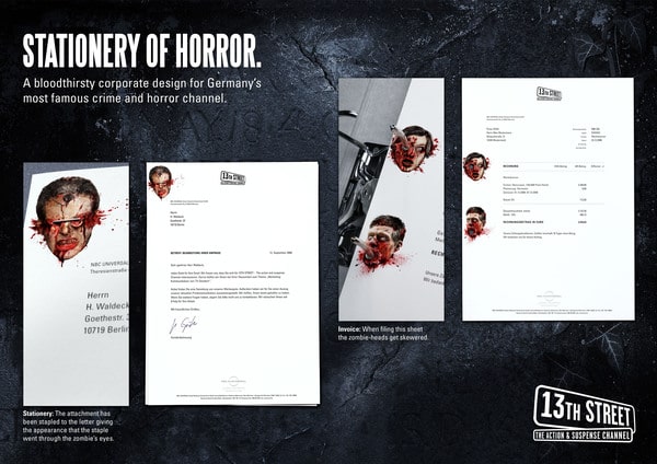
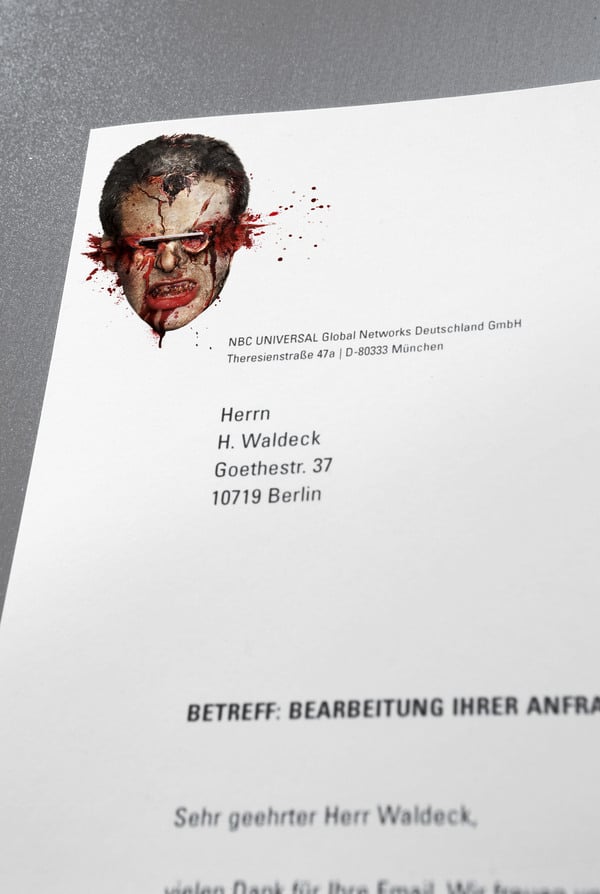
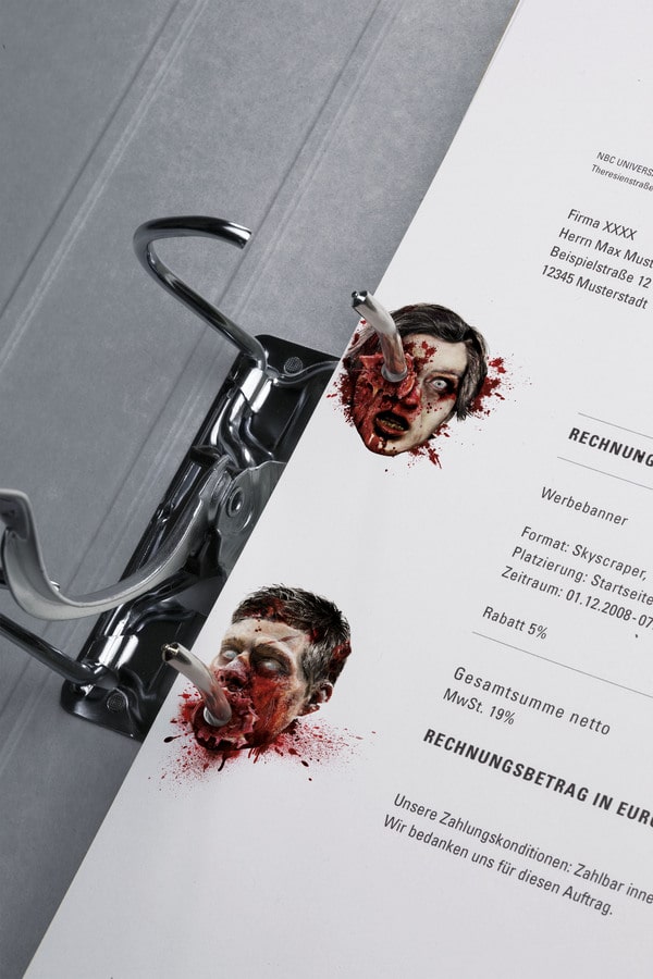
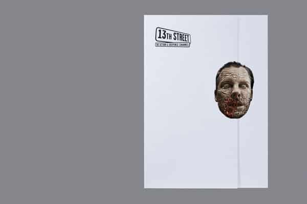
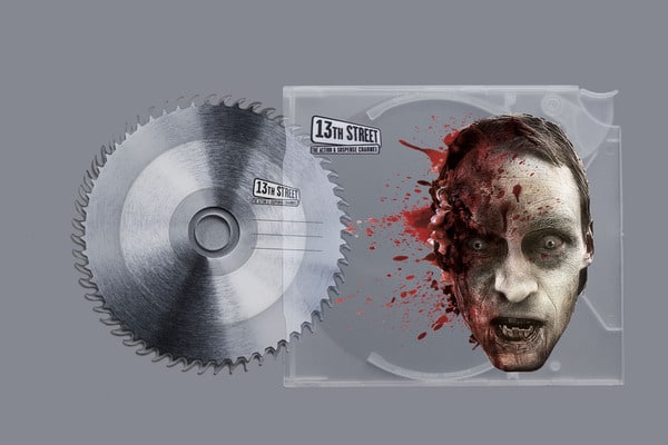
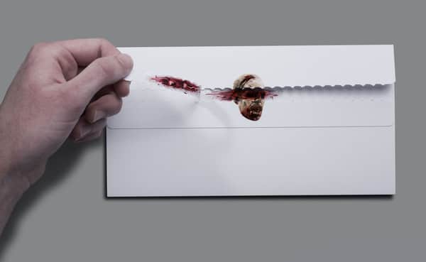
Even though you wouldn’t consider horror to be the theme of our brand, it could sometimes be a fun and interesting approach to a Halloween letterhead or business card. A company named “13th Street,” which is a German horror network, came up with the brilliant idea of switching things around a bit and designed an award winning series of stationery. The gore and carnage design is nothing less than eye-catching and is sure to bring some attention your way. The question really is… would you dare to do the same thing to your company’s temporary image? Well, you’ll never know if it will work unless you try. Why not make it a fun Halloween project… those customers are going to put this stationery all around the office for everyone to see. How’s that for advertisement?
COMMENTS