On March 7th, Facebook held a press conference to announce their redesigned page layout and news feed. It represents their biggest overhaul since the Timeline was introduced in late 2011. Facebook is currently accepting requests from those who would like to get early access to the new layout. If you are curious about the new design, here’s your chance to see it before it launches. There is no official rollout date yet.
The new timeline features 3 major changes: Higher quality images and news feed content, customized news feeds, and design homogenization across all platforms. Some people have observed that the new layout looks a bit like Google+’s layout.
3 Major Changes That You’ll See On Facebook’s New Timeline
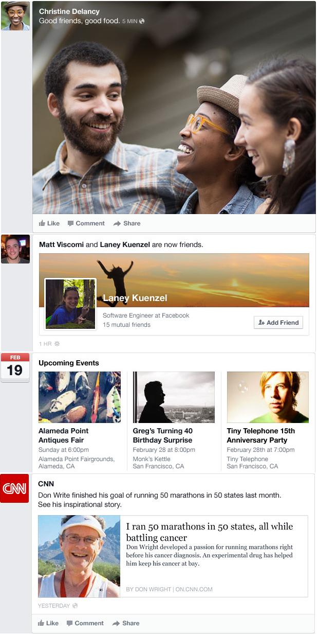
1. Higher quality images and more descriptive news feed content
According to Facebook, around 50% of all content posted is in the form of a photo. Facebook has redesigned the way it displays photos and other news feed content, like events and news stories, in order to make it more eye-catching and descriptive. The new layout takes a more visual and minimalist approach.
2. Customized news feeds
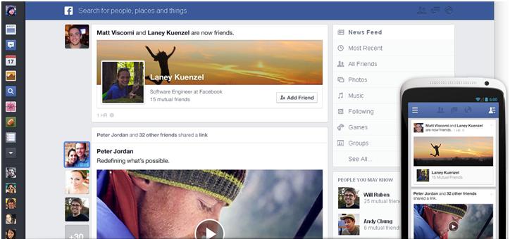
Currently, users have 2 basic options to sort through the News Feed – Top Stories and Most Recent. The new Timeline allows for 7 basic options, and even more if you decide to create additional lists.
The 7 new basic options are: Top Stories (the default), All Friends, Following (for Pages and people you follow), Photos (this includes photos from friends, Pages and people you follow), Groups, Games, Music (shows what your friends are listening to and updates from musicians that you follow), and Most Recent.
This certainly gives users a lot more choice in what posts they wish to view. Mark Zuckerberg compared it to a customized newspaper with each of the news feed options being sections of a paper. It remains to be seen how many people will utilize the different news feed features and how this will affect engagement and reach on brand pages. According to Zuckerberg, almost 30% of posts on the news feed come from pages or public figures.
3. Design homogenization across all platforms
For the first time, Facebook’s design will appear the same across web and mobile devices. This will allow first-time mobile and tablet users to dive in without having to learn a new layout. In fact, the new web layout was influenced by the mobile layout.
What do you think of Facebook’s new timeline? Leave a comment!


COMMENTS