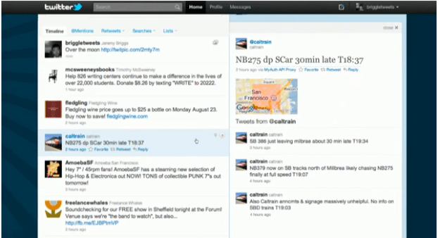
The big news that has captured everyone’s attention lately is Twitter’s new interface. You’ll see news about it all over Twitter and FaceBook. According to the CEO of Twitter, the changes lie in the experience. He pointed out that the main reason for the redesign was to make the experience richer and faster. There will be links, that when shared, will automatically show the content without your having to leave the page. They also focused on the video and picture portion since those are the most straight forward in your experience. They also looked at the services that are most used to share information by the users everyday.
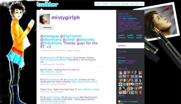
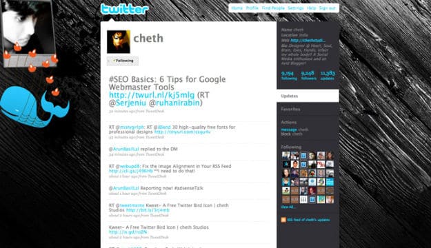
I think it is great that the site is evolving based on the user’s experience, but there is just one question I have about the new interface (maybe it is the designer in me that asks this question). How will we maximize the branding on our Twitter profile considering the space that is left for the user to brand? If you check out Twitter Background Gallery, you will see many creative ways that people have made sure their profiles stood out. It was a way for people to express who they are on one page. I have included the old interface and the new one here for you to compare (@mistygirlph and @cheth Twitter BG). I guess we will now have to concentrate on writing our bio and making sure that our avatars are sufficient to allow for personal branding. What do you think?


COMMENTS