Cars always tend to become icons at some point in time. Some models live on forever and there is no telling just how far the designers behind these cars are ready to go to make them stick around that little bit longer. Ferrari, Lamborghini, Porsche… all of them have continuously been redesigned to fit the future edge they are known for. Each design has that new line that still reminds us of earlier designs, but yet gives us a hint of the future. Of course, it is all to preserve the already legendary concept their buyers are accustomed to.
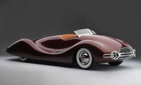
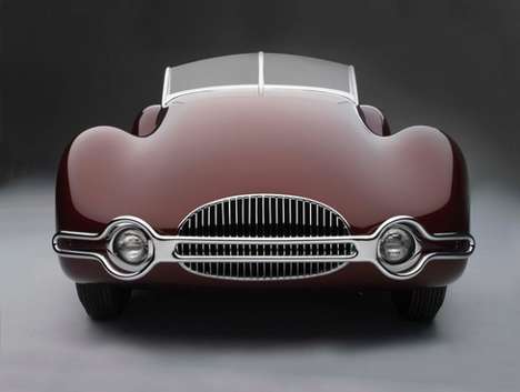
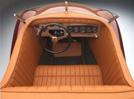
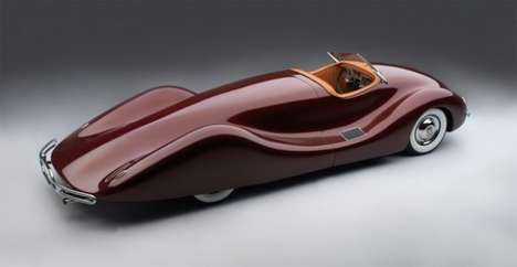
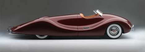
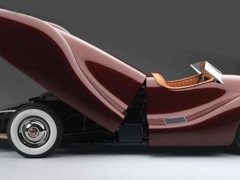
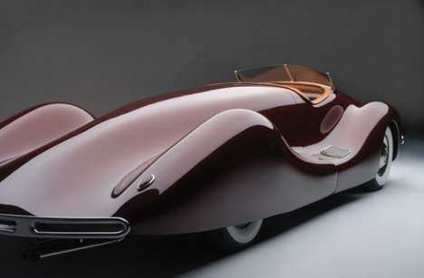
Designer Norman E. Timbs took a step back and imagined how the Buick Streamliner would look if it was updated to fit the year of 2010. The concept design he presented was not only unique, but also radical and quite hilarious. The front of the car has been totally minimized to almost look like it has hit a brick wall on the maiden ride. The rear, however, extends as it appears, forever. Obviously the engine and everything connected to it is located there, but the design is comically hilarious. Taking a corner must feel really odd when driving this almost Suess’ish car.
Parking at the grocery store or even in your garage will prove to almost be as hard as jumping to the moon. I wonder if there are any parking spots that this car would fit in at all. All I can think of is a double spot, meaning you will have to double park, which means parking tickets. Well, if you can afford it, that probably isn’t any of your concern.
Price? Well, it being a concept car, I would say invaluable. However, someone must have tried to drive it at some point right? In either case, the design is as beautiful as it is bold and as weird as it is unique. So the question really is… is it geeky enough for you?
COMMENTS