I have always found it refreshing to see new and daring concept designs that truly eliminate the annoyances and boost productivity to new and ultimately satisfying levels. However, it is not always a simple solution that will enable us to reconfigure our daily ways of doing things. Sometimes it takes a bit of getting used to, and that is exactly what the dual monitor approach did. At first the separation line between the two monitors kept us on on our toes because we couldn’t get over the annoyance of that little monitor edge, called the bar, in between the two monitors. It served as a productivity enemy, and we dealt with it the only way we could, to completely wipe it out of our viewing field by ignoring as much as we possibly could.
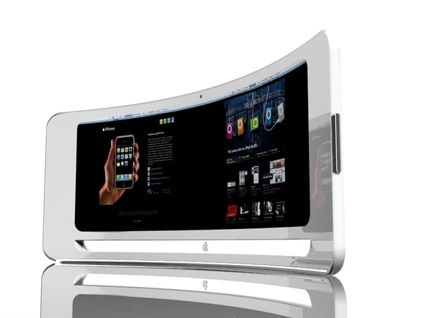
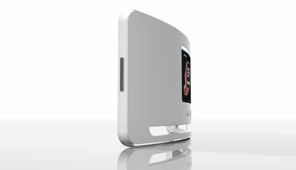
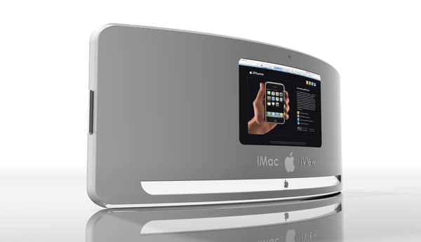
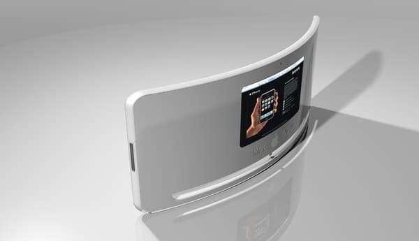
However, here is where designer Nuno Teixeira had a chance to show his brilliance. Not that it is the first time anyone has battled this problem, but Nuno did it in such a practical way that it leaves pretty much all questions answered. Instead of having a dual monitor setup, you will get a curved view, called the iView, of the same screen width as two monitors but without the annoying separation line in between them.
The design is, of course, a concept design aimed at being an Apple product. The fact that it has all the features you could ever want in a “dual monitor” setup all bundled into one screen makes me all giddy inside. Furthermore, there is a small screen in the back which tends to tell me that it is a showcase or display monitor for a store or demo. The brilliance is really in the curving of the monitor itself. All I can do now is to wish for this one to come true. Awesomeness defined!


COMMENTS