Online ads have long been one of the most popular revenue streams for websites. The interesting thing is that the online revenue trend line has overtaken the printed revenue trend line this year. What does that mean? Well, you might think that online advertising is more profitable than printed ads, but it’s not quite like that actually. Online ads have become more popular than printed ads this year, yes, but the revenue that comes from online ads is getting lower and lower. Not only that, but Internet browsers have become less inclined to click ads in general. All of this makes it ever more important to know what you are doing when you create what you think will be a working ad design.
Anyone who has ever designed an ad knows how difficult it can be to draw the viewer in, make him or her click it, and then make that person interested in what you have to offer. It’s a process that is becoming increasingly difficult as people are getting more and more used to online ads. People sort of regard it as “noise” and have learned to filter it out when they browse the web. Some even use filters to block ads altogether which of course makes online advertising a difficult decision.
At that point, even an otherwise working ad design no longer performs as expected, and that could be bad for both the advertiser as well as the website that displays the ad. Why? Because without that revenue, both the website and the advertiser will most likely not be able to provide their services to you, the browser, for a very long time. However, it still comes down to creating a working ad design, and of course which website the advertiser decides to advertise on.
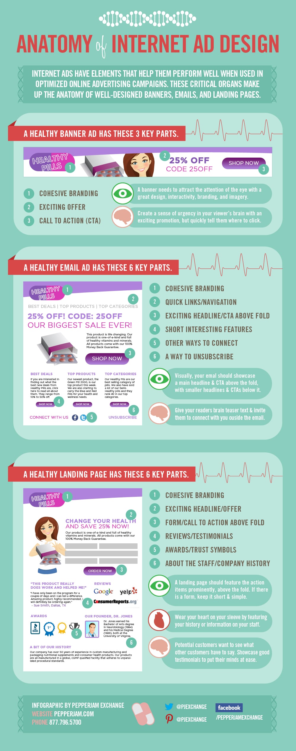
There are a bunch of different vital elements that you need to incorporate into your ad design, and they are different depending on what kind of ad it is. For example, a banner ad does not have the same vital elements as an email ad has. A banner ad should be quick, eye catching and convey as much exciting information as possible in as few elements as possible. An email ad has a whole different “appeal time” than a banner ad has, and therefore it can go a little bit more into depth about what it is you are trying to sell.
To explain all this, I thought this infographic from PepperJam Exchange (design by Darling Stewie) would be a great way to showcase what a working ad design is within each advertising area. It’s a great starting point for anyone who wants to create appealing and eye catching ads that really work. An ad design that works could yield numerous times more interest and revenue than an ad that is just thrown together. As I always say when I write these kind of articles, spending time on your work will always yield more return if you utilize the knowledge and optimizations available to you. These tools can definitely help you create a working ad design that will make sure you get a jump start on your advertising campaign.
Pepperjam’s Working Ad Design Guide
(Click To Enlarge)
Via: [visual.ly]

COMMENTS