Smartwatches are getting popular these days. With more and more affordable options from us to choose from, we see a lot of people wearing these. After all, it is a combination of a smartphone and a watch and makes our life more convenient. We have also seen the rise of other wearables like smart glasses. And a lot more is about to come.
This is a great opportunity for app developers and designers to design user interfaces for smartwatches. However, when designing a wearables UI, you will need to keep the small screen size in mind. The small screen size restricts interaction, and the best smartwatches make the most out of that screen.
So, here are some things you can keep in your mind when designing user interfaces for smartwatches and other wearables.
IMAGE: UNSPLASH
Gesture
The first thing that UI designers think about is the ease of access to the different functionalities of the smartwatch.
When designing apps for a small screen like a smartwatch, you cannot rely on on-screen buttons. That is why adding gesture-based navigation is the best thing to do.
Let’s take the Apple Watch as an example. If you tap on the screen, you can select a button or an item. If you tap and hold your finger on the screen, you can change the watch face or look at additional options. There are swipe gestures to switch to different screens. For example, you can swipe right to go back to the previous screen.
Keeping The Right Items On The Watch Face
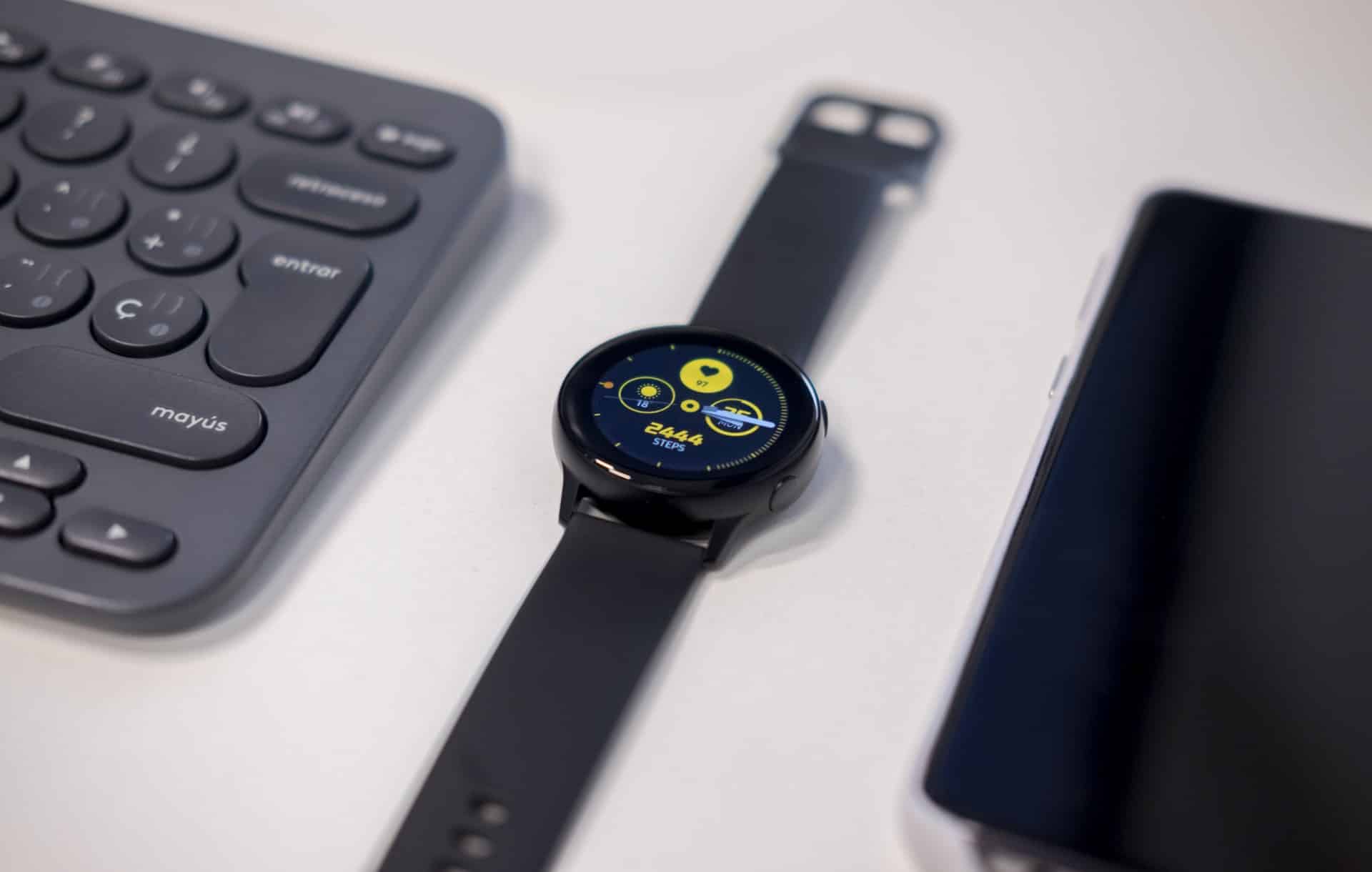
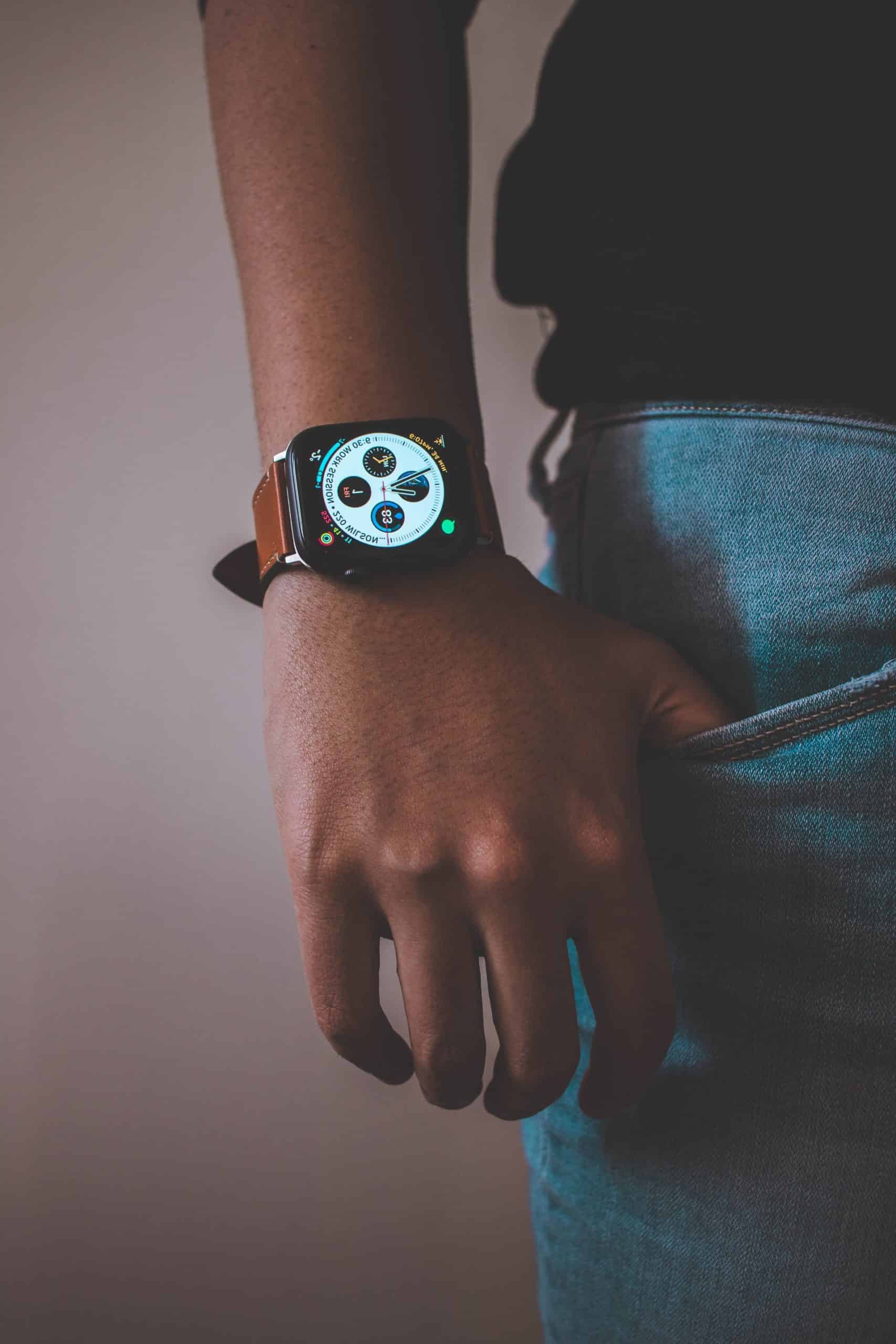
The watch face is the part of the smartwatch where you can express your true creativity. However, you need to remember that the screen size is limited, so you need to present only the information that a user needs to look at immediately.
Here are some of the things that you can add to your watch face:
- Date and time
- Missed notifications
- Steps and heart rate
- Basic music controls like next, play, pause, and previous.
- Quick info about the weather, like the current temperature.
- Battery status
Using The Right Design Tools
Well, we are talking about the things we need to mind when designing a user interface for smartwatches and wearables. Using the right software to create wearables UX design is important as well.
That’s where Crank Software comes. It is a user experience design tool for wearables that you can use to create top-notch UI for smartwatches. Crank Software is one of the leaders in wearables when it comes to UX design. By using their award-winning GUI development framework, Storyboard, you can create some of the best user interfaces for smartwatches and wearables.
You can import directly from Photoshop and Sketch, with layers, orders, and names.
The hardware and resources of smartwatches and wearables are limited. So, if you want to create smooth graphical transitions to give the best experience to your users, using the services and tools of Crank Software is the best choice.
Using Storyboard’s Rapid Design Import and Iteration technology, managing design iterations has become a piece of cake. You have a ton of operating systems to choose from. Feel free to choose whichever you want to improve and optimize the user experience of your smartwatch.
There are a lot of pre-coded functions available for you. They can help you in speeding up scrolling lists and developing tables.
Keep The Hierarchy Low
Always make sure that you don’t create hierarchies deeper than three levels. If you can reduce your hierarchy, people will be able to easily find the function they need. Adding more levels will build up more confusion, and people will lose track. Also, lesser levels of hierarchy mean newbies will be able to easily understand the functionalities of the watch.
Presentation
For any product to sell, you need to make it look appealing. And that becomes a challenge in the small screen size of any wearable. Make the layouts attractive and keep the colors subtle so that users can view and understand the info on the screen by looking at it once.
The font that you use for your apps should be readable. Plus, make sure that the letters don’t look too distorted. You can add multiple fonts for the users to choose from, but make sure that all of them are legible.
Whatever font you select, keep it consistent to improve the readability. As for colors, make sure that a person can easily distinguish between the background and the text color. It is better if you don’t use too many bright colors, as some people like it subtle.
If you have a key color or branding for your app, keep it consistent and make sure that the same color (or a variation of it) is present on all the screens of that app.
Motivate Users to Interact Frequently with The Smartwatch You should design your apps in a way that encourages users to explore them and try out the different features of the smartwatch. Allow them to explore freely throughout the watch. Also, make sure to add enough recovery options and make them simple. So, users can go back to where they were before in the case they make a mistake (as they are not making a mistake, they are just learning).
Make sure that your app can handle any form of errors and can communicate with the users easily. Also, make sure to display messages on your watch which make users aware of the different features of the watch.
Don’t Be Irritating
Wearables constantly stay in contact with the user’s body. Adding features like haptic feedback is good. However, add them too much, and it becomes irritating. If you want to add vibration feedback to every action, make sure that the user has an option to stop it.
On our previous point, we told you to add messages to encourage users to try out new features. However, make sure that the messages aren’t too intrusive. Also, give users the option to not show these messages if they want to.
Closing Words
Every new technology takes some time to reach the market. Initially, people might be skeptical and worried about the complexity of such technologies. So, it is important to design the user interface of smartwatches in a way that it looks appealing, is simple to operate, and the user can feel comfortable when wearing it. We recommend that you use Crank Software’s Storyboard if you want to give a premium user experience to your customers.


COMMENTS