I’ll admit; I’m not normally a huge fan of negative space art. I can appreciate it from a design perspective since it adds a whole level of complexity to the design itself, but quite honestly, it makes my brain hurt. The closest way I can describe it to you is that if you look at the spinning lady in the video in this right brain vs. left brain article, you can make her spin the opposite way by changing your brain. It kinda hurts, but with a little practice, you can do it by just thinking about it. Negative space art hurts my brain in that funky twisted kind of way.
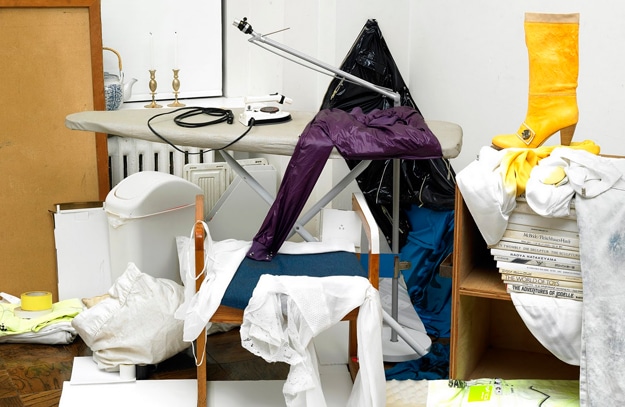
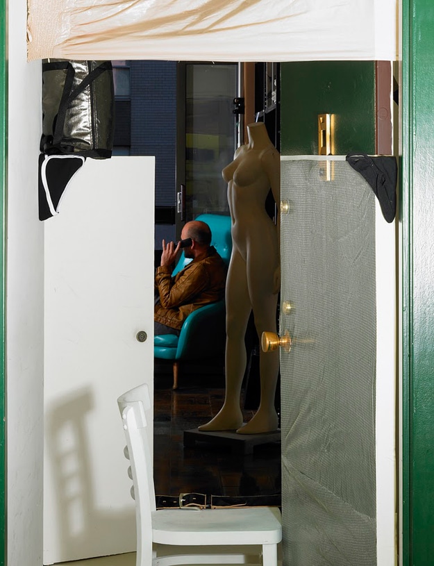
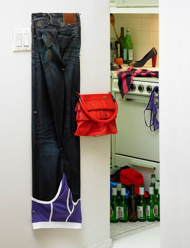
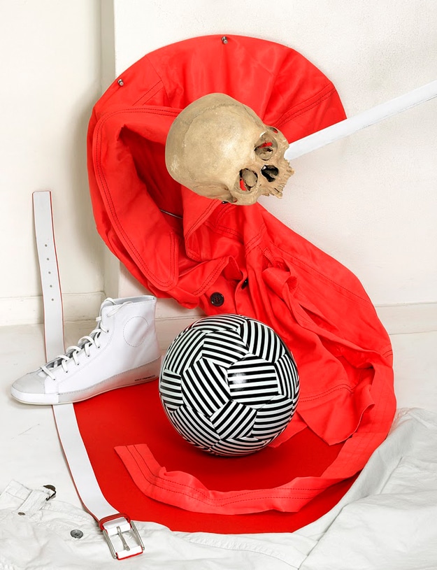
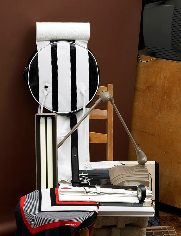
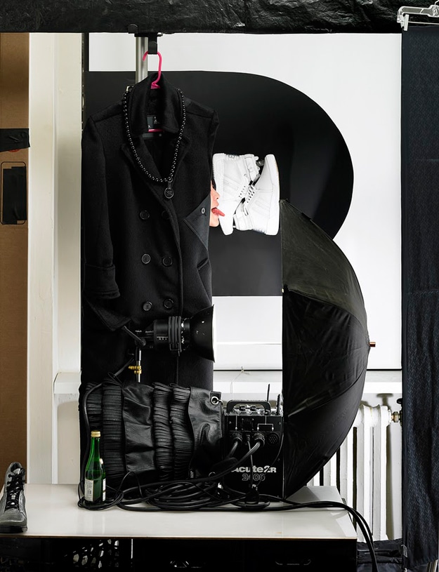
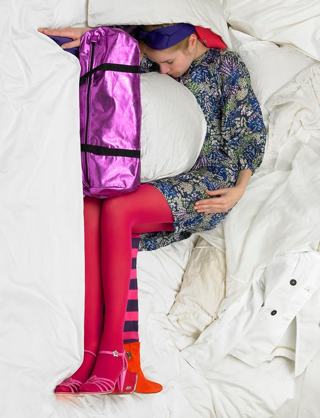
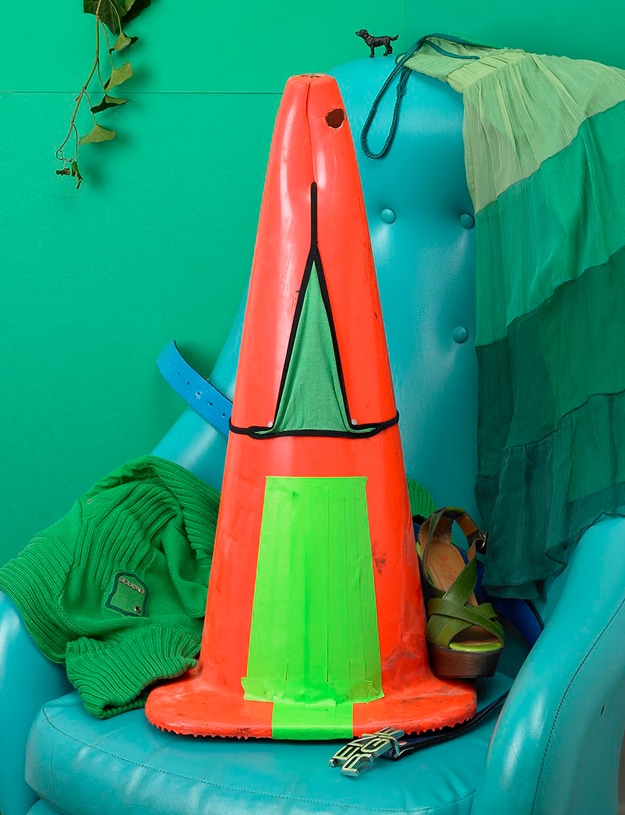
I recently wrote an article called 10 Creative Examples Of Negative Space Art. If you don’t understand what negative space art is, you will after you look at those images. Artist Bela Borsodi created these alphabet letters with negative space by using things she found in her apartment. Her props to create this unique typography included clothes, chairs, a trashcan and even her hair.
What a great example of simply using what is in our everyday lives to create something unusually interesting and fun. These particular letters were for a spread in WAD magazine, but Bella has also done work for Vogue, Hermes and many other popular brands. You can learn more about her at Bela Borsodi.
Via: [Pickchur] [Design Boom]

COMMENTS