There have been plenty of cool and artistically genius alternations of logos out there that make us realize just how much these super brands really are etched into our minds and consciousness. We go around everyday soaking up the brand names, logos and their attempts to penetrate our brains with their good deals. Most of us say that we don’t really fall for these ads, and that we just ignore them. The truth is, all of us living in the civilized world fall for everything we watch… more or less. If you, for example, watch a detergent commercial on TV, you might not run to the store to get it. However, if you were suddenly asked to name a detergent brand, I am pretty sure you would name the one you just saw. So have you not already fallen victim to their ad campaign?
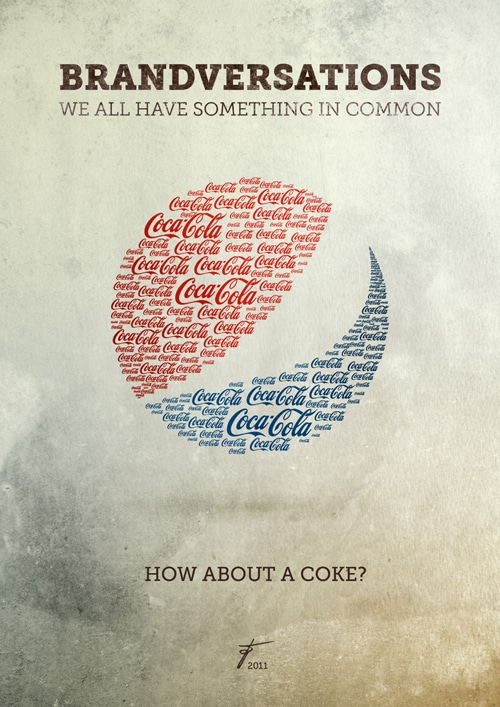
Well, it’s quite apparent that you have actually, and the more you see it, the more you will lean towards actually trying the product. That’s why we sometimes see the same commercial over and over again, sometimes even right after each other. It’s because the advertisers know exactly how we work, and that blasting us with their message is eventually going to pay off. What if we switched out their logos for another one? What if it’s the same shape and size, however all infested with a competitors logo, then what?
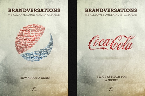
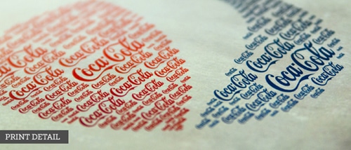
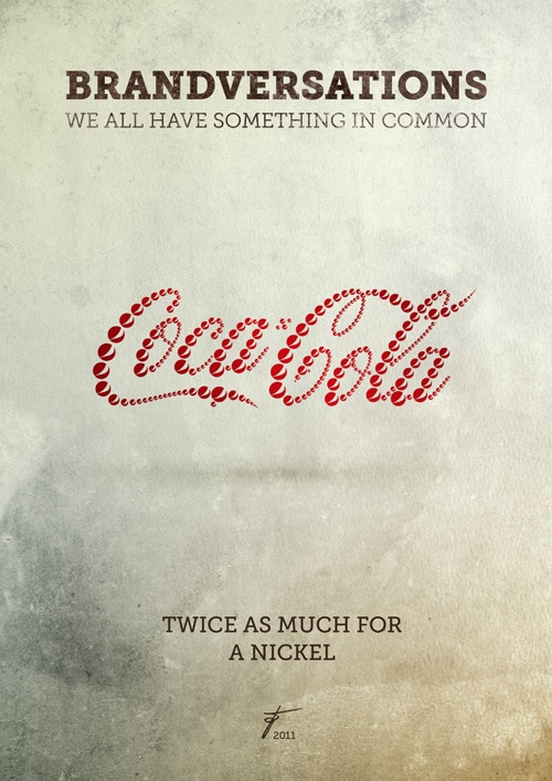
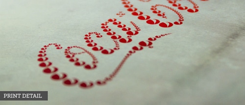
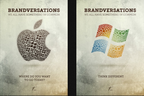
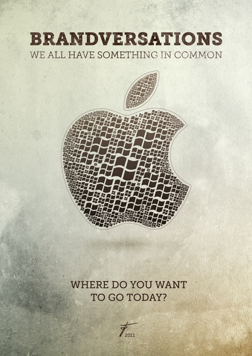
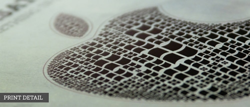
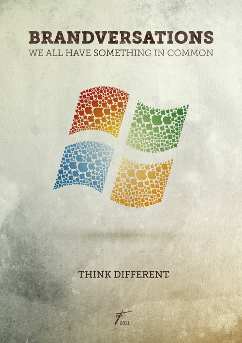
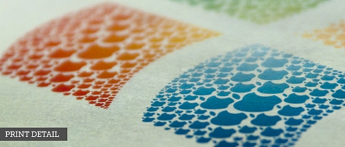
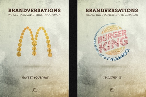
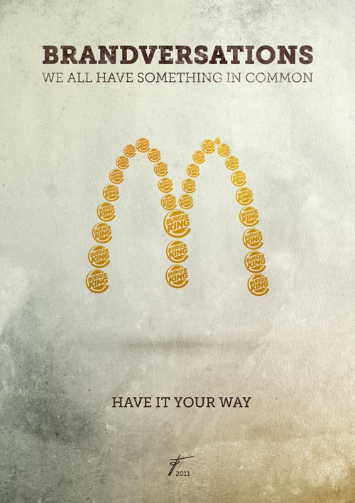
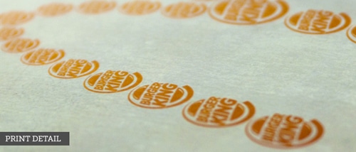
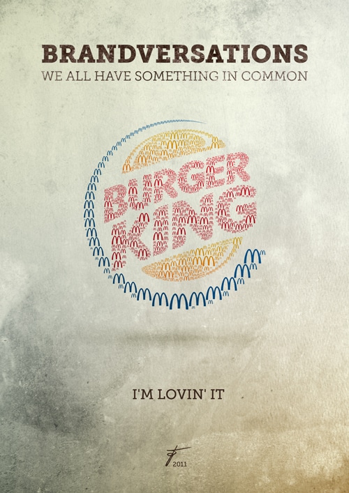
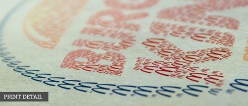
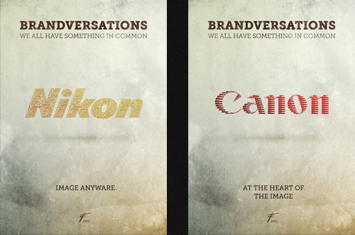
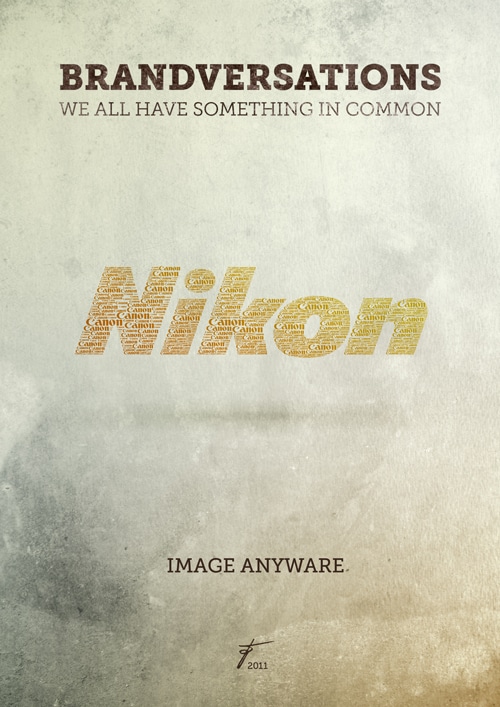
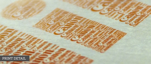
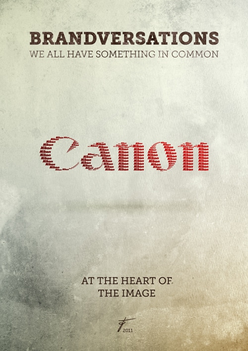
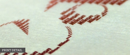
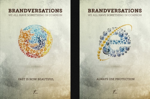
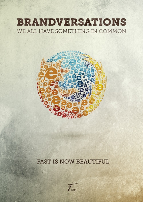
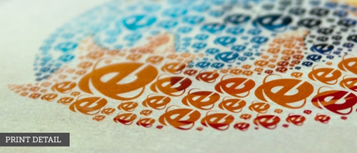
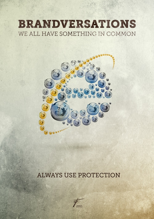
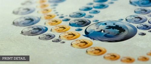
The thing is, this will start playing on our mind, but we won’t realize it at first. This is exactly what designer Stefan Asafti researched, and his project “Brandversations” is gaining huge exposure, not only from veteran ad agencies, but also from the Internet itself. The logos he’s created have their ultimate competitors logo all intertwined in their logo, and even if you don’t see it straight away, you will. It’s amazing how the brain works sometimes, isn’t it?
COMMENTS