I never truly appreciated what goes into creating a logo until I became a writer here at Bit Rebels. Richard has written a lot of articles about logos and logo design, and with each one I learn a little more about them, and their evolution. For example, have you ever seen the progression of the Warner Bros. logo in the Harry Potter movies? It’s freaky to say the least. There are also those trippy logos that aren’t real, but still mess with your head. An example of that would be these Brandversations.
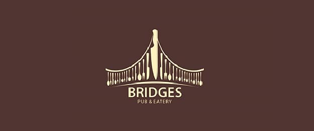
Now that I know what is involved for a designer when it comes to creating an effective logo, I can’t even imagine creating one with a double or hidden meaning. These logos below are all like a visual puzzle. They are like those pictures you stare at one way and they show one thing, and then you blur your eyes or look at it from a different perspective, and it shows something else. This classic young lady or old hag picture is a perfect example of that.
Illusion 360 put together a part 1, part 2 and part 3 of these logos with double meanings. All together they create a huge collection created by designers from all over the world. I’ve chosen a few of my favorites to share with you here. It’s fascinating to me that they were able to use just one simple picture to create two very different images. Brilliant!



COMMENTS