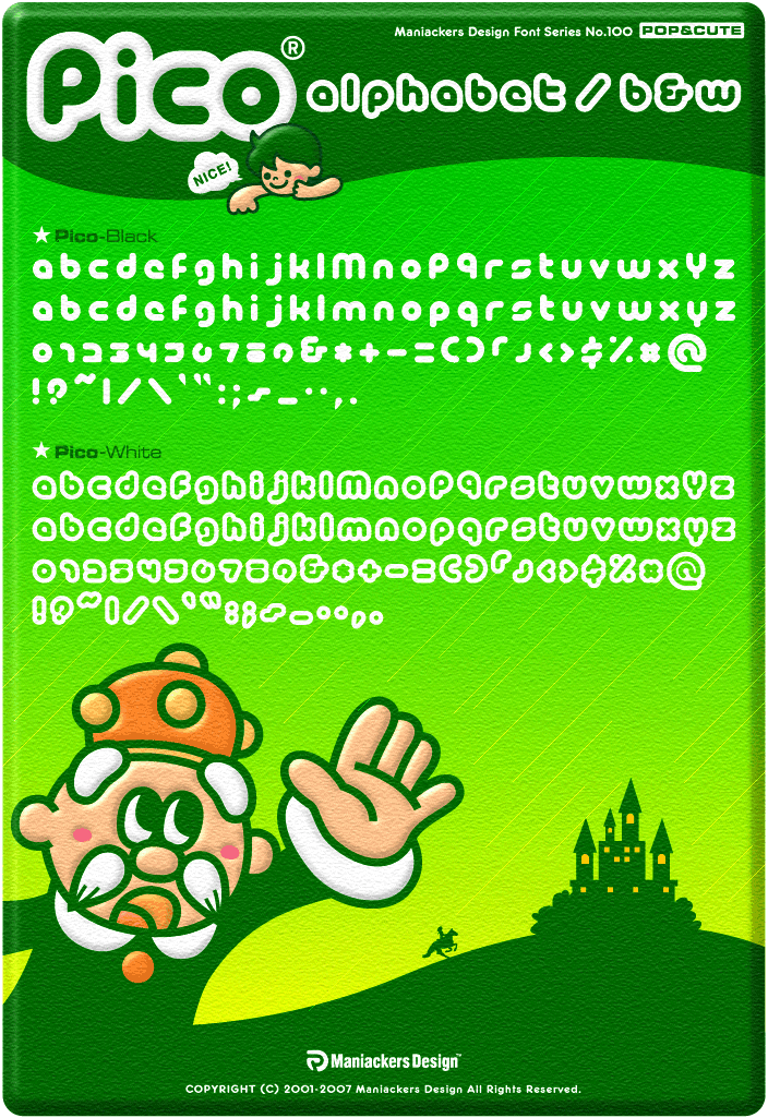
There has been quite a bit of talk going around among designers what font Twitter uses in there logo. Some have their own opinion that it’s custom made, some say it’s a rather common font that has been slightly modified. Some of you might know it already and some might now. However, we will now reveal to you what the font really is.
The font used in the Twitter logo is actually “PICO Alphabet “. A rather fun and playful font that always reminds me of some Japaneese cartoon movie title or something. Maybe it’s because it is a cartoon gracing the full alphabet showcase.
It’s created by “Maniackers Design” and its downloadable right HERE
Maybe now some designers don’t have to go through the time consuming work to custom make the logo by deforming and modify another similar font.

COMMENTS