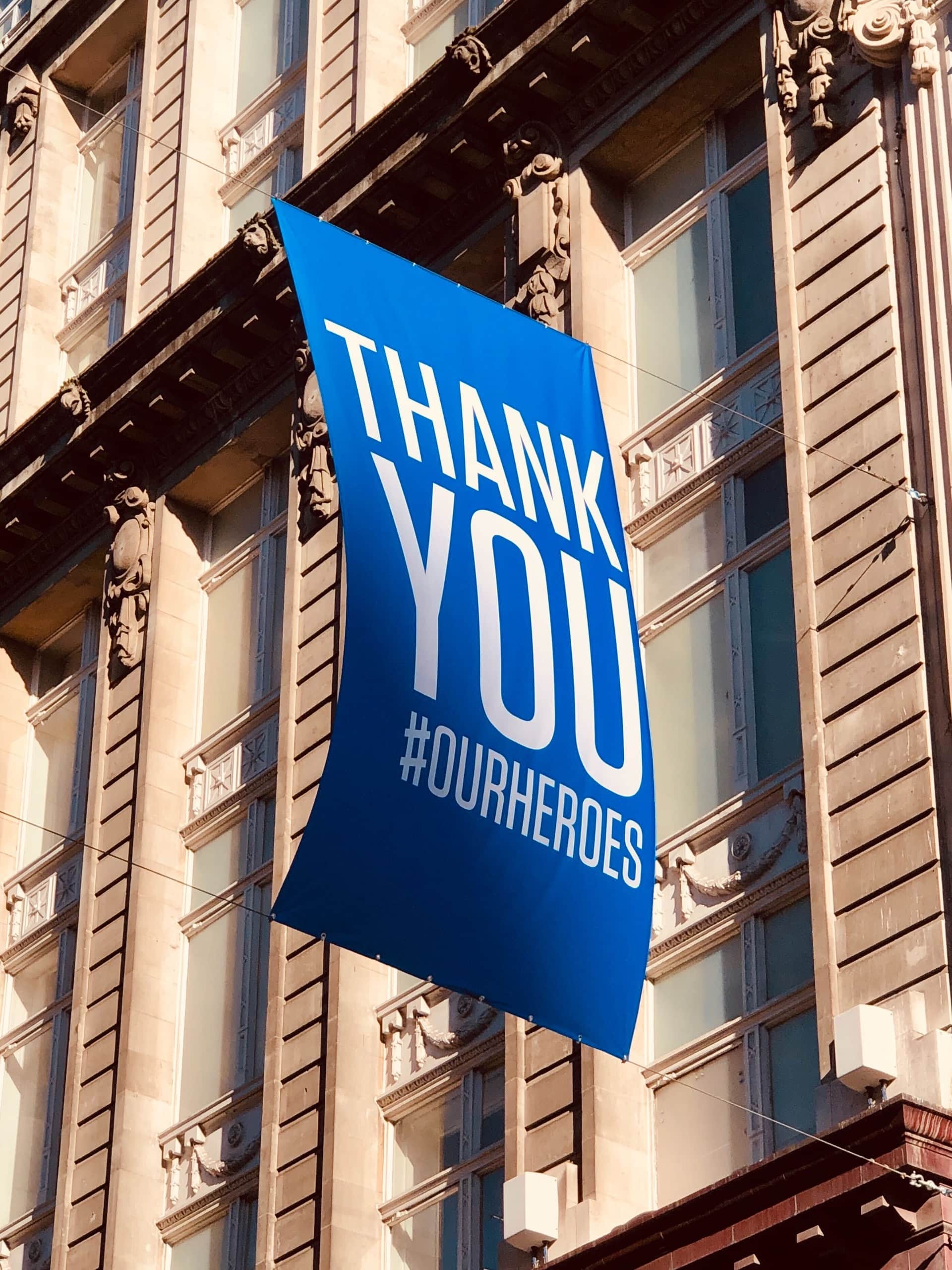
Designing printed banners is an art of its own and needs careful thought to get the most out of the medium. Banners are different from other marketing materials because they need to provide a clear message in a short amount of time, meaning that the amount of text that can be used is limited compared to a brochure or flyer. Because of this, design choices become even more critical, and the images and colors you choose are more important than ever.
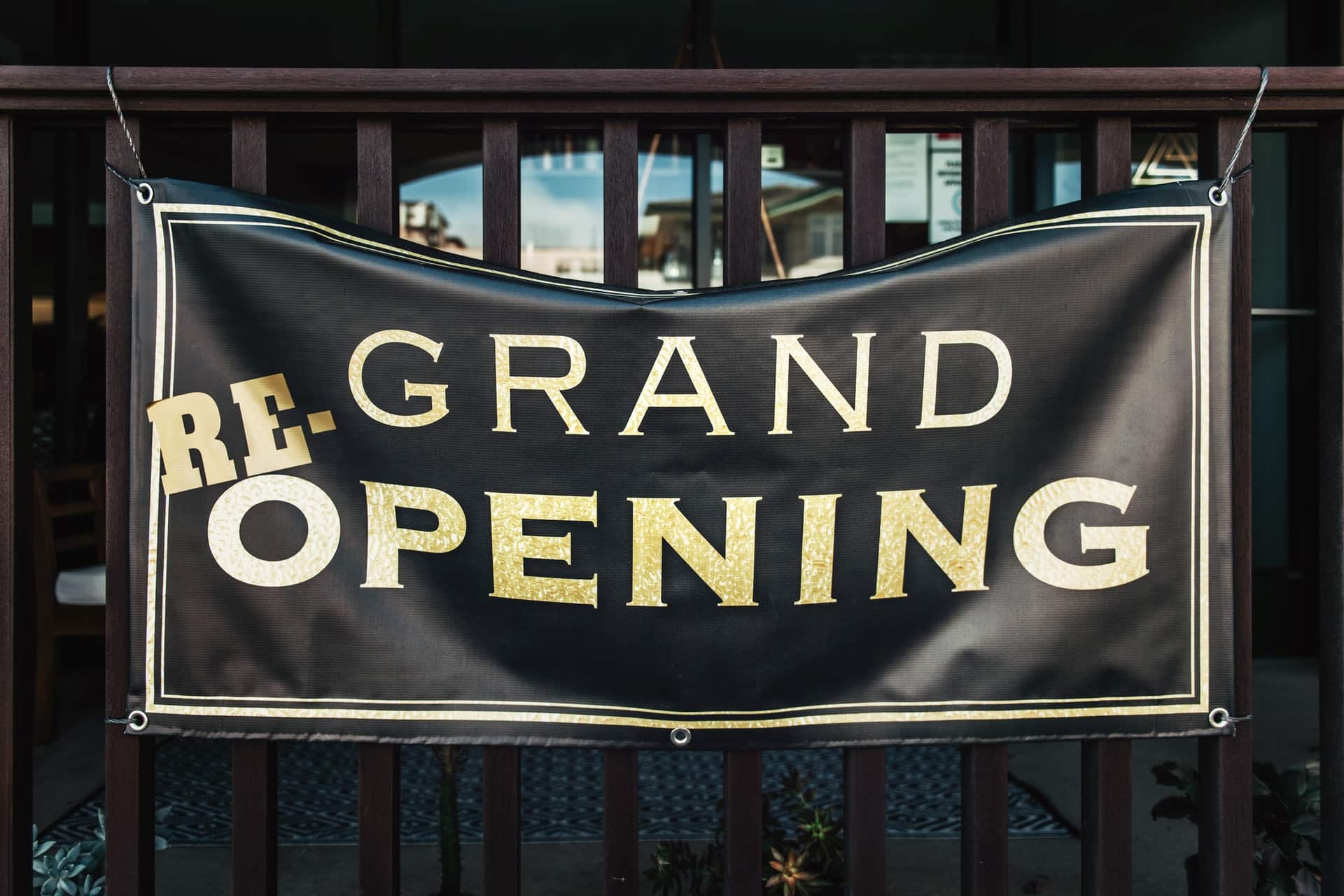
IMAGE: UNSPLASH
Image Selection
The primary purpose of vinyl banners is to get someone’s attention from a distance and deliver a clear and straightforward message. Banners are also often huge when printed, so bright and high-quality graphics are paramount. When choosing images for your banner, focus on getting the highest quality and large resolution possible, which will keep their quality when increased in size for printing.
The images on your banner will play a large part in attracting the attention you need, so think about using them as the focal point for your banner. You can get a variety of high-quality stock images from a website like Unsplash that will work well for free, but having custom photography done by a professional is even better.
Show Your Brand
One of the other main purposes of banners is to create brand awareness and help people recognize your brand in just a few seconds. This means keeping your brand a core part of your banner’s design and including your logo and brand colors where possible. Just because you’re trying to get people’s attention doesn’t mean you should use bright colors that don’t fit your brand.
Use The Right Colors
Building on this point, the colors you choose can have a significant impact on both the banner’s effectiveness and the perception of your business that people will take from the banner. Certain colors will elicit specific emotions from people, and being aware of this may impact the colors you choose as it can differ depending on your geography and the culture of the place where you’re displaying your banner. Below are some examples of colors and the typical associations people have with them:
- Red is associated with passion, anger, speed, love, and danger. Red is a powerful color and should generally be used sparingly.
- Orange often represents happiness and vitality and is energetic and friendly. This is an excellent choice for a call to action.
- Yellow is closely linked to the sun, happiness, and optimism. If you need to add some energy to design, this is a great choice, but can become too much if used in excess.
- Green is associated with the environment, growth, health, and wealth, and is a pleasing color to the eye.
- Blue gives the feeling of elegance, clarity, coldness, and refreshment, making it a versatile option.
- Purple is linked to royalty, luxury, ambition, and femininity, making this an excellent choice for promoting a premium product. Purple can also have a calming or soothing effect on people looking at it.
If you are interested in even more design-related articles and information from us here at Bit Rebels, then we have a lot to choose from.
COMMENTS