When our brains think about huge numbers, sometimes they are hard to conceptualize. Take the debt in the United States for example. It’s hard to visualize such a vast amount of money, which almost makes it seem not real. Population is like that too. We know that there are at least 7 billion people in the world, but can you imagine how many people that really is? 7 billion is a huge number, and I can’t even get a visual of that in my mind. It just seems so massive and imaginary.
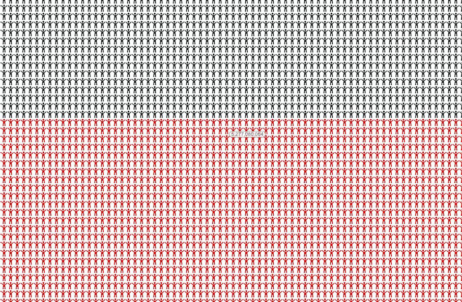
A website called 7 Billion World makes it easier for us to imagine how many people 7 billion is. They’ve created a stick figure which represents every single person in the whole world, organized by geographical area, all on one webpage.
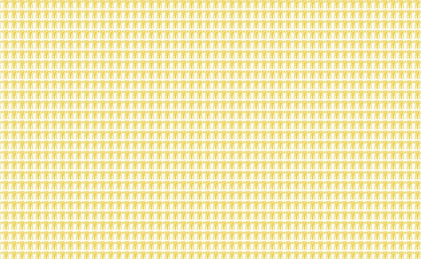
In the chart (if you can call it a chart), everyone is color-coded according to where they live. Asia is yellow (which is a huge space), Africa is black, the Americas are red, Europe is blue and Oceania is green. The color convention was chosen based on the 5 Olympic rings.
For me, it is hard to even scroll through 7 billion people, which only scratches the surface when it comes to putting that number in perspective. That webpage serves as visual representation of the moment in time when there was exactly 7 billion people in existence, which was on October 31, 2011 at 5:49:16 GMT. It represents human beings as they relate to the planet earth, and all the philosophical and symbolic attributes that entails. Click over to 7 Billion World to find yourself. Each stick figure has a number on it, so you can see how far down the list you are as you are scrolling. All I can say is wow!
Click Over To 7 Billion World To See All 7 Billion People
Via: [Popsci] Header Image Credit: [Pictures Quotes]


COMMENTS