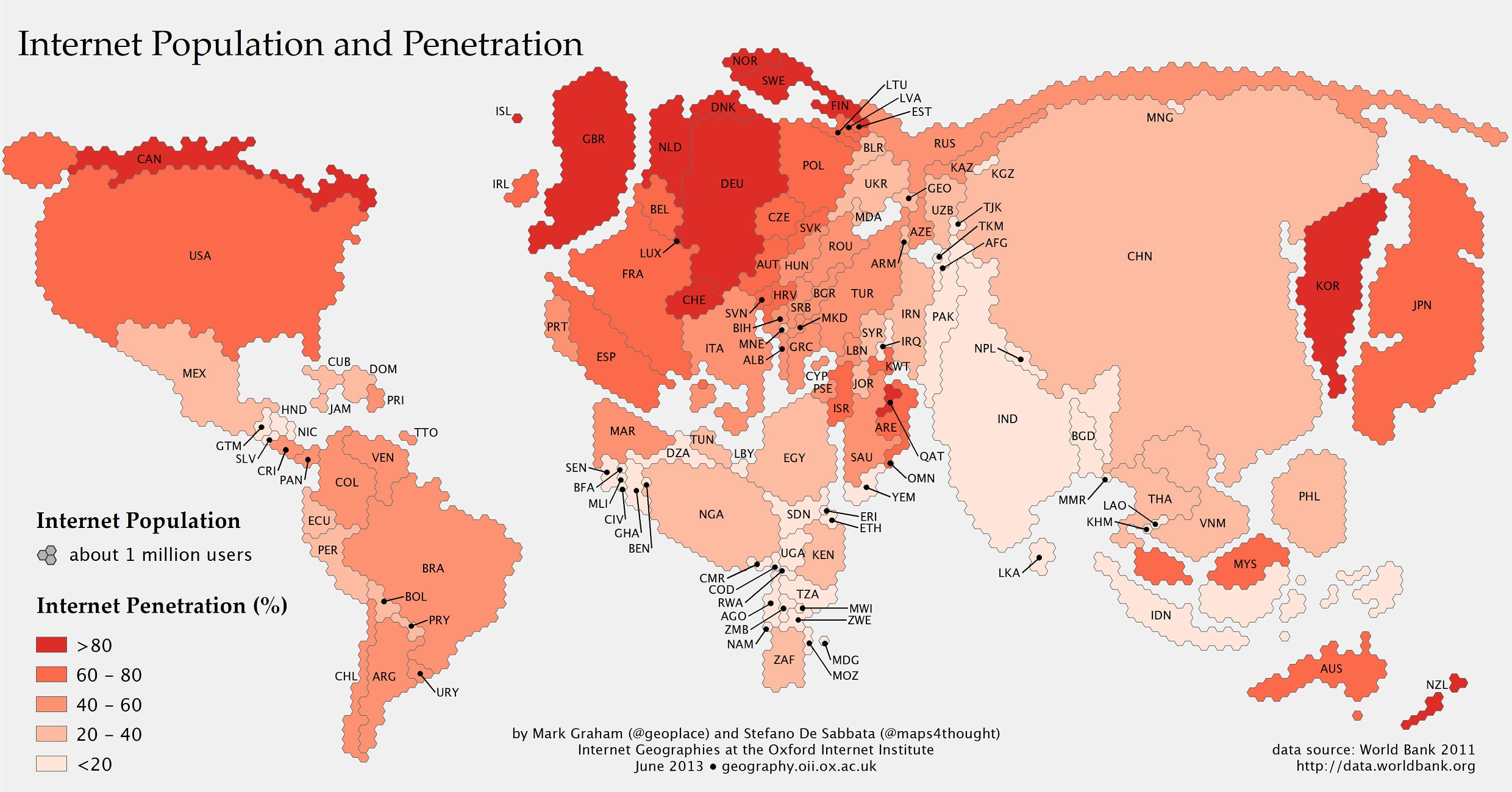
If you are an Internet addict, your brain probably thinks in terms of everything online. You may think like the guy who checks to see if it’s cold outside by going to a website instead of opening the door to feel the air. If you think of the world in those terms, it’s easy to be misled. The Internet is a huge, but in our daily online experiences, we each only see an itty-bitty part of the whole. This Internet map puts things into perspective.
This Internet map shows what the globe on your desk might look like if the countries were the size of their Internet populations. The sophistication of this map goes beyond just that though. The colors indicate how concentrated the Internet users are.
For example, you’ll see that Canada only takes up a very small space compared to the size of the real country. Although there may be a small number of Internet users in Canada compared to the United States, over 80% of the people there are online, thus making it that dark red color. The opposite is true for China (over half the people there are not online), which you can see reflected in the lighter color.
This chart was created by the Information Geographies project, and you can read more about it on the original article on The Atlantic. If you read that article, you’ll see that there is still huge potential for Internet growth in the world. With as fast as new data is added to the Internet each day, it’s easy to think it’s almost ‘filled up’ so to speak, but the truth is almost the exact opposite. The Internet is changing and growing faster than we can comprehend. It will be nuts to compare the complexion of the Internet in a decade to what it is today. When you get into the details of this Internet map, it’s fascinating!
Internet Map: Countries Are The Size Of Their Internet Populations
(Click Image To Enlarge)
Via: [Book of Joe]

COMMENTS