How come we always value things in visual mode instead of reading the charismatic words of wisdom? It’s no coincidence that movies are doing better financially than books. And as you might understand, I am not talking about the Bible or any other book that has been on sale for decades. People simply enjoy fast information rather than reading endless pages of the same thing only to get to the end where the hero dies. Nah, it’s not really like that, but you know what I mean. The effort of reading a book takes nowhere near the same energy as watching a blockbuster movie.
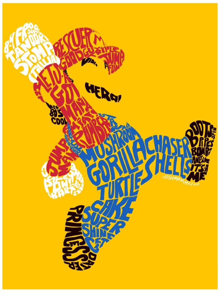
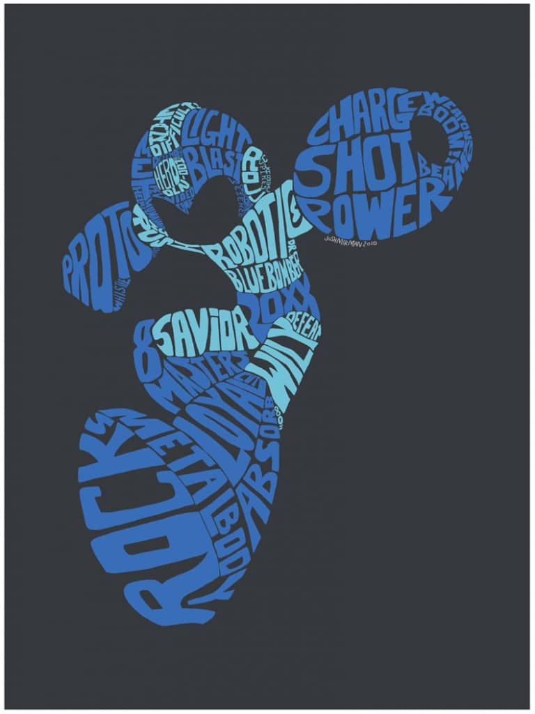
However, watching a movie could sometimes get you the wrong information. In a book, there is way more room to explain what goes on or how things look in detail. That information can easily get overlooked or even not fit into a movie. Why this has anything to do with Nintendo heroes might seem a bit far fetched, but if you look at these two images created by Josh Mirman you will understand exactly what I mean.
There is no mistaking that it is Super Mario and Megaman that you are looking at even though these two epic heroes are created with only words. Sometimes typography is saying more than an image that supposedly tells a million stories. However, these then have to say a million and one I reckon. Either way, it’s truly inspiring and creative work if you ask me.


COMMENTS