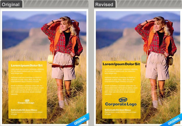
Designers, marketers, advertisers and savvy bloggers know the importance of using stunning graphics in each piece they create. In my opinion, with more and more visuals competing for our attention, this is becoming increasingly critical to the success of our work.
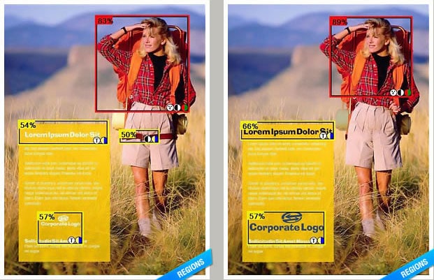
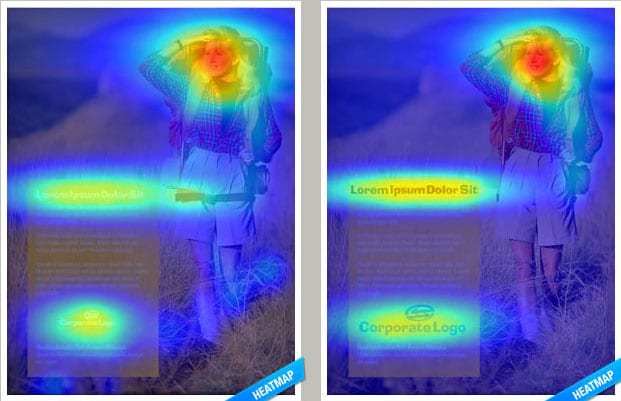
3M recently launched a new tool that helps us deliberately use the images we choose to our advantage even more. Visual Attention Service tests the impact that our images will have on our reader, and offers suggestions that will make sure the viewer sees the most important content on the page within three to five seconds, based on the quality of the images.
The results of the test are provided in the form of a heat map and region map. The algorithm they’ve created analyzes color, shape, contrast, text, etc… to determine if the design is strong enough to attract a reader’s attention. Keep in mind, this is only a test, not an end-all solution. We still have to use our own common sense. For example, there is no way this product can effectively evaluate the impact of our written text as it relates to an image because it can’t understand the words the same way a human being would.
Another example is this: We all know in advertising that an image of a face looking straight ahead has a different effect on the reader than an image of a face looking to the side. This tool just judges it as a face, without taking that detail into consideration. If you would like to read a very in-depth Microsoft case study on this service, you can do that here. I think it’s an amazing tool to add to our arsenal, but no tool will be better than your own judgment and experience about this topic. Nonetheless, it’s definitely art meets science.


[via dexigner]
COMMENTS