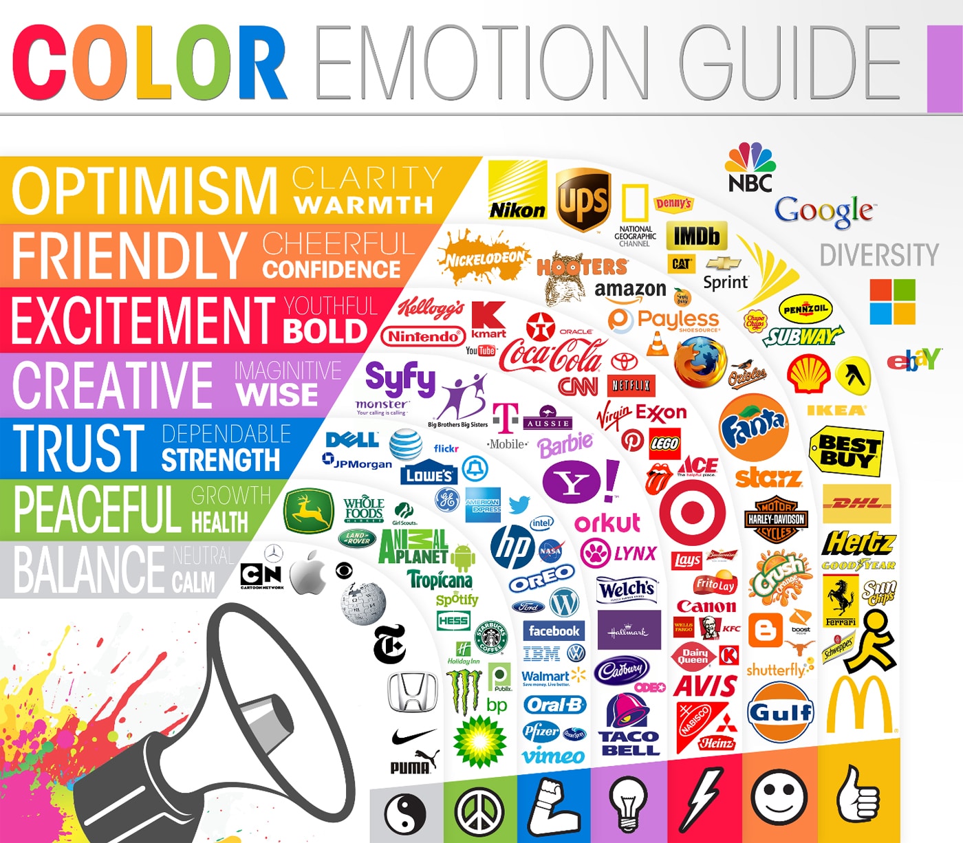
You already know how important the color of your logo is for your brand. It may seem like just a color, but to your customers and potential clients, it communicates a lot more than just that. What you may not realize is that the color of your logo can actually make a person feel a certain way. In other words, it can spark an emotion. You can see the emotion your brand feels like on this color emotion guide.
Over the years, certain colors have even become popular for certain industries. For example, many times black is used for expensive products, white is used for health care and children’s products, and blue is the most common color of all. You can read more about this on What Your Logo & Website Colors Say About Your Brand.
However, today it’s more about the emotions wrapped up in it all. This color emotion guide will show you the emotion you are evoking in people when they see your logo. Of course, you want to make sure it’s the right emotion, so this could inspire you to change your colors. It’s not a mistake that Skype and Facebook are both blue or that Windows, Google and eBay are multi-color. There is a lot of thought and decision making that goes on when choosing those colors.
Brown, which isn’t listed on this color emotion guide, gives off a feeling of strength, durability and dependability. No wonder UPS chose that as their color. There is something very fascinating about what colors do to our brains. You can read more about it on The Visual Color Theory Guide. This chart which you see below was created by The Logo Company. So, what color is your logo? Are you convinced it’s the right one?
The Color Emotion Guide
(Click Chart To Enlarge)
Via: [Jay Mug]

COMMENTS