Before a customer reads a single word on your label, before they know your price point or your origin story, they have already formed an opinion about your product.
That opinion was shaped by the material in their hand, the weight of the container, and the visual language of your design. Packaging is not the finishing touch on a product — it is the first chapter of your brand story, and for many consumers, it is the deciding factor between a purchase and a pass.
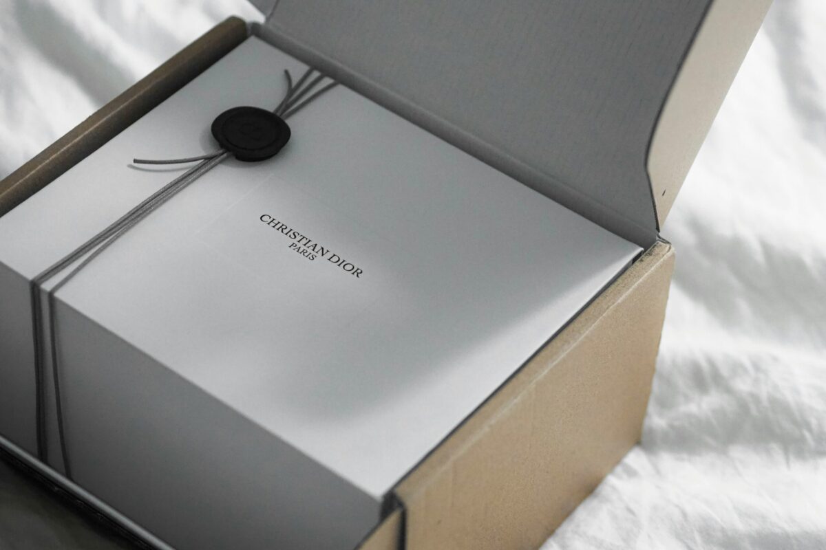
IMAGE: UNSPLASH
The Material You Choose Sends A Message Before The Product Is Opened
Not all packaging materials communicate the same thing. Whether you are filling a shelf at a natural grocery store or selling through an e-commerce channel, the physical material of your container is doing a layer of marketing work that no label copy can fully replicate on its own.
Why Glass Continues To Signal Premium Quality
Glass has a weight and a coolness to it that plastic simply cannot fake. When a consumer picks up a glass container, they register heaviness as quality. They associate the material with purity, with preservation, and with brands that care enough to invest in their presentation.
In categories like hot sauces, cold-pressed juices, artisan oils, and specialty beverages, glass consistently outperforms plastic when it comes to triggering a premium perception at the shelf level.
For small-batch or artisan brands, sourcing glass bottles in consistent shapes and sizes is one of the most effective ways to create a cohesive, shelf-ready look that commands a premium price point.
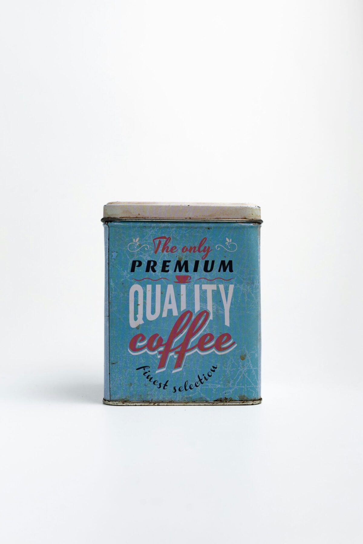
When Plastic And Pouches Serve The Brand Better
That said, glass is not always the right answer, and brands that default to it without strategic thinking are making the same mistake as those who default to plastic out of convenience.
Pouches have carved out a legitimate place in the market — particularly in baby food, trail mixes, and single-serve beverage categories — where portability and resealable technology align directly with consumer expectations. Lightweight plastic works well for personal care, household cleaning products, and volume-driven categories where the material itself does not undercut the brand message.
The key is intentionality. When the material you choose aligns with the values your brand is communicating, consumers do not notice the packaging — they simply trust the product. When there is a disconnect between material and brand positioning, they feel it, even if they cannot articulate why.
Shape Is A Psychological Trigger, Not Just A Structural Choice
Container shape is one of the most underestimated tools available to product brands. A squat, wide-shouldered bottle reads as bold and grounded. A tall, slender silhouette communicates refinement and restraint.
Rounded shapes tend to feel approachable and familiar; sharp angles suggest precision and modernity. These are not arbitrary associations — they are deeply embedded in the way the human brain processes visual information at a glance.
Some of the most recognizable brands in the world have made their container shape part of the brand identity itself. Consumers recognize certain silhouettes before they see a single word of branding. That level of recognition does not happen by accident. It comes from consistently deploying the same shape across every SKU and every product line, year after year, until the shape itself becomes a brand asset.
For emerging brands, the shape decision is an early opportunity to differentiate from a crowded shelf. Choosing something structurally distinctive — and then protecting that choice with design continuity — gives your brand an advantage that compounds in value over time.
Your Label Is Working Harder Than You Think
Once the material and shape have done their initial work, the label takes over. And in a retail environment where the average consumer makes a shelf decision in under seven seconds, every element of your label has a specific job to do.
Typography, Color, And Layout Speak Before The Consumer Reads
Color is the first signal. Muted, earthy tones communicate naturalness and craftsmanship. Bold, saturated colors project energy and confidence. Black packaging with minimal text signals luxury and exclusivity.
Each color palette carries an emotional charge, and the brands that choose wisely are the ones that match that charge to what their target customer already wants to feel before they even reach for the product.
Typography plays an equally important role. A hand-lettered script on a jar of artisan honey tells a completely different story than a clean sans-serif on the same product. The typeface is a personality cue, and most consumers are responding to it subconsciously. That response is fast, and it is formative.
Label layout also matters more than most brand owners recognize. A cluttered label with too many competing visual elements creates cognitive friction. A clean, well-organized layout with a clear hierarchy — brand name, product name, key differentiator — guides the consumer’s eye and builds immediate trust. White space is not wasted space; it is a signal of confidence.
Consistency Across Your Product Line Is What Earns Long-Term Trust
A single well-designed product can earn a first purchase. A product line that communicates a coherent, consistent visual identity across every SKU is what builds a loyal customer base that comes back without needing to be convinced twice.
When a customer picks up a second product from your brand and immediately recognizes it as yours — through the same color palette, the same label structure, the same container proportions — that recognition is doing something meaningful.
It confirms that you are a brand worth trusting, one that has been deliberate and consistent in every decision it makes. That confirmation matters because repeat purchases are driven not just by product satisfaction, but by brand confidence.
This is why packaging decisions should never be made in isolation. The container for a new SKU, a label redesign, the choice of closure or cap — each of these decisions should be evaluated against the full context of your existing product line and the direction you want the brand to grow. Visual cohesion is not just a design principle; it is a revenue strategy.
Packaging Is A Brand Decision, Not A Supply Chain One
Too many brands treat packaging as a logistics problem to solve as cheaply as possible. The most successful consumer brands treat it as one of the most important strategic assets they manage — one of the few marketing channels where every customer who touches the product is getting a direct, unmediated experience of what the brand actually stands for.
The physical touchpoint of packaging is where your brand promise either gets validated or quietly falls apart. Get the material, shape, and label design working together in the right direction, and you have a product that earns attention on its own. Get it wrong, and even the best product inside the package will have to fight twice as hard for the trust it deserves.
COMMENTS