It’s one of the most recognized phrases ever uttered, and it is completely true. It’s “the more simple the better.” It applies to everything from storylines to gadgets. If you want people to be able to connect, identify and immediately pick up on your product or service, you have to make it as simple as possible without breaking the actual purpose it has. I know, it’s easier said than done. Most of the world’s most successful products have been ultimately simple inventions that everyone understood instantly. However, this particular way of thinking has not been implemented into the movie industry much. Movie posters are still mostly overcrowded with all kinds of creatives in order to draw the viewer in, but more times than not it has the opposite effect.
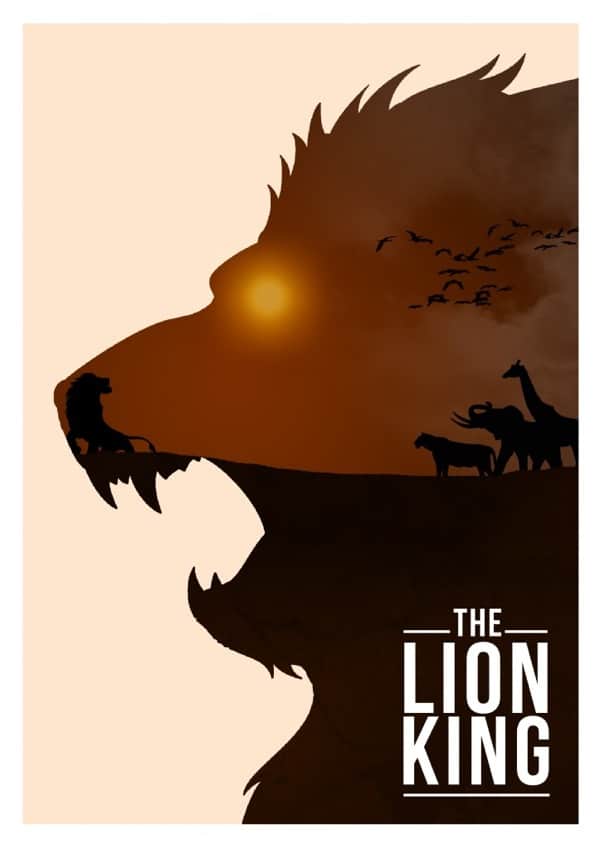
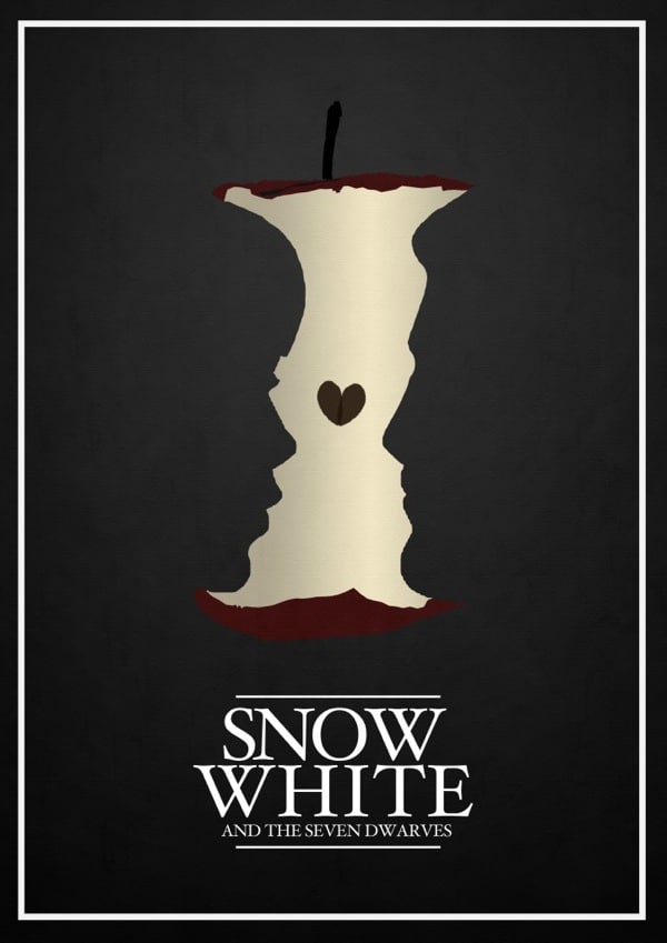
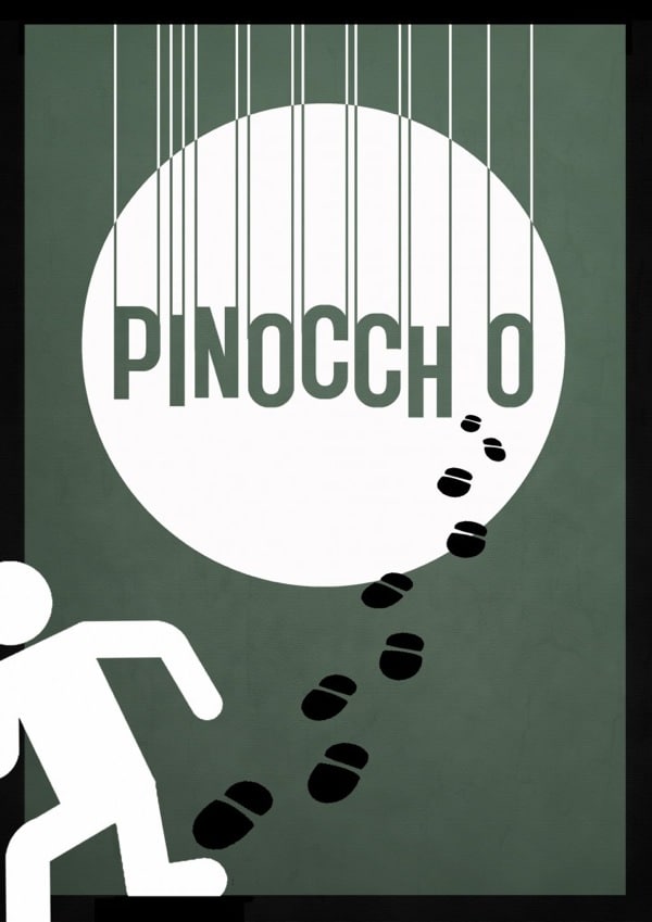
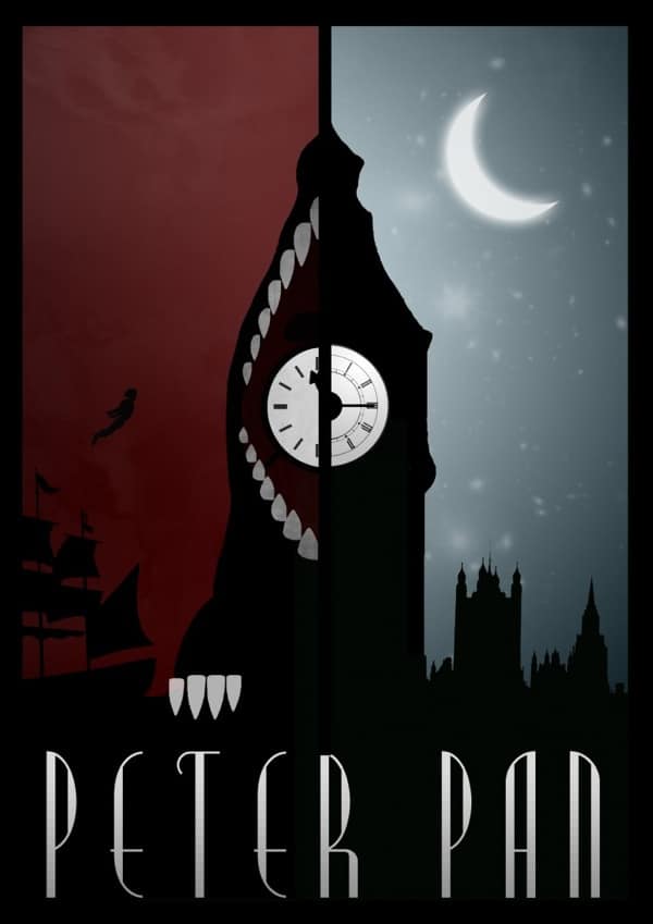
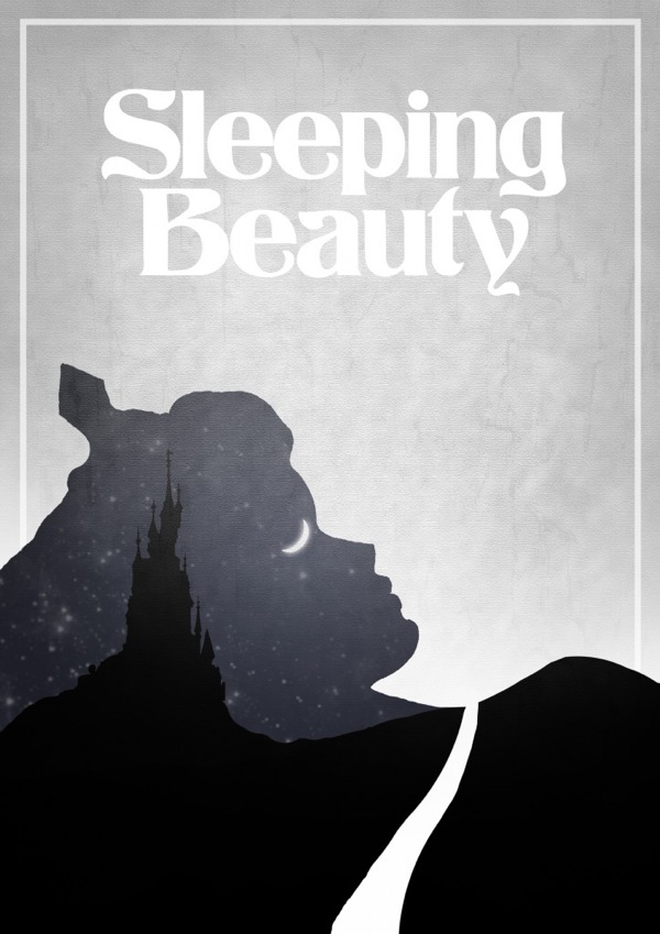
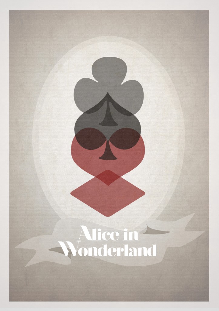
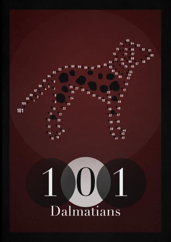
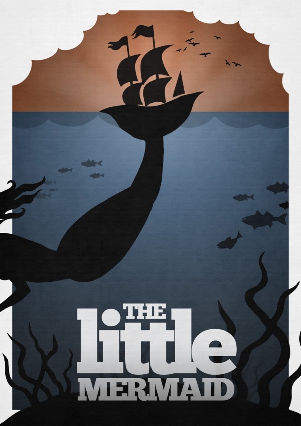
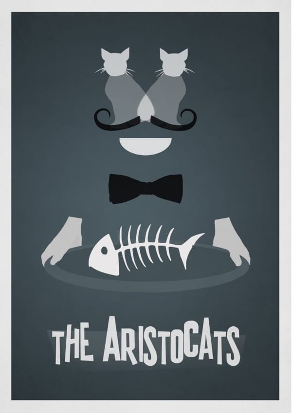
I sometimes wish that movie executives would hit up one of the many creative artists out there who really make stuff a little bit easier. A good example of an artist who would do great is freelance graphical artist and illustrator Rowan Stocks Moore who has a peculiar way of creating innovative and eye-catching movie posters. It becomes quite apparent when you have a look at his series of alternate Disney movie posters.
Not only are they minimalistic in the very sense of the world, but they really tell you the core of the story with just a few graphical elements. It would be great to see these kinds of movie posters for movies at least every once in a while. With all the epicness that gets injected into movies these days using special effects and whatnot, it could be quite cool to use the opposite to draw the movie goers in. It’s not like we have about 2 hours to check these movie posters out like we have to watch the movie. We usually just have a few seconds, and in that time, the poster’s purpose is to make us want to see the movie. That could be something to think about for all you movie poster designers out there.
Via: [Walyou]

COMMENTS