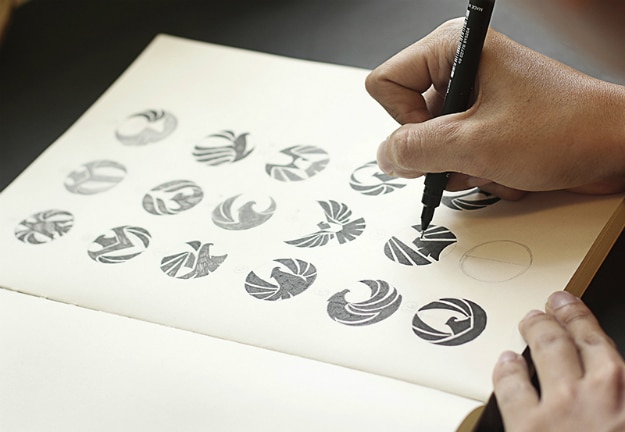
Imagine hosting an event for your company. You buy desserts from the best bakery in town, but you soon realize guests aren’t eating because the treats are stale. You’d be embarrassed if bad food ruined a special event. Yet many business owners don’t realize their logos have the same effect. Presenting yourself with a clever and recognizable logo is one of the most valuable investments a business owner can make.
[pullquote]A logo is your brand’s most recognizable symbol – and almost always the first one people see.[/pullquote] Its “taste,” or style, tells them what working with you will be like. An unappetizing logo can turn potential customers away before you have a chance to interact with them.
So how do you whip up the perfect logo? Check out the infographic below called “The Recipe For A Perfect Logo” and follow this recipe from Company Folders to learn which ingredients you need – and which ones you can skip.
1. Be Enticing
Just like some people prefer chocolate or vanilla, personal tastes impact how they perceive your logo. You can better appeal to your target audience if you study up on their demographics, likes, and dislikes.
2. Be Unique
Cliché logos – like mug symbols for coffee shops or airplanes for travel agencies—are easy to forget. If customers can’t remember what your logo looks like, you can’t expect them to buy a product from you. A logo has to stand out to make a lasting impression.
3. Be Timeless
Running after the hottest new trends is the quickest way to exhaust yourself and create a logo that won’t work in a few years. Since renovating a logo takes a lot of work, why not save yourself the trouble? Opt for a classic style that will last for years to come.
4. Be New
“Timeless” doesn’t mean “boring.” You’ll want to infuse those classic concepts with at least one bold, new trait. That way, your logo has ties to the past, looks to the future, and evolves with your business.
5. Be Simple
Before you get carried away adding bold new ideas, realize that complicated designs force customers to process more information in the same amount of time. This makes it harder for them to register and remember your logo, whereas a simple design is recognizable at a glance.
6. Be Consistent
A logo isn’t just perfect by itself – it has to be perfect for your company. You may have an awesome logo, but if it isn’t true to your brand identity, it’s not doing its job. You’ll have to use all your design know-how to make sure your logo accurately portrays your brand.
You can start by studying how shapes, colors, fonts, and spaces convey emotions that appeal to your audience on a psychological level. For instance, clever use of negative space could show off your company’s witty side, while a green logo can imply a love of nature.
7. Be Adaptable
Today, logos are everywhere – signs, stores, clothes, cars, websites, print ads. With so many places to go, your logo has to adapt at a moment’s notice. Test your design to make sure it’s scalable and that it’s readable in black and white, too.
Cooking up the perfect logo sounds simple, but putting new concepts into practice is difficult if you haven’t seen the results. Read on to see examples of these ingredients in action.


COMMENTS