There is far more to a design than creating a pretty picture and using suitable colors. In fact, every color, shape, line, font, text, and graphics will be carefully thought out to ensure that it gets a very specific message across.
Let’s take logos – these are the most important design for a brand; they all have one and each one will become an instantly recognizable symbol for the company. A lot of thought goes into these… probably much more than you might think. In fact, while many will look fairly simple they are actually very far from it.
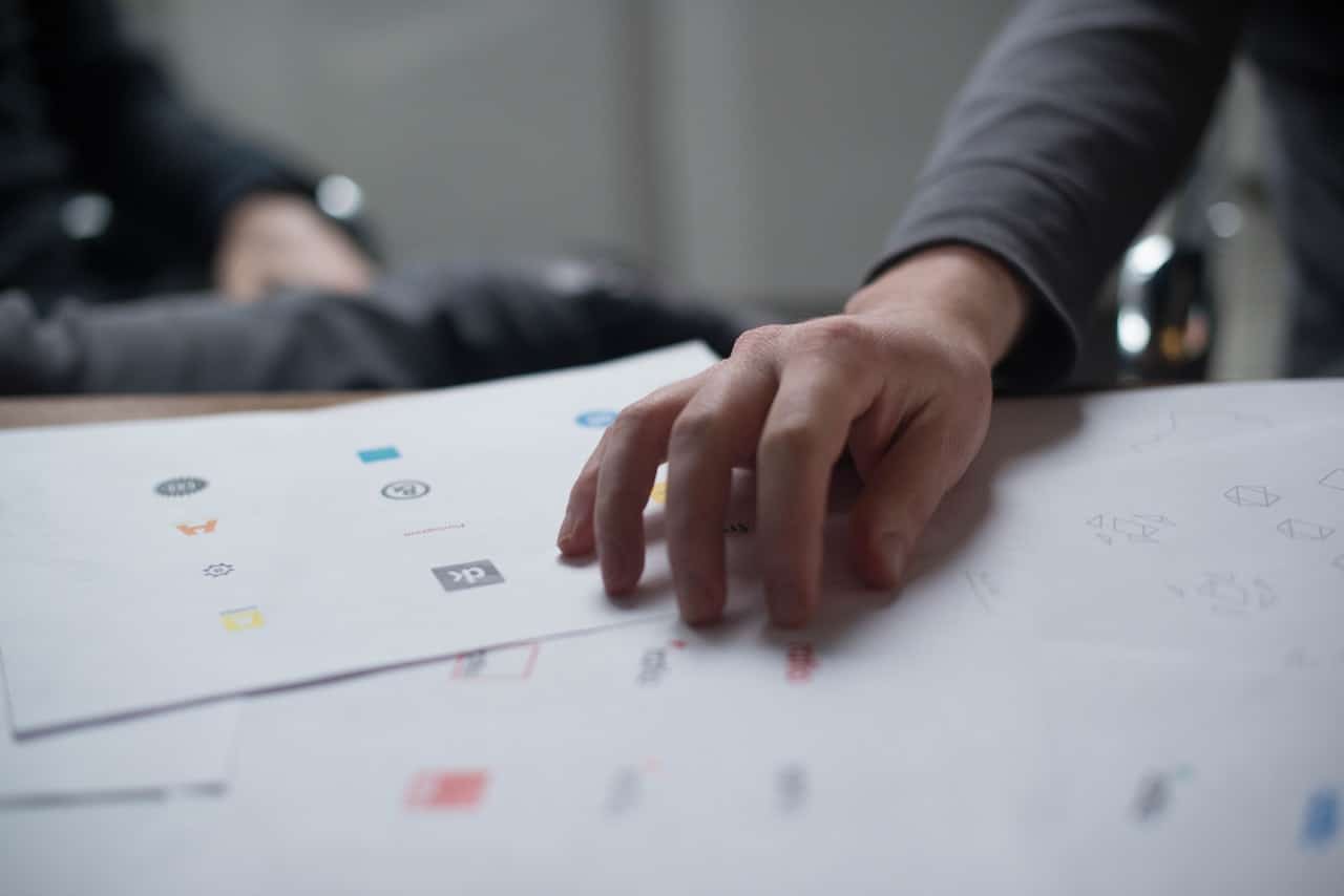
IMAGE: PEXELS
Picture the golden arches – the yellow M on a red background which means you are minutes away from your Big Mac and chips. The M, of course, stands for McDonald’s but it was also designed to represent a pair of breasts.
[pullquote]The Freudian symbolism was almost abandoned in the 60s but design consultant and psychologist Lewis Cheskin convinced bosses to keep the design.[/pullquote] The arches are intended to represent a mother’s breasts, subconsciously making hungry customers feel comforted and at home.
The work of ‘hidden persuaders’ in the psychology of marketing has been going on since the 1920s and companies will pay millions to ensure that their design seduces us into buying by manipulating our unconscious desires.
Therefore, the design of the logo will affect the way that customers and potential customers view a product, service or company.
Shape
Our subconscious responds in different ways to different shapes. You know the Nike tick? The combination of curves ending in a sharp point suggests movement. Exactly what Nike wants you to do in its sportswear; move.
So what do other shapes convey?
Circles, ovals, and ellipses: emotional, community, friendship, love, relationships and unity as well as stability and endurance. This shape tends to be viewed as feminine.
Squares and triangles: stability, balance, strength, professionalism, and efficiency. However, if combined with blues and greys this can become cold and uninviting. But mix this with more dynamic colors and you can produce something far more interesting. Triangles are also associated with power, science, religion, and law. These tend to be viewed as masculine.
Vertical and horizontal lines: subconsciously we associate vertical lines with masculinity, strength, and aggression, while horizontal lines suggest community, tranquility, and calm.
Lettering: jagged, angular typeface can appear aggressive or dynamic, while soft, rounded letters appear youthful. Strong, bold lettering is masculine while curved typeface appeals to females.
Colors
The color of your design will help to convey your message and evoke emotions.
- Yellow: is optimistic – it provides clarity and warmth
- Orange: conveys confidence – it is friendly and cheerful
- Red: raises energy levels – it is bold and youthful
- Purple: sparks imagination – it is creative and wise
- Blue: is dependable – it portrays trust and strength
- Green: is for growth and health – it is peaceful
- Black and white: simple and elegant – it is neutral and calm
Gestalt Theory
The Gestalt theories were formed by German psychologists in the 1920s – they state that the human brain unifies the visual elements it sees to form a whole with far more meaning. People can form patterns out of similarly shaped objects and objects that differ become a focal point.
[pullquote]Another principle, closure, is also used in design – this is when an object is incomplete but has just enough detail that the eye can complete it.[/pullquote] An example of this is the panda used by WWF.
If you are currently designing your own logo and hadn’t thought this deeply about it don’t panic – it isn’t too late! Now you understand the psychology behind designs you will be able to create something far more powerful than perhaps you would have done before. Even adding a few client giveaways such as Uber Buttons could significantly increase conversion.
Firstly, you need to consider the values and attributes that you want the logo to convey – once you know this you will be able to determine the shapes, colors, and font to use.
Once you have the perfect logo you need to get it out there so people are able to recognize and associate it with your brand as quickly and easily as they do with that yellow M and black tick. Order online with Phroom Print and business cards, flyers and leaflets, as well as brochures, can be delivered to your door to help you get your logo out to the public and your message across.
For more design-related stories and information from us here at Bit Rebels, click here.
The Intricate Psychology Behind Your Designs And Colors
COMMENTS