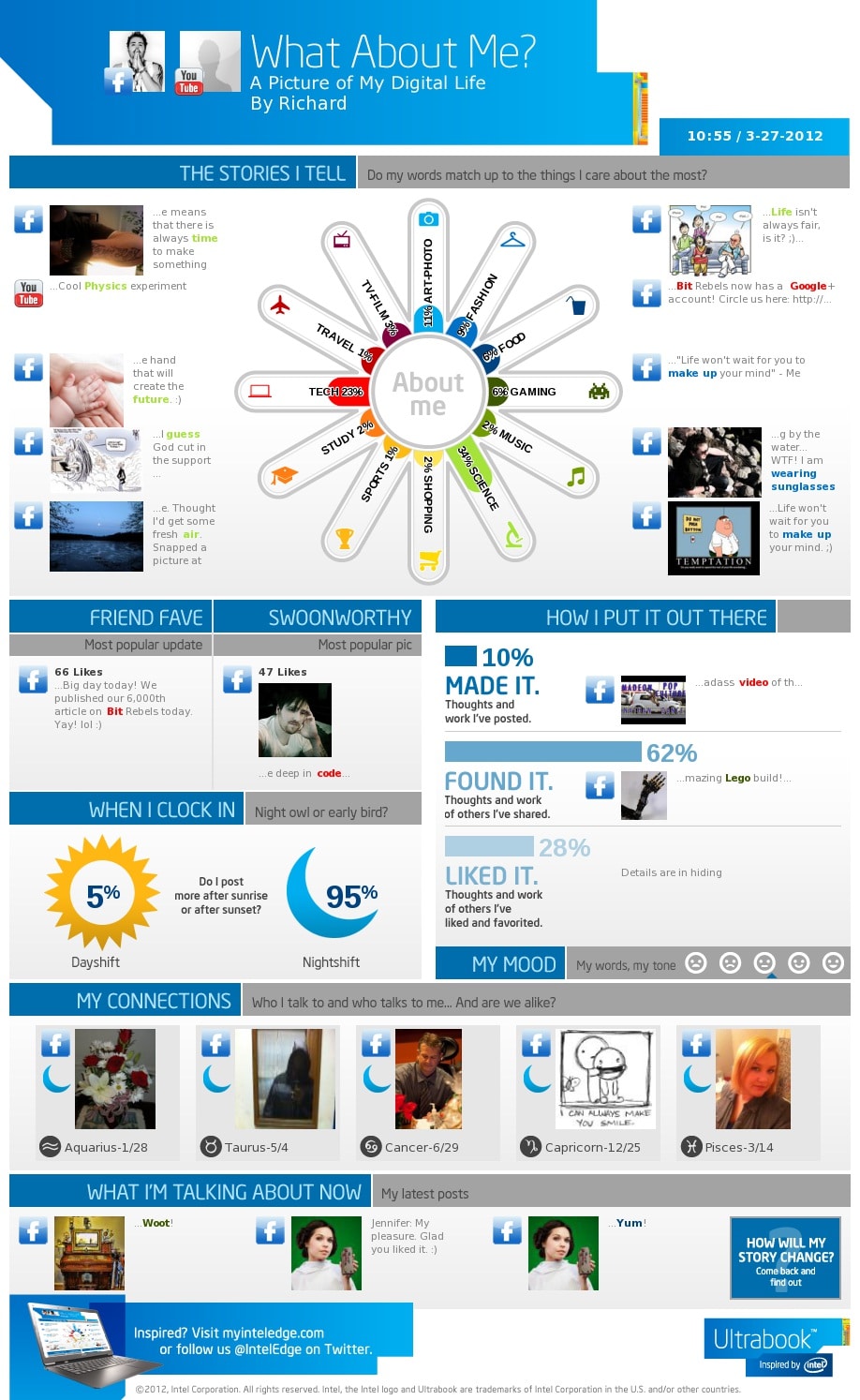
As most of you have noticed, we are big fans of infographics here at Bit Rebels, and we try to feature the very best ones we can find or that are submitted to us. An infographic usually takes a long time to produce since it involves a lot of data mining and designing to make it look and feel simple and straight forward. Some of the infographics we have featured are almost works of art. It takes great passion and dedication to create a really good infographic, but in the end, it is the data presented in it that really determines the success of it. If the data doesn’t hold up, an infographic has little value to the consumer.
I recently found an interesting (notice that I didn’t say “great”) online service, created by Intel, that actually creates an infographic based on your own online presence. It connects to your Facebook, Twitter and YouTube services (if you allow it to) and mines the data therefrom. It then produces an easy to read infographic of it all that pretty much compiles all the information into sections of different topics. I tried it on my own accounts, which I must say, wasn’t too accurate.
The service is called What About Me? and it will, as I said, produce an infographic based on your activity online. However, the thing that bugged me about it was that it really didn’t seem to pull the right data. For example, in the section “My Connections” it says that there are 5 people who I talk to (the most?). The five people represented on this generated infographic aren’t at all the people I talk to the most, which is a little bit of a letdown to be honest. There is data in this infographic that is quite accurate, so I wouldn’t deal out this infographic generator just yet. I guess I will just have to create another one to see if it picks up more accurate statistics. I urge you to have a go at it, and then tell us what you think about this new “service” from Intel. What is your experience when using this? Does it live up to the hype, or is it just another online software to produce a time sink in your daily schedule?
Click Infographic To Enlarge
Via: [Cool Infographics]

COMMENTS