Statistics can be ridiculously misleading sometimes. Not only that, but they can be skewed beyond their actual value, and that is something we’re working really hard here at Bit Rebels to prevent. It’s common practice for people with websites to trust whatever tracking services they are using. They trust that their tracking services provide correct information; however, they seldom do. Even Google Analytics has a quite significant margin of error. It all comes down to the algorithm they are using to track unique visitors, pageviews and whatnot. Some trackers take bots out from their statistics for example, which sometimes means a lot of the real visitors get taken off as well. This goes for popular social platform statistics as well unfortunately.
We have come to that part of the year when people are starting to compile the past year into infographics and statistics to present to the world. Even the big companies do this. Facebook and Twitter are continuously looking at what LinkedIn and Google+ are doing and what their statistics present, and vice versa. Of course, there is an element of “salting” when statistics are presented in order to attract more attention and to put pressure on competitors. Whatever you can do to get ahead, right?
When it comes to popular social platforms, we are used to seeing increasing numbers on pretty much every infographic we are presented. We’ve seen that Twitter has over 500 million users and Facebook is footing over 1 billion. You have to ask yourself, is that really an accurate measurement for how active these social platforms are? Sure, as statistics, they are probably correct and all, but I doubt they really represent how active these services are. And what about their actual statistics? I’m referring to the statistics that will tell you just how well you are doing when you start collecting and compiling your own progress on any of these popular social platforms.
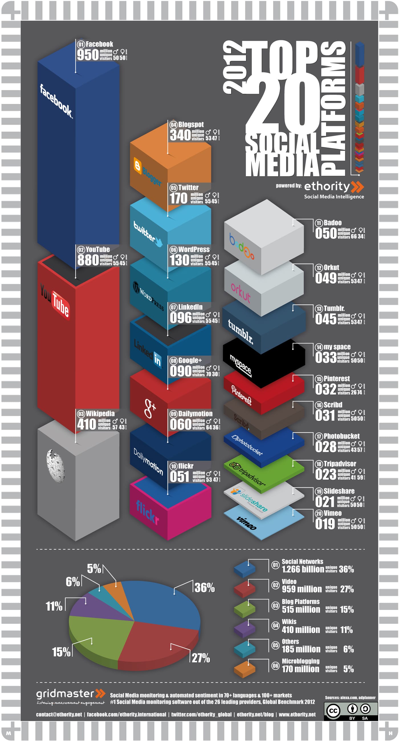
In an effort to shine some light onto this, I have found an infographic that I hope took all of the above into consideration and weeded out any or all misleading error calculations. By the looks of it, these statistics look quite promising. I don’t dare to say they are absolutely accurate, but they make for an interesting reading at least.
This infographic called 2012 Top 20 Social Media Platforms is presented to us by ethority. They have tried to compile the most accurate statistics when it comes to these top social platforms. If anyone is unclear about what is presented in it, and how it’s charted, it’s by “million unique visitors per month” (or so is my interpretation of the infographic).
Looking at these statistics, we quickly see that Twitter (with their over 500 million users) only attracts 170 million unique visitors a month. See what I mean? We’re not talking pageviews here. We’re talking actual people who actually use Twitter’s services. Suddenly the whole playing field got scaled down, and we can once again start compiling more accurate statistics for ourselves as well. The question is whether or not these statistics are correct…
ethority’s Top 20 Social Platform Statistics
(Click Infographic To Enlarge)

COMMENTS