Split testing a landing page involves making multiple versions and putting them live at different times to see which option provides the best results for your business. It can be very helpful if you’re looking to boost your conversions but aren’t sure which landing page elements could be holding you back.
In this article, we’re going to provide you with five different split testing ideas you can try out on your landing page to ensure you’re getting the most out of your website.
Just remember that, when you’re monitoring the behavior of your website visitors and collecting the relevant information, you’ll need to use software that respects all of the necessary data privacy rules and regulations. If you don’t, you could risk losing your customers’ trust and might even be at risk of facing a fine.
With that in mind, let’s jump into our ideas.

IMAGE: PEXELS
Test Different Calls-To-Action To See Which Is The Most Motivating
Call-to-action are prompts that tell users what to do next and they can have a huge impact on the behavior of website visitors.
When choosing and designing a CTA for your landing page, you should make sure that you use strong verbs that are going to motivate people to do something. Your copy could look something like “subscribe now”, “sign up today”, or “try now for free”.
You should also try to design your CTAs with vibrant and catchy colors so you can get the attention of visitors who land on your website. Colors like red, purple, or orange have been known to stand out, especially if they are used against a white background.
There are different tests you could perform with CTAs on your landing page. You could try creating multiple CTAs with different colors to see which one gets the most attention. Or you could place your CTA in different locations on your landing page and monitor which option users click on the most.
To provide you with some inspiration for switching up your CTAs, let’s take a look at some effective examples.
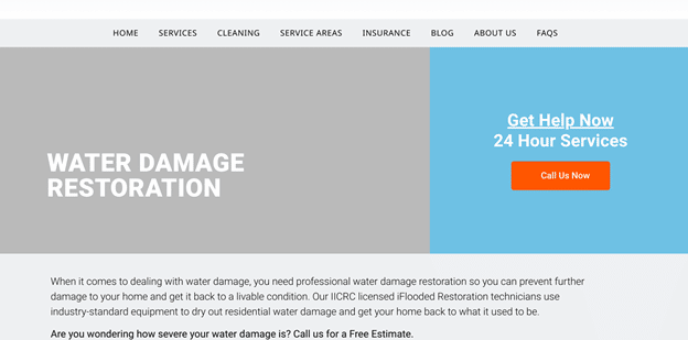
For instance, iFlooded Restoration is a company that offers emergency home repairs and, on their water damage restoration page, they have used a call-to-action that aims to inspire a sense of urgency.
They have used the phrase “call us now” on a bright orange button that contrasts very well against the blue background. This CTA also comes beneath the words “get help now” which, again, helps prospective customers feel like they shouldn’t wait a minute longer before getting in touch.
You could use a similar tactic to inspire your website visitors to make a purchase so, when you’re split-testing your CTAs, make sure you include some options that have an urgent edge. This could just be enough to convince people to stop thinking and start calling you.
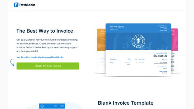
Another example comes from FreshBooks, an online accounting software provider that helps small and medium-sized businesses.
On their landing page for free invoice templates, they have a bright green call-to-action that urges website visitors to “create my free invoice”. What is most notable about this is that they’ve also included a navigational cue in the form of a blue arrow that is pointing right at the button.
This is a great way of giving visual guidance to people so their eye goes straight to the button that will move them further into your sales funnel. To replicate this, you can also use arrows or other signals to ensure people are always guided towards making the right move. Try some CTAs with these cues and without them to see what kind of design your customers are most motivated by.
To measure the effectiveness of your CTAs, you’ll want to monitor the click-through rate and the number of conversions you secure. Piwik PRO has a great guide to monitoring button clicks that will help you with this.
Work Out What Kind Of Social Proof Is The Most Convincing
Social proof can make a very powerful addition to your landing page, as it can serve as evidence that you’re great at what you do. But there are a number of ways you can incorporate reviews and testimonials into the design of your website, so it’s worth testing out some of the different options to see which one will optimize the customer experience most effectively.
Some of the different types of social proof you can add to your landing page include star ratings, written testimonials, “as featured on” sections, and user-generated content. Let’s take a look at some websites that are already using these options effectively to provide you with some inspiration.
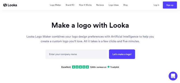
Our first example comes from Looka, an online branding and logo creator. As social proof, they have included Trustpilot star ratings on their logo maker page. While this is relatively subtle, the reviews sit just below the box where people can enter their details, and it’s very easy to see that the company has been awarded full marks from more than 7,000 reviews.
This is a simple but effective way for the business to prove that it’s great at what it does. Star ratings tend to be most commonly used by product-based businesses, but this just goes to show that it can also work for service-based companies. When you’re split-testing what kinds of social proof generate the best results, it’s worth trying this tactic to see if it’s enough to motivate people to take the next step with you.
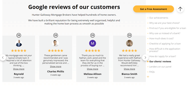
On the other hand, Hunter Galloway, a mortgage broker in Brisbane, uses a combination of star ratings and written testimonials. This can be very effective, as the stars offer a basic picture at a glance, but then anyone who is looking for more in-depth information about working with the company can choose to read more.
Longer testimonials tend to work particularly well for service-based businesses, because they can provide more context about what a customer was looking for and whether the company could deliver. So, if you don’t already have these types of reviews on your website, it could be worth adding some to your landing page during the split testing process.
To measure the effectiveness of different types of social proof, monitor how your conversions are affected and whether people choose to interact with the reviews you’ve added. If you start to make more sales after you add new star ratings or testimonials, it’s likely to be a sign that your customers appreciate them.
Switch Up Your Imagery To See What Sells
Your landing page imagery is very powerful — it can make or break a sale, so it’s worth switching things up to see what sells.
There are several different types of imagery you could use during your landing page split testing, depending on what kind of business you have. For example, you could include high-quality product shots that show your stock in the best light, or even create illustrations or diagrams that explain exactly how your products or services work. You could try using emotive imagery, include photos of people who look just like your customers, or provide photos of you and your staff to humanize your business and help prospective clients feel a connection to it.
To provide you with some inspiration, let’s look at a few ways different companies have used imagery to encourage conversions.
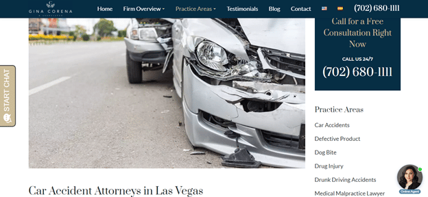
Gina Corena & Associates is a company that offers legal services in practice areas like auto accidents, medical malpractice, or wrongful death. On their service page for car accident attorneys in Las Vegas, they’ve used emotive imagery to help their prospective clients to feel something, and hopefully motivate them into getting in touch.
People who are looking to hire a car accident attorney are likely to have found themselves in a situation similar to the one depicted in the image used. This could therefore be enough to jog the website visitor’s memory about how stressful the situation can be, so they enlist the help of the company to handle their case.
If you provide a service that can help people to deal with a stressful situation, this is a tactic you could replicate on your own website to encourage them to contact you. And it’s well worth trying this out during your split testing.
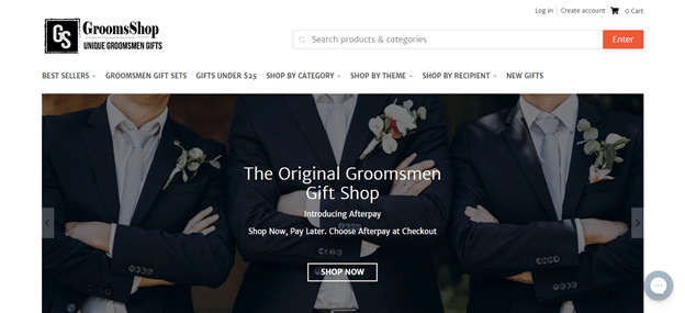
On the other hand, GroomsShop tries to stir up more positive emotions in their website visitors. The company specializes in helping grooms to pick out the perfect gifts for their wedding party. And, this image of a man flanked by two of the most important men in his life is sure to get anyone excited for the moment they can experience the same things.
This imagery encourages prospective customers to imagine how great their wedding day is going to be — and, more specifically, how happy they’ll be to present their groomsmen with incredible presents. This could well be enough to encourage a sale. If you have a product-based business, this approach would work well for your website. Use emotive imagery that represents the people you’re trying to sell to, and you might just stir up enough emotion that they’ll make a purchase there and then.
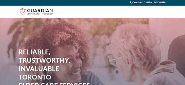
Lastly, let’s take a look at how Guardian Home Care uses imagery effectively on their landing page. They provide elder care services and, on the web page where people can find out more about these services, they’ve made sure to use imagery that humanizes their business. Trusting a company with the well-being of a family member can be very difficult, but this photo shows that Guardian Home Care truly cares about their clients and has their best interests at heart.
It’s always a good idea to use visuals that give a glimpse into who the people are behind your business. So, it’s a good idea to test out this tactic when conducting your split testing experiments.
To work out which visuals best help you reach your website goals, use specialist software that will help you to track your website’s analytics. This will give you a good idea of whether people move further into your sales funnel after seeing your imagery, or if they click away instead.
Change Your Heading To See How Customers Respond
The heading of your landing page is typically the first thing website visitors will see, so it’s incredibly important that you make sure it’s as attention-grabbing and convincing as possible.
To ensure your headline is powerful, try to understand your target audience. It’s easier for you to write headlines that convert when you know and understand what will trigger the people you are writing for.
You can also write down a lot of different headlines, then narrow them down to your favorites before starting your split test. Then you can work on researching which headings best optimize your landing page to promote visitor engagement.
To give you some inspiration, here’s an example of a company with a strong landing page headline.
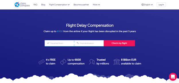
Claim Compass helps people get flight delay compensation from travel airlines, and they make that abundantly clear with their landing page’s heading.
Anyone who lands on their website immediately knows that they can use this service to get compensation for flight delays and will be motivated to start the process by entering the details required.
Something you can learn from this example is that you need to get straight to the point, and make it very clear what people can do on your landing page. Are they there to make a purchase, make a claim, or learn more about your services? Make it very obvious, and people will be far more likely to take the action you’re looking for. This is something you should try to achieve when split testing your page’s headline.
Update Your Copy To Discover What People Really Care About
The copy on your landing page can have a huge impact on your conversion rate. If you are able to create SEO copy that reflects what people really care about, then you’ll be able to move people further into your sales funnel.
When writing your copy, there are a few things you can tweak and test. You should outline your product or service’s features and make sure you highlight the benefits first. It’s also important to provide the price of your products straight away so people know if they want to make a financial commitment. Lastly, you should lead with information about the results you’ve gotten for other customers, as this will encourage potential prospects to make a decision and improve your conversion rate.
Here, let’s take a look at a landing page that has very effective copy straight off the bat, so you can see what kind of content will get you the results you need.
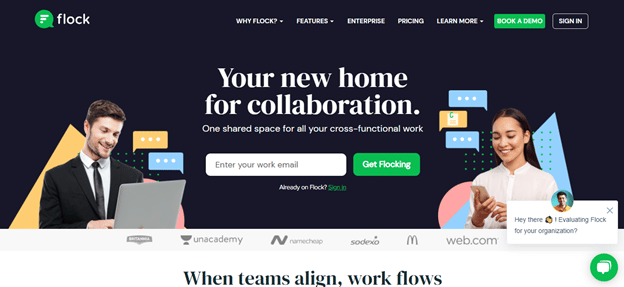
Flock, a messaging and collaboration platform, makes use of strong copy on its landing page.
They make it very easy for new users to know what their product is about by spelling it out for them. They also use the phrases “your new home for collaboration” and “one shared space for all your cross-functional work” to help people imagine what it would be like to use their platform.
This also gives people an idea of the benefits they stand to gain from using Flock. If you want to use this as inspiration, make sure you think deeply about how to convey the advantages of using your products, and how they can change your customers’ lives, through your landing page copy. This will help to push more people towards making a purchase.
Summary
The great thing about split testing ideas on your landing page is that it will help you to improve the engagement and conversion rates of your website.
As we’ve discussed, there are a number of elements you can test, such as your calls-to-action, your choice of social proof, and the visuals you use. The more information you have about your website visitors’ behavior, the more effectively you’ll be able to sell to them. So, get split testing and refine your landing page today.
Author Bio: Adam Steele is the COO at Loganix, an SEO fulfillment partner for agencies and marketers. We build easy-to-use SEO services that help businesses scale. If you liked this article, please check out our SEO guides and templates on the Loganix blog.
If you are interested in even more technology-related articles and information from us here at Bit Rebels, then we have a lot to choose from.

COMMENTS