Wow, you know I don’t usually put videos in my articles unless they are really, really worth watching, and this one falls into that category for sure. I remember when I was at University; one of my favorite classes was Statistics. It approached the actual numbers from the perspective of an Industrial Engineer, and I loved every minute of it. My friends and I did some serious geeking out in that class. This reminds me of that experience.
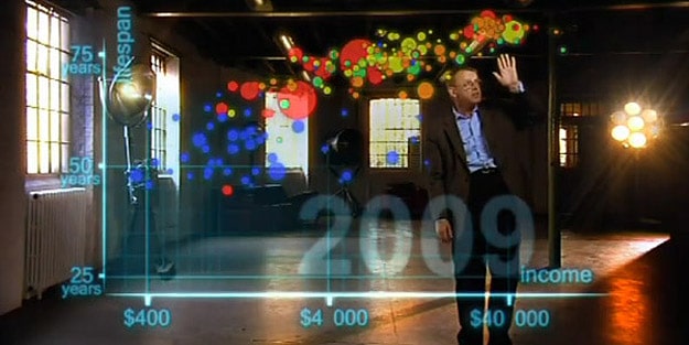
As the title of this video states, it shows Hans Rosling’s brilliant interpretation of 120,000 statistics spanning 200 countries over 200 years. The incredible part of it all is that he illustrates it in a very interesting, simple way, and in only 4 minutes and 48 seconds. In this augmented reality presentation called “The Joy of Stats,” he uses life expectancy vs. income on this graph, and then plots the countries from year 1810 until now.
By showing us the “big picture” in this way, and detailing the amazing progress the world has made, he creates optimism and a smile about the future, which is refreshing. He says, “I see a clear trend into the future with aid, trade, green technology and peace. It’s fully possible that everyone can make it into the healthy/wealthy corner.” He backs this up with his presentation of stats. Get ready to be schooled by one of the best teachers ever. Wow, I’m so impressed!

[via Book of Joe]
COMMENTS