As we all know, one of the most popular ways to share information online right now is through infographics. This trend started a few years ago, and right now, it’s hotter than ever. One of the most effective ways a designer can get his or her name on the map is to design a kick ass infographic. It will no doubt go viral and link the designer’s name all over the Internet.
One of the many other trends that has become popular as a result of the infographic craze is a new style of illustrating information. It’s a format that wouldn’t really be considered an infographic; however, it still presents information in an illustrated way. It’s a style that is called a chart, and charts are becoming very popular also.
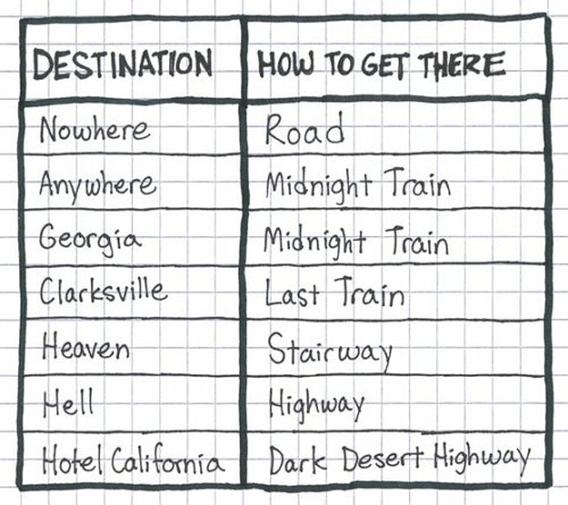
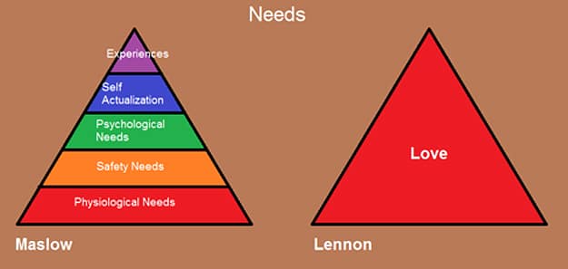
A perfect example is I Love Charts. That site has grown exponentially over the past year, and it’s because of their chart brilliance. Artists, illustrators, and ordinary people everywhere are illustrating just about anything in a chart. I remember when I wrote about a new trend in cooking, which is to illustrate the recipes in a chart. Songs are also illustrated in charts, and it’s always fun to see how people interpret the lyrics in an illustration. Jason Oberholtzer, a writer for Forbes and urlesque, recently wrote a post with his Top Ten Song Charts (By the “I Love Charts” Master). I enjoyed that post a lot, and it got me thinking about my own favorite song charts. Below is a list of my eight favorite song charts. What are yours?
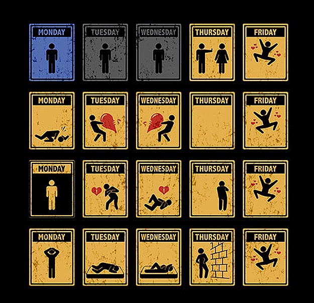
This “Friday I’m In Love” (The Cure) is a classic song chart, and definitely my favorite.
This is another oldie but goodie. Michael Jackson, if you are looking down, you know I love you. This is all in good fun.
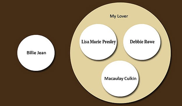
Image Credits: [Flickr] [Graph Jam] [Photobucket] [urlesque]


COMMENTS